3D Contrast
Heads Up!
This article is several years old now, and much has happened since then, so please keep that in mind while reading it.
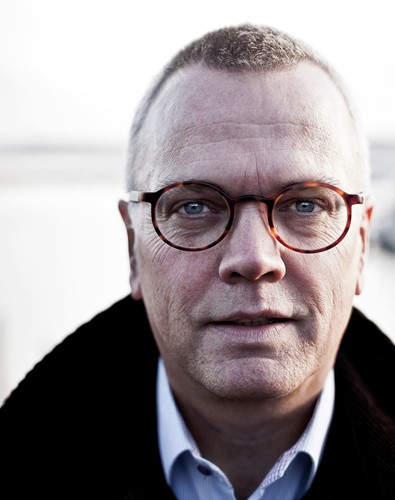
For this demo I'll use a portrait, since a portrait often shows contrast very easily.
I'll go with this fine portrait I show years ago

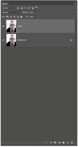
Then copy the layer, by pressing CMD or CTRL +J and you'll end up with someting like this in your layers palette.
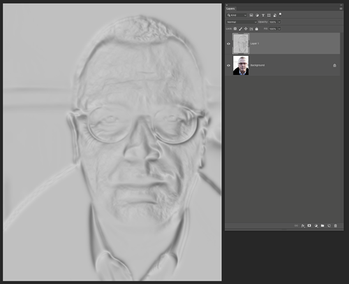
Then go to Filter -> 3D -> Generate Normal Map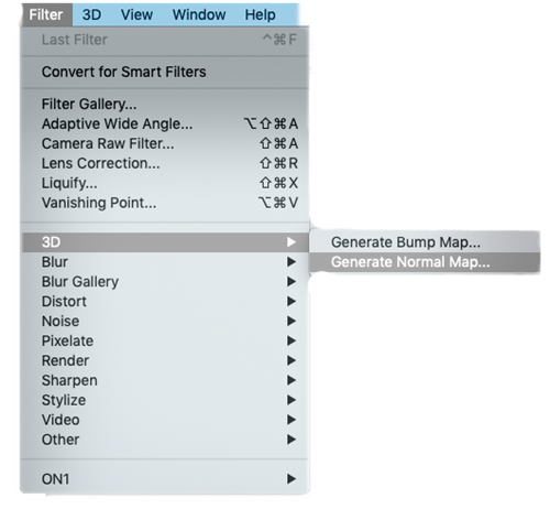
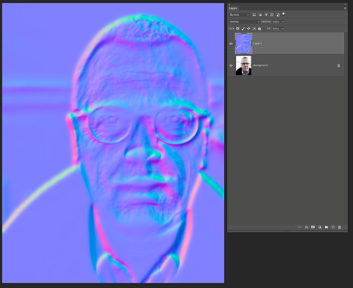
Now you might not be familiar with the 3D maps ... I know I wasn't. But this one looks like this
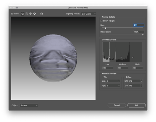
And you'll see a sphere of you image ... and you can mess around with the Blur and the Detail Scale. Personally I leave the Detail Scale at 120% to really give that deep contrast – and we can adjust it later in the layers ... so in this case more is better. The Blur you should adjust so you don't see all the tiny pores in the skin – because they will really stand out then. In this case I go with 4.7. Then press OK.
Panic Attack
Now ... breathe .. don't panic. It's supposed to look like that ... we're not done yet!
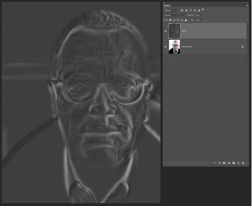
So for this to work, we need to desaturate the layer, so we only have the highlights and the shadows. To do that (with the psychedelic layer selected) press CMD or CTRL + SHIFT + U or go to Image -> Adjustments -> Desaturate.
And you end up with this ... still freakish .. I know!
So now we need to INVERT the layer to map the shadows in the black areas in stead of the whites. And the highlights to the whites in stead of the blacks.
So press CMD or CTRL + I
And you get this .. still very "ghost-like".
So NOW comes the magic part
Set the layer blend mode to SOFT LIGHT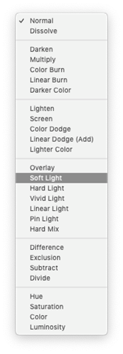
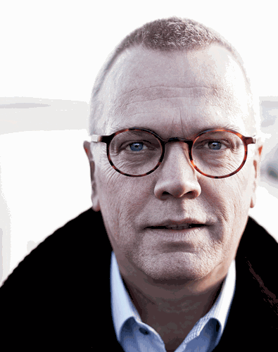
And Voila ... you have this amazing deep 3D contrast
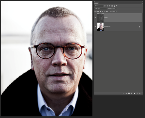
Now all you have to do is assess if the effect is too much. Tone down the opacity of the top layer, and maybe even put a layer mask on top and brush out the effect where it's not needed (in this case, the eyes) – and maybe semi brush out in other areas if the effect is too much.
And then lets finish off witn some before / after comparison
And maybe even a little GIF to really give you an idea
That's all folks ... hope you found it useful.
Merry Christmas
