Umbraco Block Builders
Heads Up!
This article is several years old now, and much has happened since then, so please keep that in mind while reading it.
Umbraco has always been known for its flexibility as a CMS, giving an editor the ability to set the content of a defined template. The process of integration of Umbraco was generally a one to one operation, i.e. you would have one Document Type to represent one design template. You would have many Document Types that would represent many pages.
As time has gone by, editors wanted more power over the CMS when it came to layout. Not necessarily design control but layout control. Landing pages became the go to marketing tool. The ability to move areas of content around on the page without needing to engage the developer. This gave rise to the Grid Editor in Umbraco 7, which allowed editors the ability to create more complex Bootstrap grid based layouts in the CMS and get a pseudo preview in the back office. The Grid Editor was great, however it required large amounts of developer input to ensure that it worked well within design guidelines and also it required that the content editors themselves had some sense of design and a fair amount of training to make their pages cohesive.
Many developers avoided the grid due to its complexity, only using it when they really had no choice. And then in stepped Stacked Content. Stacked Content provided developers the ability to simplify a page into a set of content block elements, and if the developer invested the time they could provide the user a preview of the content in the back office. I consider this the first real block builder. It basically was an advanced implementation of the popular Nested Content property editor and was the brainchild of UMCO (Matt Brailsford and Lee Kelleher). As an agency we extensively used Stacked Content on projects as it provided us the flexibility to build out pages using blocks. If the Grid was Lego, Stacked Content was Duplo, providing editors with a library of defined block types with a defined purpose. Building out “unique” landing pages was a matter of adding some blocks and setting the content.
At release, Umbraco 8 only shipped with the Grid Editor, and at the time Stacked Content had no plans for migration to the new platform. The Umbraco Block List was not a thing, only a dream in the form of an RFC. Developers were manipulating the Grid Editor to act like a block editor but this was not tenable long term. So a few different agencies set out to try and solve the lack of a block editor, my agency, Koben Digital, included. The first cab off the rank was Perplex Content Blocks, then Bento Editor and then the OTB Umbraco Block List Editor and more recently the Contentment Content Blocks (Stacked Content 2.0?).
So, which one is right for you? It’s all going to come down to your preferences, your style of development and what suits your project. In this article I want to look at producing the same feature in each of the different block builders, Umbraco Block List, Perplex Content Blocks, Contentment Content Blocks and finally, Bento Editor. This hopefully will highlight the key differences to help you make a decision on, which workflow suits you best. I will give you the walk through on each and my thoughts.
What are we going to build?
To keep this simple I want to create one typical block that represents a call to action that might be displayed on a landing page. This call to action will consist of a title, description, a button and an image. The editor should also have the option to select the background color of the block.
I'm using TailwindCSS for the frontend code for convenience.
Getting setup
To get setup I have installed a blank version of Umbraco 8.9 in Visual Studio via Nuget. I have setup some basics like a default layout and a homepage Document Type for each block builder.
There are also some data types that are shared amongst each of the examples.
To keep things tidy and make it easy for you to figure out what belongs to what I have created folders in each of the areas to easily identify each of the components and what they belong to.
I have also included a link to download the solution at the end of the article. Let's dive in!
Umbraco Block List
This is the out of the box block editor. The Umbraco Block List is based on the RFC that Umbraco worked on over the past few years to establish a solid pathway forward for block builders. This RFC defined a data model that Umbraco hoped that block editors would follow.
Setup
First we will need to set up the Block List Data Type. For simplicity I have called this Block List. You will also need to select the property editor Block List.
Define the block
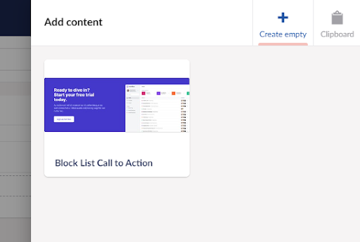
To define our block for our CTA we then need to click on the Add button in the Available Blocks section of the form. Here we can either pick a doctype that is of type element or we can create a new doctype at the root of our Document Types folder and it will automatically be configured as an element type. I have set up my Document Type using the features described earlier and to keep things separate I have called it Block List Call to Action.
We now have a block defined. I will leave all the other properties in their default configuration and Save.
Now we have our data type configured, we can add it to our Home Document Type. Great! We have the simplest form of the Block List configuration done and we can go add a CTA to our Home page in the content section.
The Block List on first glance looks a lot like Nested Content. But once you click Add content things are a little different. First thing you will see is a list of the available blocks. Clicking on a block will then display the editor as shown below.
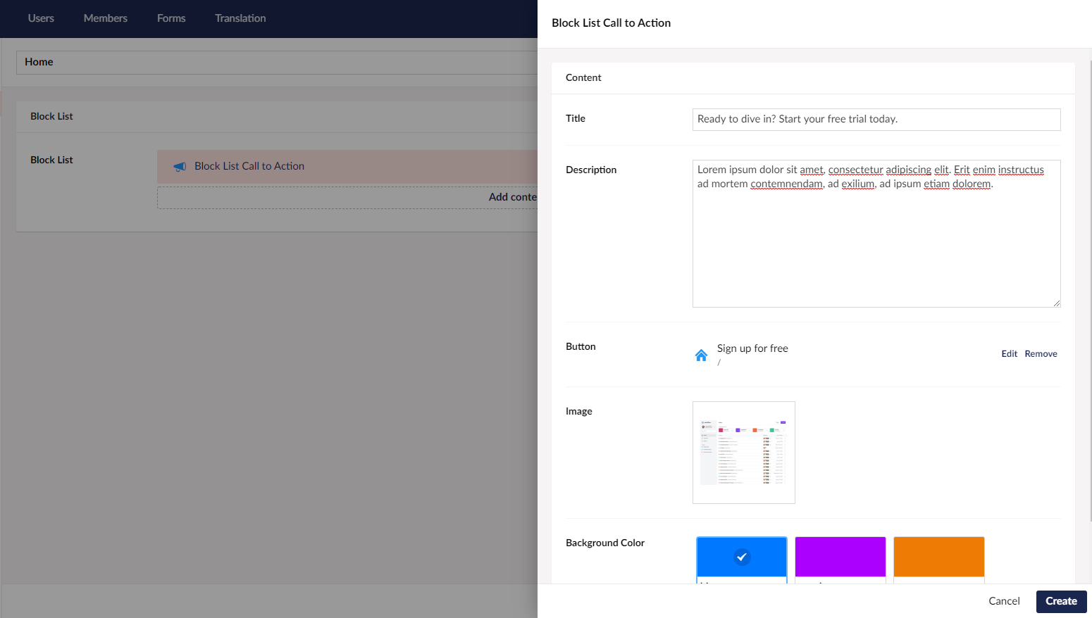
Clicking Create adds the block to the document. But where is the preview? This is where things get a little more advanced and we have to add more configuration and start writing some code. AngularJS to be specific.
Controlling the back office preview, appearance and advanced features.
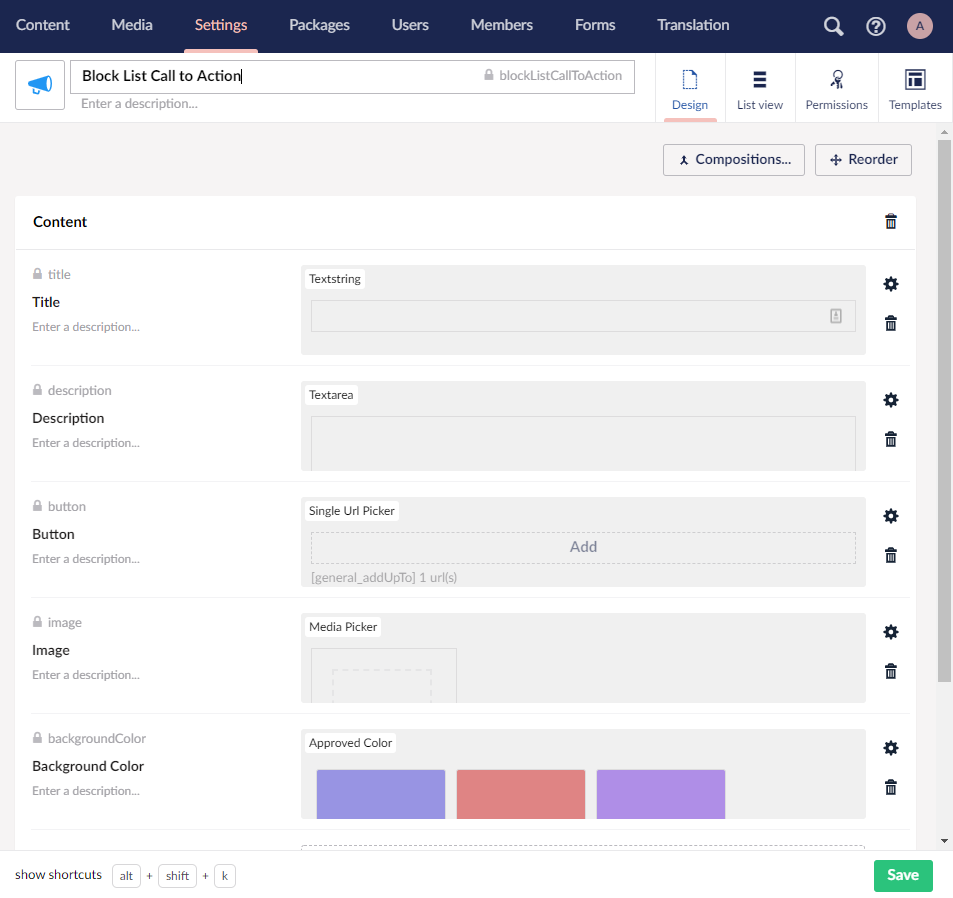
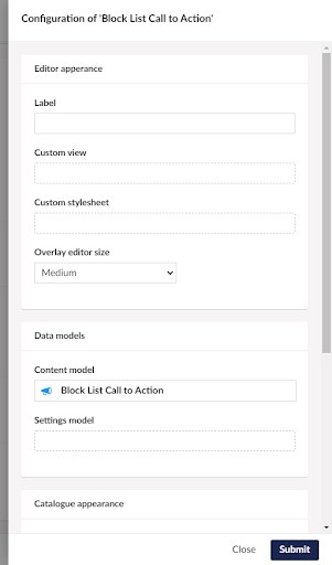
Lets head back to the Block List data type and click on the Call to Action block that we created earlier. At first this step had me a little stumped as this workflow is not that obvious as it is not part of the Add step. This will reveal the configuration settings for our block including control over editor size, preview and custom styling etc.
Here we are going to set a friendly label for the block so it's easier to identify in the Block List, and change from the default icon to a thumbnail preview to help the editors identify which block they are picking. The image needs to be either a JPG or an SVG. Once saved we should now have a catalogue item that looks like this.
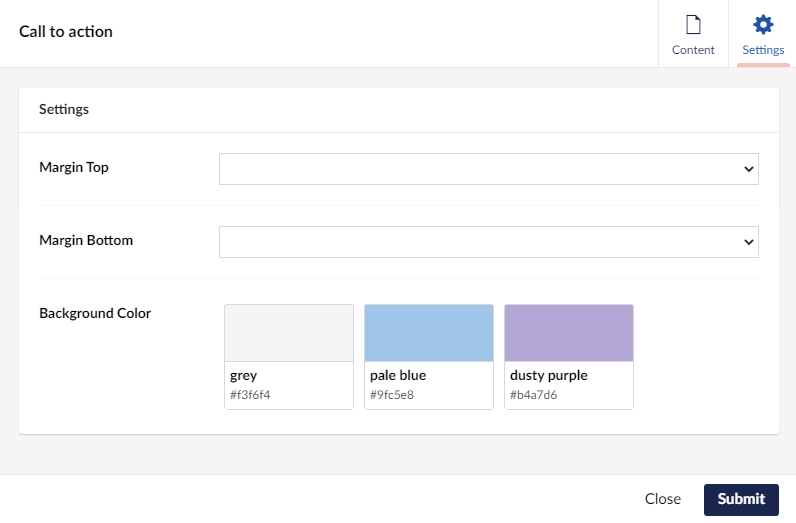
In our requirements we need to be able to control the background of the block. For this we are going to add a settings model to our block configuration. Again you will be presented with the option to choose either an existing Document Type of type element, or create a new Document Type. I find it quite nice UX that you can do these things on the fly without having to stop our flow. So for our settings type we are going to create a simple Document Type which has the following features.
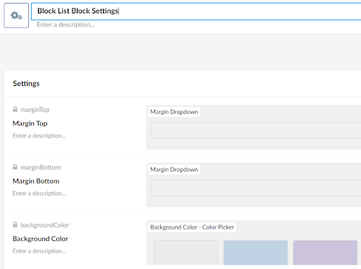
Save the Block Configuration and our Block List Data Type. Now when we add a block to our block list we can access these options through settings tab of the block.
Awesome work so far but we still need a preview for our block in the back office. This is going to get quite technical but is the extra sauce that is probably the reason why you would use the Block List over something simple like Nested Content.
Back office previews are Angular JS views. If you have special requirements, such as loading an image as we are, we are also going to need an Angular JS controller for our block and a package manifest to load it.
We are basically creating a plugin for our content block and this will live in the App_Plugins folder. In our solution to keep things simple we have created a container folder called blocklist and in this folder we have a folder for each block type we are creating, so in our case cta.
Package.manifest looks like this:
{
  "javascript": [ "~/app_plugins/blocklist/cta/ctacontroller.js" ],
}
Our Angular view ctaview.html looks like this:
<div ng-controller="ctaController" ng-click="block.edit()">
    <div class="bg-{{blockbgcolor}}">
        <div class="max-w-7xl mx-auto py-16 px-4 sm:px-6 lg:px-8">
            <div class="bg-{{bgcolor}}-600 rounded-lg shadow-xl overflow-hidden lg:grid lg:grid-cols-2 lg:gap-4">
                <div class="pt-10 pb-12 px-6 sm:pt-16 sm:px-16 lg:py-16 lg:pr-0 xl:py-20 xl:px-20">
                    <div class="lg:self-center">
                        <h2 ng-bind="block.data.title" class="text-3xl font-extrabold text-white sm:text-4xl">
                        </h2>
                        <p ng-bind="block.data.description" class="mt-4 text-lg leading-6 text-{{bgcolor}}-200"></p>
                        <a href="#" class="mt-8 bg-white border border-transparent rounded-md shadow px-6 py-3 inline-flex items-center text-base font-medium text-{{bgcolor}}-600 hover:bg-indigo-50">{{block.data.button[0].name}}</a>
                    </div>
                </div>
                <div class="-mt-6 aspect-w-5 aspect-h-3 md:aspect-w-2 md:aspect-h-1">
                    <img class="transform translate-x-6 translate-y-6 rounded-md object-cover object-left-top sm:translate-x-16 lg:translate-y-20" src="{{imageUrl}}" alt="{{block.data.title}}">
                </div>
            </div>
        </div>
    </div>
</div>
And the ctacontroller.js which is required to load our picked image and handle some of the changes in settings model and the picked color changes:
angular.module("umbraco").controller("ctaController", function ($scope, mediaResource) {
$scope.$watch('block.data', function(oldVal,newVal) {
$scope.bgcolor = $scope.block.data.backgroundColor !== null && $scope.block.data.backgroundColor.label !== undefined ? $scope.block.data.backgroundColor.label : 'indigo';
$scope.blockbgcolor = $scope.block.settingsData.backgroundColor.label !== undefined ? $scope.block.settingsData.backgroundColor.label + '-200' : 'white';
var imageUdi = $scope.block.data.image;
if (imageUdi !== null && imageUdi !== '') {
mediaResource.getById(imageUdi)
.then(function (media) {
console.log(media);
$scope.imageUrl = media.mediaLink;
});
}
}, true);
$scope.$watch('block.settingsData', function (oldVal, newVal) {
$scope.blockbgcolor = $scope.block.settingsData.backgroundColor !== null && $scope.block.settingsData.backgroundColor.label !== undefined ? $scope.block.settingsData.backgroundColor.label + '-200' : 'white';
},true );
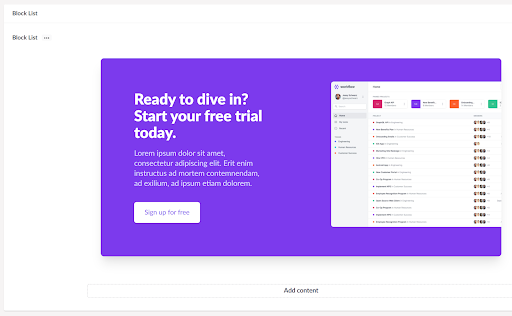
});We are getting somewhere. After we connect our Custom view to our block configuration Editor Appearance section in the Block List Data Type, our back office now looks like this:
But, it still doesn’t look like what we are rendering for our users on the frontend. For most clients this isn’t a big deal but for some it is. They want to work on the site in the back office and have it still look like the frontend. Fortunately we can tell Umbraco which CSS file to use for the block and it will apply the stylesheet.
To include the css file for our block we are going to select the Custom stylesheet file we want to use in the block configuration in the Editor Appearance section.
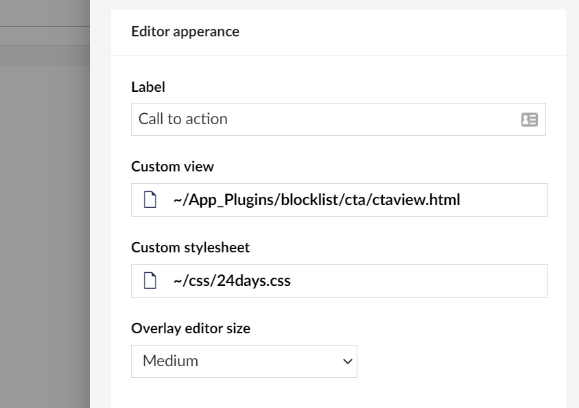
In our case we have selected the main site css file. Block list is quite clever and uses a shadow DOM to keep Umbraco from being affected by our stylesheet. Now our block now looks like our frontend.
We are now done setting up our block for the back office. So how do we render this?
We have to do a bit more work. Unfortunately this is a bit of double handling and we need to build an MVC partial view. This view lives in the /views/paritals/blocklist/components folder. We will create a new view in this folder called blockListCallToAction.cshtml that matches the alias of the block.
The view looks like this:
@inherits Umbraco.Web.Mvc.UmbracoViewPage<Umbraco.Core.Models.Blocks.BlockListItem>
@using ContentModels = Umbraco.Web.PublishedModels;

@{
    var content = (ContentModels.BlockListCallToAction)Model.Content;
    var settings = (ContentModels.BlockListBlockSettings)Model.Settings;

    var blockBg = settings.BackgroundColor != null && !string.IsNullOrWhiteSpace(settings.BackgroundColor.Label) ? settings.BackgroundColor.Label + "-200" : "white";
    var bgColor = content.BackgroundColor != null && !string.IsNullOrWhiteSpace(content.BackgroundColor.Label) ? content.BackgroundColor.Label : "indigo";
}

<div class="bg-@blockBg">
    <div class="max-w-7xl mx-auto py-16 px-4 sm:px-6 lg:px-8">
        <div class="bg-@bgColor-600 rounded-lg shadow-xl overflow-hidden lg:grid lg:grid-cols-2 lg:gap-4">
            <div class="pt-10 pb-12 px-6 sm:pt-16 sm:px-16 lg:py-16 lg:pr-0 xl:py-20 xl:px-20">
                <div class="lg:self-center">
                    <h2 class="text-3xl font-extrabold text-white sm:text-4xl">
                        @content.Title
                    </h2>
                    <p class="mt-4 text-lg leading-6 text-@bgColor-200">
                        @content.Description
                    </p>
                    <a href="@content.Button.Url" class="mt-8 bg-white border border-transparent rounded-md shadow px-6 py-3 inline-flex items-center text-base font-medium text-@bgColor-600 hover:bg-indigo-50">@content.Button.Name</a>
                </div>
            </div>
            <div class="-mt-6 aspect-w-5 aspect-h-3 md:aspect-w-2 md:aspect-h-1">
                <img class="transform translate-x-6 translate-y-6 rounded-md object-cover object-left-top sm:translate-x-16 lg:translate-y-20" src="@content.Image.Url" alt="@content.Title">
            </div>
        </div>
    </div>
</div>
To render the blocks in our block list we can either use the provided helpers in Umbraco, or if we need to do something a little different, we can create our own renderer. For our case I am going to stick with the default.
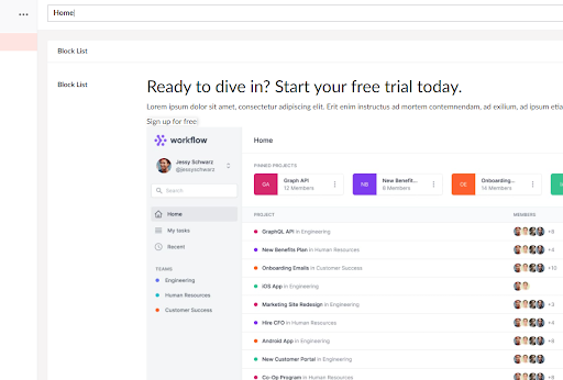
So in my Home template view I insert:
@Html.GetBlockListHtml(Model.BlockList)
And we are done! The block now outputs to the page!
Here are my thoughts on the Block List editor.
The things I liked.
Block List feels like Umbraco in its implementation.
I really love the back office implementation, its minimalism in terms of the list and that you could access block settings while you are editing the content. This enabled me to move quite rapidly as an editor.
The ability to modify the back office presentation using thumbnails of the blocks and the ability to apply the website stylesheet to the block in the back office without it affecting the rest of the page was really great. I can really see editors loving that they can see what their block looks like.
The things I didn't like so much
There is a very steep learning curve. If you don’t do things in angular JS often setting up the block previews can be a real chore. The documentation on this is somewhat lacking and you end up having to make up for shortfalls such as needing to implement $scope watchers to handle the image updates or whenever you need to do something a little trickier. To really build block previews you really need to be familiar and comfortable with extending Umbraco as you are basically building a plugin.
Our example was quite simple but imagine if we had to build out a carousel or a listing of picked content, this would have required a lot more Angular work to see the items we had selected. All doable, just not straightforward.
Most developers will probably not go to the full extent of building the full previews like we did in this example, opting instead to provide a far more limited view of the content to save them from conversations with the client as to why the back office does not work EXACTLY like the frontend.
Some of the UX is not obvious at times. Sorting blocks that have previews can be an interesting / frustrating experience as they do not collapse on drag and it's often not clear what you are picking up. Another UX issue was understanding that once you had created a new block definition in your block list that you had to click again to reveal the extended settings. This could be fixed by simply showing a settings icon on rollover like it shows the delete icon. I would have also liked to have had the option to pick the stylesheet once for the whole Block List rather than for every block I created, minor things but this would make life as a dev a lot quicker if there is only one stylesheet for the whole site.
Final thoughts on Block List
I really like a lot of the concepts in Block List and I am glad that it exists in Umbraco as it does provide the opportunity for some powerful editing experiences. I hope that simple UX issues are fixed and that overtime, some preview helpers are created to reduce some of the complexity.
Perplex Content Blocks
Perplex are the talented team behind the UMarketingSuite plugin for Umbraco, but they also built a block editor called Perplex Content Blocks.
Let's look at the process of implementing our example block. First we have to install the plugin using Nuget. We are going to install version 1.6.2 which is the current stable version at the time of writing but we are aware there is a beta version available for those who want to live on the edge.
Install-Package Perplex.ContentBlocks -Version 1.6.2
Once installed we move to the back office. We will need a Document Type to represent our Content Block which we will called Perplex Call To Action and it will have the same properties as the block we setup for our Block List example, and mark it Is an element type in the permissions.
Next we create a Nested Content Data Type that implements our Perplex Call To Action Document Type. We also need to configure the Nested Content List to only allow a minimum of 1 and a maximum of 1 item. We also turn off the property label to give us more editing space.
We must take note of the Guid or ID of this Data Type as we will need to refer to this later when we are defining our content blocks in code. These can be found on the Info tab.
Now let's dive into the code to set up our block definitions.
I need to create a new class file in my solution. I created my c# file in a folder called /PerplexContentBlocks with the file name PerplexCallToAction.cs to match our content block. I also created all the required classes in the same file. The guts of it are here:
using Perplex.ContentBlocks.Definitions;
using System;
using System.Collections.Generic;
using System.Linq;
using Umbraco.Core.Composing;

namespace _24days.Web.PerplexContentBlocks
{
    public class PerplexCallToAction : IContentBlockDefinition
    {
        public Guid Id => Guid.Parse("a855eefd-c0b3-4074-b566-2544089dc704");

        public string Name => "Perplex Call To Action";

        public string Description => "A call to action content block";

        public string PreviewImage => "/PerplexContentBlocks/cta.jpg";

        public int? DataTypeId => 1082;

        public Guid? DataTypeKey => Guid.Parse("82dc6276-6037-4bab-8719-5c4a3cc65c3e");

        public IEnumerable<Guid> CategoryIds => new[] { Perplex.ContentBlocks.Constants.Categories.Content };

        public IEnumerable<IContentBlockLayout> Layouts => new IContentBlockLayout[] { new PerplexCallToActionLayout() };

        public IEnumerable<string> LimitToDocumentTypes => Enumerable.Empty<string>();

        public IEnumerable<string> LimitToCultures => Enumerable.Empty<string>();
    }

    public class PerplexCallToActionLayout : IContentBlockLayout
    {
        public Guid Id => Guid.Parse("78a9e5bc-ced5-43c8-a4d3-0777f18ed62e");

        public string Name => "Call To Action";

        public string Description => "Generic Call To Action";

        public string PreviewImage => "/PerplexContentBlocks/cta.jpg";

        public string ViewPath => "/views/partials/perplex/calltoaction.cshtml";
    }


    public class PerplexComponent : IComponent
    {

        private readonly IContentBlockDefinitionRepository _definitions;

        public PerplexComponent(IContentBlockDefinitionRepository definitions)
        {
            _definitions = definitions;
        }

        public void Initialize()
        {
            var block = new PerplexCallToAction();
            _definitions.Add(block);
        }

        public void Terminate()
        {

        }


    }


    [RuntimeLevel(MinLevel = Umbraco.Core.RuntimeLevel.Run)]
    public class PerplexComposer : ComponentComposer<PerplexComponent> { }
}
Let's break it down. The first class, PerplexCallToAction is an IContentBlockDefinition. You don’t need to create this as class like I have, you can new up a new ContentBlockDefinition if you prefer to do things that way but the principle is basically the same. This defines the block, gives it a friendly name and connects it to the Nested Content Data Type that we created earlier by either its Guid or its ID. I have set both. This class also refers to a list of available layouts. For our example we are creating just one layout which brings us to the next class PerplexCallToActionLayout which is an IContentBlockLayout. This class describes where the view is, what the preview looks like etc.
The next class is our Umbraco Component class that we are using to register our Call to Action Content Block into the block definition list of available blocks. We then register our component in Umbraco using a Composer.
When we compile and restart the site, Umbraco will register everything for us at startup.
Perplex does not really have the concept of a back office block preview, just a mini preview of the page the block is on. We will therefore need to write our frontend block view.
The view to render our block looks like this and we have placed it in the folder /views/partials/perplex and named it CallToAction.cshtml. You might have noticed this is referenced in the PerplexCallToActionLayout class earlier.
@using Perplex.ContentBlocks.Rendering;
@model IContentBlockViewModel<PerplexCallToAction>

@{
    var content = Model.Content;
    var bgColor = content.BackgroundColor != null && !string.IsNullOrWhiteSpace(content.BackgroundColor.Label) ? content.BackgroundColor.Label : "indigo";
}


<div class="bg-white">
    <div class="max-w-7xl mx-auto py-16 px-4 sm:px-6 lg:px-8">
        <div class="bg-@bgColor-600 rounded-lg shadow-xl overflow-hidden lg:grid lg:grid-cols-2 lg:gap-4">
            <div class="pt-10 pb-12 px-6 sm:pt-16 sm:px-16 lg:py-16 lg:pr-0 xl:py-20 xl:px-20">
                <div class="lg:self-center">
                    <h2 class="text-3xl font-extrabold text-white sm:text-4xl">
                        @content.Title
                    </h2>
                    <p class="mt-4 text-lg leading-6 text-@bgColor-200">
                        @content.Description
                    </p>
                    <a href="@content.Button.Url" class="mt-8 bg-white border border-transparent rounded-md shadow px-6 py-3 inline-flex items-center text-base font-medium text-@bgColor-600 hover:bg-indigo-50">@content.Button.Name</a>
                </div>
            </div>
            <div class="-mt-6 aspect-w-5 aspect-h-3 md:aspect-w-2 md:aspect-h-1">
                <img class="transform translate-x-6 translate-y-6 rounded-md object-cover object-left-top sm:translate-x-16 lg:translate-y-20" src="@content.Image.Url" alt="@content.Title">
            </div>
        </div>
    </div>
</div>
And to render our content blocks we use the following helper in our template using the RendeContentBlocks helper from the Perplex.ContentBlocks.Rendering namespace.
@Html.RenderContentBlocks(Model.PerplexContentBlocks)
We now have all of our code written and we can move back to Umbraco to create and setup our Content Blocks Data Type. This is our definition:
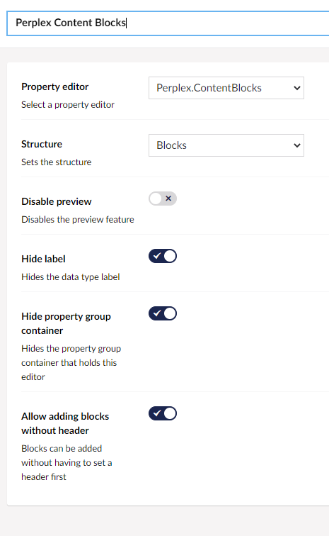
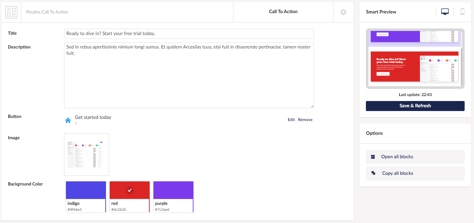
We then need to add this Data Type to our Perplex Home Document Type as a property. And that is it! We have completed our very basic setup of Perplex Content Blocks. We should be able to head over to the content section and add a block to our page and when we hit Save we should see a preview of our block on the right.
Here are my thoughts on Perplex Content Blocks.
The things I liked
There is some really nice UI in this editor, especially the layout switching. Although we didn't specifically use this in our example, one of the nicest features of PCB is the ability to quickly shift between layouts without needing to add a whole different block. This is kind of like how a Document Type in Umbraco can have many templates to render the same data.
I also like the mini preview with the ability to preview both desktop and mobile while editing, although I did find it quite small it was helpful to at least get some sense of how the page looked.
Overall PCB is like Nested Content on steroids. The ability to collapse the blocks makes it extremely easy to sort if you have a longer list of blocks.
The things I didn't like so much
I found the setup quite confusing at first, and it took me multiple read throughs of the documentation to understand the registration process with the definitions. I'm not a huge fan of having to create extra classes to get things up and running and this will definitely be a barrier to entry for a lot of people.
There is no concept of block row settings, so if you need a setting on a block to change the background of the row the block is being rendered on, you either have to add extra properties to the block or add extra layouts to handle the variations.
The preview is miniscule. I wish it was bigger by about three times. I found myself opening the Umbraco preview on another screen and watching the updates on that at full size. If you didn't know already, when you are in preview mode, Umbraco updates the preview on every save!
Final thoughts on Perplex Content Blocks.
If you are looking to extend Nested Content and want to provide a visual way to select the view that is used for rendering, and you are not afraid of spending a bit of time defining block definitions and layout definitions then PCB might be for you. I would love to see a bigger preview or a way to quickly enlarge or switch between edit and preview in PCB itself.
I wish there were row settings and the ability to have another model to manage them. It's not a biggy and in many cases this constraint will not hold developers back.
Contentment Content Blocks
Contentment is so much more than a content block editor. It's actually a suite of useful utilities to really enhance Umbraco. Built by Lee Kelleher, Multi MVP winning Umbraco aficionado (10x Lee). For our article we are going to focus only on the Content Blocks aspect. Let’s get started by installing Contentment from Nuget.
Install-Package Our.Umbraco.Community.Contentment
Once set up we spin up Umbraco and head to the back office. We have to create a Document Type to represent our Content Block, which we will called Contentment Call to Action with the same property setup as the other block editors. We could have used the same block in every editor but we thought to keep things clearly separate we should duplicate the setups.
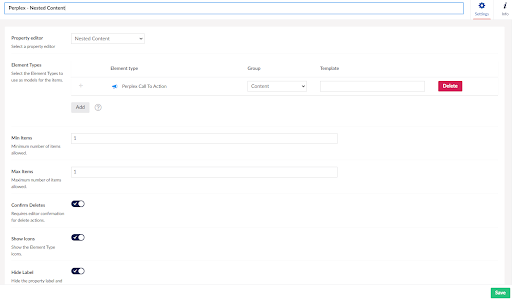
Once this was done we need to create a new Data Type definition which I will name Contentment and selected Contentment [Content Blocks] from the editor list.
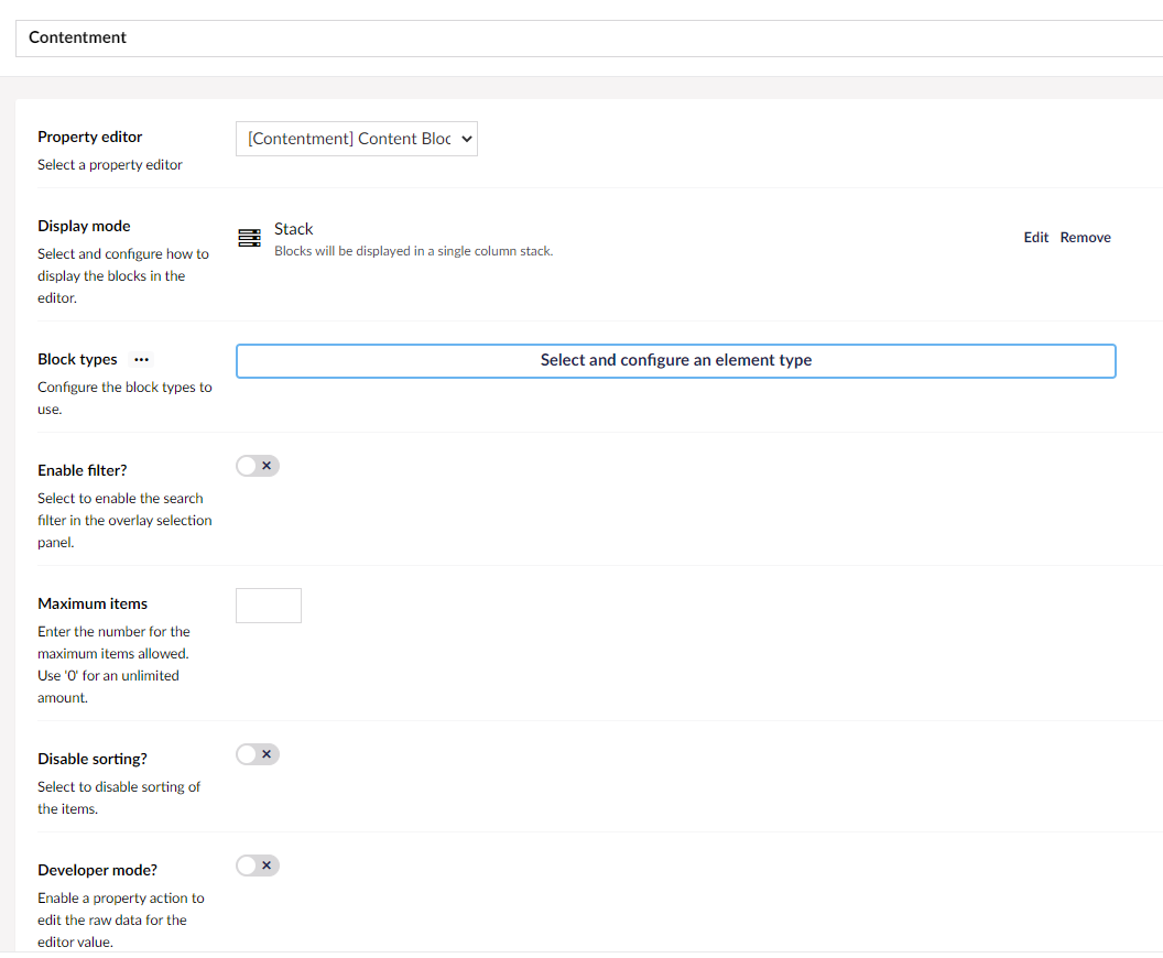
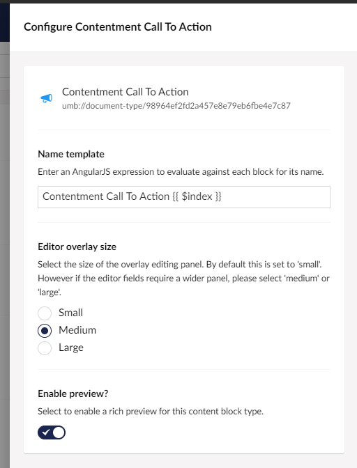
We now Select and configure the element types we want to use for our blocks in the Block types section of the configuration. This will open the following slide in panel.
We used the above settings. Once this is done we can save the Data Type and go add it to our Contentment Home page Document Type. I called this property Contentment. We are now done with our back office setup and we can move to the code.
With contentment you have the options to create custom previews of the backoffice. This according to the documentation should be quite straight forward. Basically you create a view in the /views/partials/blocks folder that is named the same and the blocks Document Type alias which in our case is contentmentcalltoaction.cshtml and the view should have the following inheritance.
@inherits Umbraco.Web.Mvc.ContentBlockPreviewView
This gives you access to a content model for the block is on, and the element model for the actual content block.
@Model.Content
@Model.Element
I unfortunately ran into issues getting the previews to work and I will raise the issue with Lee, but I want to state this is a very new content block editor and I am sure Lee will resolve this quickly. For now we will need to leave the back office without previews working.
Rendering our block on the frontend is fairly simple. We create a standard partial the the name ContentmentCallToAction.cshtml in the /views/partials:
@inherits Umbraco.Web.Mvc.UmbracoViewPage<ContentmentCallToAction>
@using ContentModels = Umbraco.Web.PublishedModels;

@{
    var content = Model;
    var bgColor = content.BackgroundColor != null && !string.IsNullOrWhiteSpace(content.BackgroundColor.Label) ? content.BackgroundColor.Label : "indigo";
}

<div class="bg-white">
    <div class="max-w-7xl mx-auto py-16 px-4 sm:px-6 lg:px-8">
        <div class="bg-@bgColor-600 rounded-lg shadow-xl overflow-hidden lg:grid lg:grid-cols-2 lg:gap-4">
            <div class="pt-10 pb-12 px-6 sm:pt-16 sm:px-16 lg:py-16 lg:pr-0 xl:py-20 xl:px-20">
                <div class="lg:self-center">
                    <h2 class="text-3xl font-extrabold text-white sm:text-4xl">
                        @content.Title
                    </h2>
                    <p class="mt-4 text-lg leading-6 text-@bgColor-200">
                        @content.Description
                    </p>
                    <a href="@content.Button.Url" class="mt-8 bg-white border border-transparent rounded-md shadow px-6 py-3 inline-flex items-center text-base font-medium text-@bgColor-600 hover:bg-indigo-50">@content.Button.Name</a>
                </div>
            </div>
            <div class="-mt-6 aspect-w-5 aspect-h-3 md:aspect-w-2 md:aspect-h-1">
                <img class="transform translate-x-6 translate-y-6 rounded-md object-cover object-left-top sm:translate-x-16 lg:translate-y-20" src="@content.Image.Url" alt="@content.Title">
            </div>
        </div>
    </div>
</div>
And in our template we loop through it and render the blocks partials based on the alias:
@inherits Umbraco.Web.Mvc.UmbracoViewPage<ContentModels.ContentmentHome>
@using ContentModels = Umbraco.Web.PublishedModels;
@{
	Layout = "_layout.cshtml";
}

@foreach (var item in Model.Contentment)
{
	@Html.Partial(item.ContentType.Alias, item)
}
And we are done! The page renders my block.
Here are my thoughts on contentment
The things I like about Contentment Content Blocks
Lee is always good at making things simple and in the case of Contentment Content Blocks it's no different. It is to the point and does what it says on the wrapper. The setup was straight forward and didn't add to many foreign concepts other than its special custom preview model.
The things I didn't like so much
I was quite bummed out that I was not able to get the previews running as it means I was not able to fully test the capabilities of the back office features. I’m sure that Lee will have this resolved in short order. I was also not able to see any reference to style, which means you would likely have to inject this some other way and deal with conflicts of style between Umbraco and your site styles.
Contentment also lacks the concept of block settings which would mean that you would have to bake the settings into the block itself rather than its container.
Final thoughts on Contentment Content Blocks
If you are looking for something that is more advanced than nested content, contentment might be the ticket. It lacks some of the more advanced features some of the other block editors have, but due to the simple setup it might fulfill many developers requirements.
I think with a bit more work Contentment Content Blocks will be a welcome addition to the developer arsenal even if you don’t use the Content Block editor, it is definitely worth checking out for its other features.
Bento Editor
Now I know what many will say that it will be difficult to stay impartial when it comes to reviewing my agency's own Umbraco content block editor, Bento Editor, but I will try my hardest to be as brutally honest as I can. Straight up I will say Bento has a lot of setup, but the concepts should be familiar to Umbraco developers so let's get going.
First we need to install Bento from Nuget and we will use the latest version:
Install-Package Bento.Editor
Once installed we fire up Umbraco. For this example we are going to go for the most simple setup. First step we will create a Document Type that identifies a Bento Item. This is a Document Type with no template and will be used as a composition for each Bento Item we create. Bento uses this composition to automate the creation of templates and also helps the back office pickers. This Document Type does not need any properties and needs to be set as Is an element type in the permissions tab.
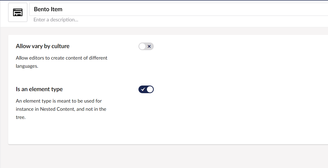
Next we will create our Call to Action block with the same setup we did in the previous block builders. We are calling ours Bento Call to Action. Make sure you create it without a template, Bento will be doing this for us later.
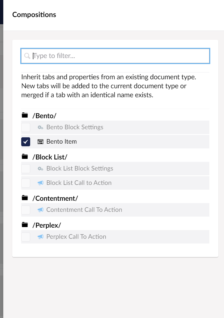
Make sure you include the Bento Item Composition.
And set the Document Type permissions to Is an element type.
We will come back later and re-save this Document Type after the Bento Stack Property Editor is set up to allow Bento to automatically create the partial views for our block.
Bento also allows for layouts to have settings to control things like backgrounds etc. like the Block List so we will also set up a Document Type called Bento Block Settings which is set to Is an element type. Its setting are the same as those that we set for the Block List Block Settings Document Type.
We have finished the minimum Document Type setup we need for our example.
Next step is to create the Bento Stack Editor Data Type. We will set up a new Data Type with the name Bento and set its type to Bento Stack. You might notice there is another type called Bento Item. Bento Item allows you to have a single property that is based on a single Bento Item. This is useful for headers areas on pages etc.
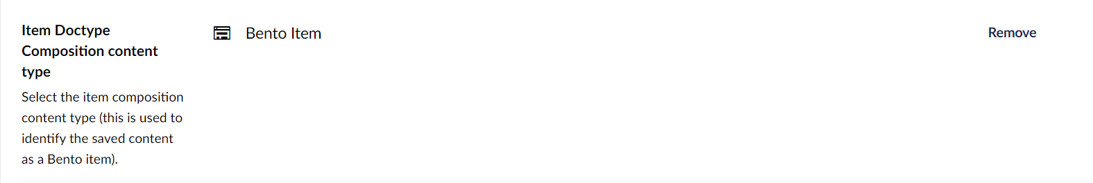
Next set the Item Doctype composition content type to the Bento Item Document Type we created earlier.
Now comes the more complex aspect of Bento. We need to set up the layouts. Layouts in Bento are based on CSS Grid. We are going to create a layout called default with the following settings:
Layout name: default
Layout alias: default
Layout settings: Pick your Bento Block Settings Document Type you created earlier.
Add a layout column by entering a column size of 1 and click Add.
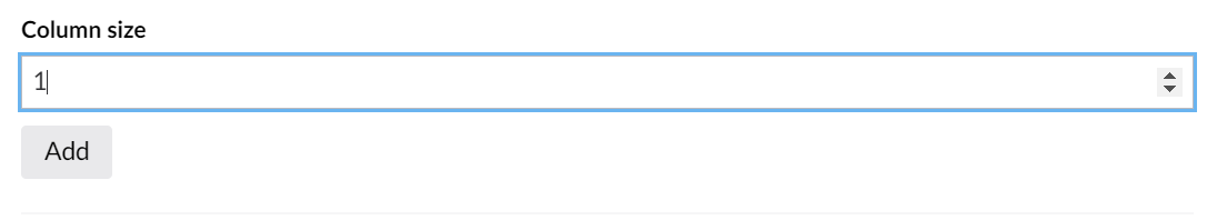
This will represent 1fr. As per the description of this field; for layouts we assume that 100% of the space is available so for example, 1fr for each column will distribute the columns over that available space. 1f 2fr 1fr will make the second column twice as wide as the first and last using only the available space. In our example we only need one.
Now we want to create a layout area that will go in that column. Click Add and set the fields to the following:
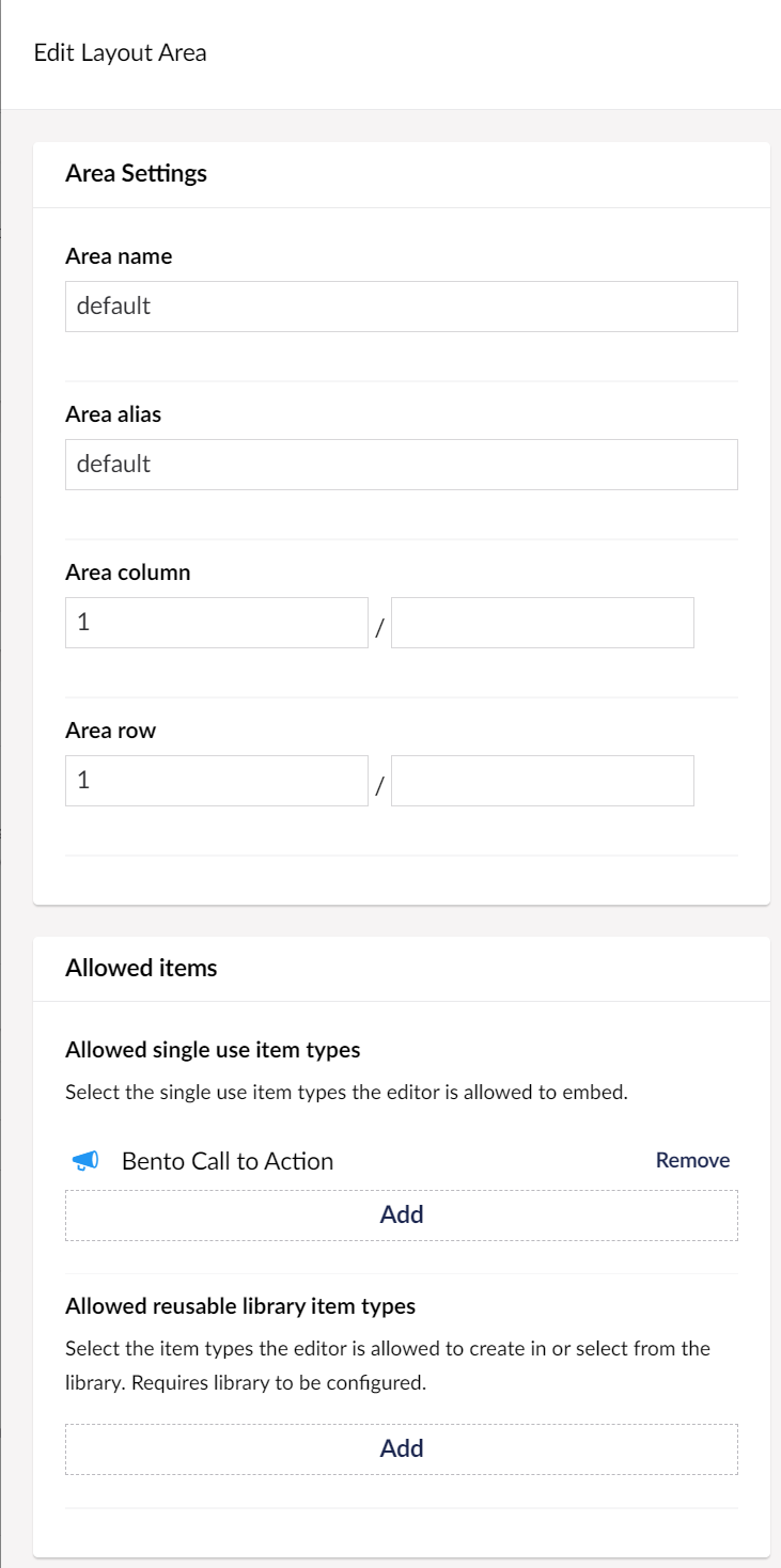
As mentioned earlier we are using CSS grid in the back office to manage the layouts. Area Column and Area Row specify what line in the CSS Grid the area goes from and to.
In our case our area goes from line 1 on the column and row and fills one space in our grid. As there is only one space in our grid this basically is the same size as our row. For more information on CSS Grid check out https://css-tricks.com/snippets/css/complete-guide-grid/
We also need to set the Allowed single use item types. Pick your Bento Call To Action. Now submit and save all of the open panels. You should now see:
You can have multiple row layout configurations in Bento. For this example we will stick with one basic layout.
Next we want to let Bento know we want to style the previews using our websites CSS.
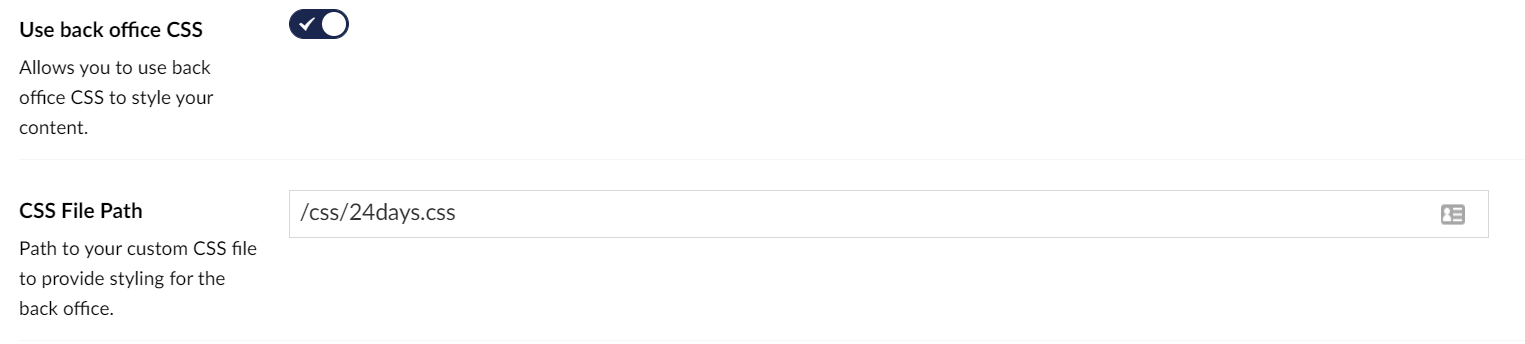
We need to flick the switch and set the path to the CSS file.
Now save the Data Type.
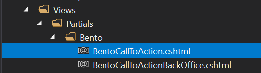
Next we need to go back to our Bento Call To Action Document Type and re-save it. Bento will set up all the basic views for us in /views/partials/bento. It will create two views. One for the frontend, and one for the back office which allows us to control the output separately if we want to have different back office markup and not full frontend views. For this example we will be going all the way ;)
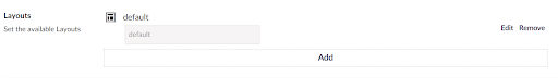
Lets now go and add our bento Data Type to our page. We have called our property Bento for the sack of the article.
Congratulations the back office setup is complete but we still need to write our markup that will go in the views mentioned a few seconds ago.
Let's move back to the code. Bento automates some activities but not everything. We are going to need to set up our bento Layout views named with layout alias for the layout we created earlier. These are created in the /views/partials/bento/layout folder. We will create a new partial view called default.cshtml. The markup of our file is as follows:
@inherits Umbraco.Web.Mvc.UmbracoViewPage<Bento.Core.Models.StackItem>
@using ContentModels = Umbraco.Web.PublishedModels;

@{
    var settings = Model.Settings as ContentModels.BentoBlockSettings;
    var blockBg = settings.BackgroundColor != null && !string.IsNullOrWhiteSpace(settings.BackgroundColor.Label) ? settings.BackgroundColor.Label + "-200" : "white";
}

<div class="bg-@blockBg">

    @foreach (var area in Model.Areas.Where(x => x.Content != null))
    {
        @Html.Partial($"~/Views/Partials/Bento/{area.Content.ContentType.Alias}.cshtml", area.Content)
    }

</div>
The main thing to note on this view is the first line. All Bento layouts have a model of StackItem. StackItem provides access to our layout Areas collection and our Settings model. Areas contain our Content Model which is of type IPublishedElement which for us will be our Bento Call To Action block item.
Next we set up our back office and frontend views. Let's start on the frontend. As we are going to use the same markup on backend and frontend we only want to write our output markup once. Open up the BentoCallToAction.cshtml file. You will see the markup that Bento automatically produces for us which has an inheritance from IPublishedElement.
@inherits Umbraco.Web.Mvc.UmbracoViewPage<IPublishedElement>
We can see it's a standard Umbraco partial. We are going to update its markup to the following and update the content model to our Models Builder BentoCallToAction model:
@inherits Umbraco.Web.Mvc.UmbracoViewPage<ContentModels.BentoCallToAction>
@using ContentModels = Umbraco.Web.PublishedModels;

@{
var bgColor = Model.BackgroundColor != null && !string.IsNullOrWhiteSpace(Model.BackgroundColor.Label) ? Model.BackgroundColor.Label : "indigo";
}

<div class="max-w-7xl mx-auto py-16 px-4 sm:px-6 lg:px-8">
    <div class="bg-@bgColor-600 rounded-lg shadow-xl overflow-hidden lg:grid lg:grid-cols-2 lg:gap-4">
        <div class="pt-10 pb-12 px-6 sm:pt-16 sm:px-16 lg:py-16 lg:pr-0 xl:py-20 xl:px-20">
            <div class="lg:self-center">
                <h2 class="text-3xl font-extrabold text-white sm:text-4xl">
                    @Model.Title
                </h2>
                <p class="mt-4 text-lg leading-6 text-@bgColor-200">
                    @Model.Description
                </p>
                <a href="@Model.Button.Url" class="mt-8 bg-white border border-transparent rounded-md shadow px-6 py-3 inline-flex items-center text-base font-medium text-@bgColor-600 hover:bg-indigo-50">@Model.Button.Name</a>
            </div>
        </div>
        <div class="-mt-6 aspect-w-5 aspect-h-3 md:aspect-w-2 md:aspect-h-1">
            <img class="transform translate-x-6 translate-y-6 rounded-md object-cover object-left-top sm:translate-x-16 lg:translate-y-20" src="@Model.Image.Url" alt="@Model.Title">
        </div>
    </div>
</div>
Because we want to have the same markup in the back office we will call the frontend view from the backend view. Open the BentoCallToActionBackOffice.cshtml file and update the markup to:
@inherits Umbraco.Web.Mvc.UmbracoViewPage<ContentModels.BentoCallToAction>
@using ContentModels = Umbraco.Web.PublishedModels;

@Html.Partial("~/views/partials/bento/BentoCallToAction.cshtml", Model)
Almost there. Now we need to go to the page template that we are rendering our Bento stack on, in our case it's the BentoHome.cshtml. Add the following markup:
@inherits Umbraco.Web.Mvc.UmbracoViewPage<ContentModels.BentoHome>
@using ContentModels = Umbraco.Web.PublishedModels;
@{
	Layout = "_layout.cshtml";
}

@foreach (var item in Model.Bento)
{
	@Html.Partial($"~/Views/Partials/Bento/layouts/{item.Alias}.cshtml", item)
}
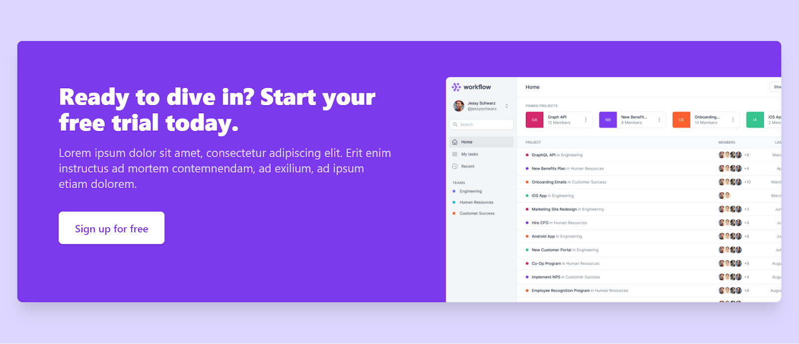
That's it! We are done with our demo Bento setup. We should now be able to go to Umbraco and create a new bento Call To Action block, set all the properties and get the following output in the back office.
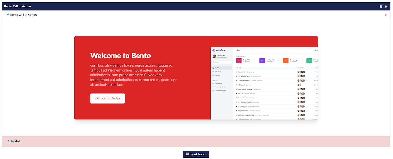
We can go much further with the back office and get Bento to also preview our row settings, but that is for another article. Basically Bento can pretty much do anything you want given a small amount of effort.
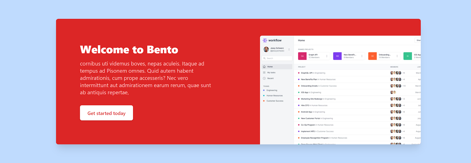
And after we publish we should see:
Thoughts on Bento.
The things I like about Bento
I am pretty biased towards Bento as we have been using it as an agency on pretty much every site we have built over the past 12 months as it suits our workflow. We like to see it as a bit of a hybrid between the Umbraco Grid Editor and Nested Content. It imposes more constraints than the Grid Editor but it is these constraints that make it so rapid to work with. Editors are not left wondering how to achieve things, they pick blocks and fill them with content. Setup although it takes some initial effort, once done allows a developer to rapidly create blocks with complex logic.
We love how you don’t need to know more than one language to work with Bento, and the only custom model is used only at the layout rendering. Everything else is standard Umbraco with no compilation unless you want custom controllers per block (which is possible).
Bento's ability to allow for multiple layouts is awesome. And as they are CSS Grid based you can do some pretty creative things, like mosaic galleries and more magazine style layouts. We only created a simple single area layout in our example but the limits of what is possible is up the developer.
The option to render the back office previews in full color design is really great, but with the option to stay simple if required.
Reusable items can be handy in larger sites when situations where the same call to action blocks is used on multiple pages you can pick a prebuilt one from a library. We didn't go into this during our demo, as the point was to create the same thing in all the block builders. But it is a feature none of the others have as standard.
The things I don't like so much (and will likely change)
This is where I have to be a little bit brutal on my own and my team's work. Bento is by no means perfect but that means we can learn and improve.
Initial setup can take some time, and until you are comfortable with the Bento concepts it can be confusing. For example I have seen people state that you must have your blocks as reusable library item, which is not true at all.
It is great that some things are automated but it would be nice to also automate the layout creation and also setup a basic rendering partial/helper as standard. There are code snippets in the documentation but providing an example helps to spur creativity. This would make it even more accessible to more people who don't usually write c#/razor code.
The chrome of the editor can be quite heavy at times. It would be nice if it was a little more lightweight. We still feel its necessary to provide editors clear handles and not hiding features.
I would love to see the ability to copy an area / layout feature to aid in creation of pages.
The documentation could be a little better, possibly a dedicated wiki or website to document the more advanced features.
Bento does not follow the RFC specifications for block builders. This would require a bit of a migration for sites that already implement Bento if it were ever to change.
Final thoughts on Bento
Bento was created out of necessity and even with the advent of Block List, we still think it fills a gap in the market for Block Builders. Things like only needing to build out CSHTML files is a bonus for our team.
Setup complexity could be a barrier for some developers, but the Bento team is working on automating some of these processes to get you up and running quickly.
Overall Bento brings features to block building that the others don’t in the way it still allows for flexible multi block layouts and its reusable block library. Bento is only going to improve over time and is in constant development.
Conclusion
We made it to the end! Phew….
That was mammoth but I felt it was the only way that we could really and truly compare the block builders by doing the same task in all four. I am not going to tell you which one to use as each has its strengths and weaknesses, and some will fit your workflow better than others. You be the judge and pick the tool that best represents how you want to work. It would not be fair to create a table trying to compare key features against each other as they all take slightly different approaches. But here are highlights for each.
Block List
- Ships as standard with Umbraco CMS 8.8+
- Feels like Umbraco
- Support is guaranteed as it is an Umbraco core component
- Back office previews are built in AngularJS and can be complex to setup
- Clipboard copy paste
- Pretty catalogue view with block image preview
Perplex Content Blocks
- Like Nested Content on steroids
- Each Block can have multiple layouts
- Back office preview is provided through a mini view of the entire page
- Requires a Nested Content Data Type to be setup for every block type
- Requires C# classes to define block definitions
- Does not provide the concept of row or block settings
Contentment Content Blocks
- One of multiple back office utilities in the Contentment package
- Similar to Stacked Content
- Simple to setup
- Does not provide the concept of row or block settings
- Does not allow as a feature for the use of the site CSS file in the back office
Bento Editor
- Allows for multiple layouts in back office via CSS Grid
- Option for a reusable block library
- Same view used on the frontend can be used in the back end
- All block views are standard Umbraco views inheriting from either IPublishedElement or ModelsBuilder Model
- Can be used with no compilation
- Allows for full back office previews
- No copy and paste features for block or layouts
The work that each respective agency and Umbraco have put in to get these on the market is a massive feat in itself. Building and supporting these tools is often a loss project. Spare a thought for the developers who do the hard work so you don’t have to and maybe buy them a coffee, softdrink or beer next time you see them at a meetup or conference (if we ever have a conference again). And if you are using any of these block builders I would love to hear in the comments.
Get the source code
If you would like to try out all of these block builders in a single solution, you can get the code on GitHub
