Lovely Back-end
Heads Up!
This article is several years old now, and much has happened since then, so please keep that in mind while reading it.
If you're unfamiliar with these concepts, the idea is that you produce reusable code that can be installed on an Umbraco instance to provide better or enhanced functionality. This is a big subject in itself but there's some good documentation on extending the backoffice on Our to get you started.
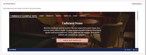
Let’s run through an example to illustrate the difference you can make once you have access to the right tools. For this, we have a content app with some basic functionality that we want our editors to have access to. We’ve done the hard work; we’ve thought about what we want our content app to do, how our editors interact with it and how we're going to make it. After some graft and custom styling we end up with the below:
<div ng-controller="moreInfoAppController as vm">
    <div ng-if="vm.loading">Loading...</div>
    <div ng-if="!vm.loading" class="mia_container">
        <h2>Live Content Preview</h2>
        <a href="{{ vm.iframeSrc }}" target="_blank" class="mia_button">View in browser</a>
        <div class="mia_content">
            <p>Don't forget to save your changes to see them in the preview window.</p>
            <iframe src="{{ vm.iframeSrc }}" class="mia_iframe"></iframe>
        </div>
        <h2>Maybe some more pieces</h2>
        <div class="mia_content">
            <p>Current user: {{ vm.userName }}</p>
            <p>Last person to edit: {{ vm.contentNode.updater.name }}</p>

            <p>Content Name: {{ vm.contentNode.variants[0].name }}</p>
            <p>Content Type: {{ vm.contentNode.contentTypeName }} [{{ vm.contentNode.contentTypeAlias }}]</p>
            <p>Number of properties: {{ vm.numberOfProperties }}</p>
        </div>
    </div>
</div>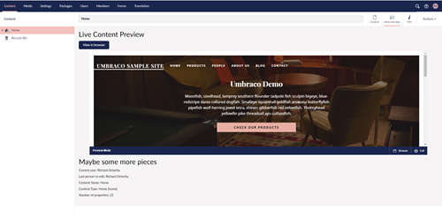
Now, this doesn’t look too bad. It responds to the user’s browser window and does what we want it to do. It just looks a bit… *meh*. So how do we get it looking like it belongs in Umbraco without inspecting, copying and pasting the stylings from Umbraco CSS? Well, we can use the Angular directives that Umbraco use to build up the rest of the CMS UI.
Simply put, Angular directives are custom tags that reference capsulated chunks of code (usually containing both visual and functional code). There are a bunch of these at our disposal ranging from simple layout markup to treeviews and other interactive components.
Let’s get styling
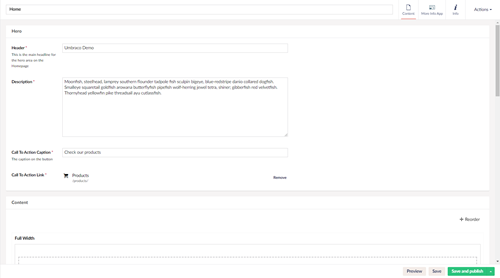
The first step is to properly look at an existing page setup and see how that is made up. For our inspiration, we can take a look at the content page. This is quite similar in the fact we have a full-width box that we want to encase our work, plus it’s split up into different sections which is what we’re looking for. Here’s what we’re using to go off:
Let’s start restyling our app from the top down - so the first thing we can improve is the loading visual. Currently, we just have the word Loading but we can swap this out for the full-screen loading gif. Here’s what we do and what we see.
Before:
<div ng-if="vm.loading">Loading...</div>After:
<umb-load-indicator ng-if="vm.loading"></umb-load-indicator>
Next we’ll tackle how the container around the actual content app looks, this is the wrapper with class mia_container. We have a couple of things we could do here, we could add tabs to split the content out but what we want is to list it all out into a single page so let’s use a box instead.
Swapping out our div for an umb-box gives us a nice margin around the box, along with a white background to give our content some definition.
Before:
<div ng-if="!vm.loading" class="mia_container">
    ...
</div>
After:
<umb-box ng-if="!vm.loading">
    ...
</umb-box>
Going down the page the next thing we have is the header Live Content Preview. Let’s bring this inline using an umb-box-header. Now the really neat thing with this directive is that you can throw things inside it which appear in the header bar too! We’ll use this to our advantage and pop that View in browser button there using another directive umb-button.
Before:
<h2>Live Content Preview</h2>
<a href="{{ vm.iframeSrc }}" target="_blank" class="mia_button">View in browser</a>
After:
<umb-box-header title="Live Content Preview">
    <umb-button action="vm.viewIframe()"
                label="View in browser"
                type="button"
                button-style="info">
    </umb-button>
</umb-box-header>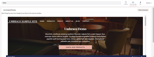
So far so good, we’ve not changed a lot and can see a massive improvement in how the app looks. Moving on we have the actual content which doesn’t need much doing - maybe just some padding around the edges. Swapping out our div for an umb-box-content sorts this out for us.
Before:
<div class="mia_content">
    <p>Don't forget to save your changes to see them in the preview window.</p>
    <iframe src="{{ vm.iframeSrc }}" class="mia_iframe"></iframe>
</div>
After:
<umb-box-content>
    <p>Don't forget to save your changes to see them in the preview window.</p>
    <iframe src="{{ vm.iframeSrc }}" class="mia_iframe"></iframe>
</umb-box-content>
Next, we have the other information at the bottom of the page. Following the same path as above, we get something that looks a bit better and we can add a description to the umb-box-header to give some more info to the editor.
Before:
<h2>Maybe some more pieces</h2>
<div class="mia_content">
	...
</div>
After:
<umb-box ng-if="!vm.loading">
    <umb-box-header title="Maybe some more pieces"
                    description="Something more meaningful could go here">
    </umb-box-header>
    <umb-box-content>
        ...
    </umb-box-content>
</umb-box>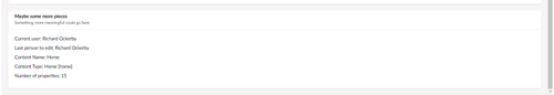
Go further with CSS
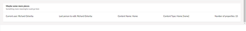
Alongside the directives there are also a lot of Umbraco CSS classes that you can use to help you out with your custom layouts. The classes themselves aren’t documented but the great thing about open source software is that you can go take a look for yourself! A good starting place for this would be the utilities folder in the Umbraco source. By way of example, we could add two classes to our second umb-box-content to display our info in a row, rather than a column:
<umb-box-content class="flex justify-between">
    <p>Current user: {{ vm.userName }}</p>
    <p>Last person to edit: {{ vm.contentNode.updater.name }}</p>

    <p>Content Name: {{ vm.contentNode.variants[0].name }}</p>
    <p>Content Type: {{ vm.contentNode.contentTypeName }} [{{ vm.contentNode.contentTypeAlias }}]</p>
    <p>Number of properties: {{ vm.numberOfProperties }}</p>
</umb-box-content>
There we have it; without changing a vast amount of code in our content app we’ve got something that has gone from *meh* to *wow, did someone at Umbraco HQ make this?* (might be pushing it a bit, but you get the idea).
Where can I find out more?
The API documentation for the Angular directives can be found in the official documentation which has a list of what’s available plus more information around other useful Umbraco Angular areas. As good as the documentation is, there are areas which are lacking and some directives, services and components which haven't been documented. Also worth noting is UmbSense; a Visual Studio plugin which brings IntelliSense for Umbraco into Visual Studio and is very useful if you’re doing a lot of this sort of dev work. You can find out more about that in the Visual Studio Marketplace.
This is just a toe in the water of what can be done but hopefully gives a great place to start on creating your styled up backoffice extensions. You can find all the source code shown in this article over on my 24d_Package repo on GitHub.
