Grid Nouveau Block List
Heads Up!
This article is several years old now, and much has happened since then, so please keep that in mind while reading it.
Back in the days, when v8 first arrived, I was reluctant to start using it, because Doc Type Grid Editor was not ported. I had grown pretty dependent on the possibility to build page content using a collection of different block / component / widget / you-name-it types. I have never been a fan of the full blown grid experience, where the editor has to choose from a heap of column sizes, and then mix and match headlines, photos, textareas etc. to make up the content. I have always liked the component based approach, where you would have ie. a banner, a story etc. component you would place in a flow of a page. On top of that, grid let me divide these components into sections, and columns when needed. And I had the ability to add some settings to each division. This could be controlling whether or not the section should gain more focus on the page, through negative space or color, or more advanced stuff like preventing anonymous users from seeing the section.
In my first v8 days, I was trying to fit Nested Content into what I needed, but often fell short on the single layer of components. I needed my sectioning ability. In addition to that, settings now had to be a part of each component document type. This was the driving factor for me to get Doc Type Grid Editor ported to v8. Grid v2 had been on the drawing board for v8, but development never really got started. Instead Project Proteus as the block based editing approach was called, was going on. The first one out there is the before mentioned Block List, but the real gist of this work, has been to unify the way different block based editors are storing their content. So in theory (practise awaits) you should be able to switch from using one block based editor to another, without losing your content. So maybe one day, we will see an even better approach, and moving to this, would be no harder than switching the data editor.
As mentioned Block List looks like a beefed up version of Nested Content. I see two main differences. One being, that you can edit your stuff in a dialog, instead of the inline view that Nested Content uses. For more complex blocks, this makes it a bit easier to work with, as a long list of page components can be quite overwhelming. The other one, the most interesting one, is the addition of a "settings document type", used for all the non-content content of your block. This is where stuff like the before mentioned ability to add more focus, or control anonymous user access should live. Using a doctype for this is genius, I have always dreaded the way you add settings fields for grid rows/columns, and you even get them strongly typed with ModelsBuilder now. If only this "settings document type" could be a thing for real nodes too.
Block List comes with a default placeholder view for each block, that behaves much like Nested Content does. You can add a javascript template for the name, so you don't have to settle with the document type name. In my previous attempts to add sections with nested content, I would create a section document type, and set its name template to something like "Section containing 4 blocks". Which is ok, but then you would also have to nest the blocks inside, hidden at first sight. Not very friendly UX if you ask me. In Block List, you can replace this view with your own - which is how I made my Block List Grid experience.
A simple example - The Twitter card
Before going full on and showing how the grid is replicated with Block List, I would like to show you a simpler example. Just to show what the custom view can be used for. I think most websites today in some way implement different meta tags, for controlling the appearance when the page is being shared in social media. One of the ways to share a link, is by using Twitter. When you share a link on Twitter, a card will be shown with a preview of the link you are sharing, this is called the Twitter card. The Twitter card is controlled by adding different meta tags, and if you were to control this in Umbraco, you would usually add a couple of textstring properties for the title and description, and a media picker for the image. You would maybe even have a composition document type for this.
But what if this composition document type, was just an element type used in a block list? With the ability to set a custom view, you could use Block List, to make your own document type backed property editor for a Twitter card. Take this document type for example:
| Name | Alias | Data Type |
|---|---|---|
| Image | image | Media Picker |
| Title | title | Textstring |
| Description | title | Textstring |
Just adding these fields to a regular document type, would be ok. The editor would then fill them, and have beautiful Twitter previews. But let's go the extra mile. I have set up a Block List data type instead, with this document type as a block. As the custom view, I add the following custom view, and some CSS for styling. Note, the CSS needs to be added through a package.manifest, and not as custom CSS for the block.
<div class="twitter-card">
<div class="twitter-card__image">
<umb-property-editor model="block.content.variants[0].tabs[0].properties[0]"></umb-property-editor>
</div>
<div class="twitter-card__title">
<input type="text" ng-model="block.data.title">
</div>
<div class="twitter-card__description">
<input type="text" ng-model="block.data.description">
</div>
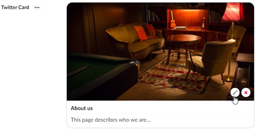
</div>Notice how this is just basic html. Not much AngularJS magic going on here. You can see in .twitter-card__title and .twitter-card__description that I have added an input field for controlling the values, and set the model to be block.data.title or block.data.description. These values are coming from the block, and are simultaneously updated when you type in them. So you can edit the Twitter view directly from the card preview. Looking at .twitter-card__image, it's a bit different. Because this is a media picker, I wanted to use Umbraco's own property editor. Umbraco comes with a component for this called umb-property-editor, if you feed this with the right model, you get the same experience as normally, when dealing with media pickers, but in the context of the Twitter card preview. I found the right model in the path block.content.variants[0].tabs[0].properties[0] because the media picker is the first property in the first group of the document type for my Twitter card.
The result of this looks like this - see how 10 lines of HTML, and some CSS makes the editor experience a lot more WYSIWYG.
It has a drawback though. In Nested Content, when you set the property to have a minimum of 1 item, a maximum of 1 item, and only one document type to choose from, you would get what is called the "Single Item Mode". In Single Item Mode the block is already added, and just works like a subpart of the node you are editing. I really like this approach for groups of properties on a document type, and this would be great for something like a Twitter card too. Block List doesn't work this way (yet, I have added an issue, requesting something like this, so hopefully one day, we'll get it). Instead, the editor needs to add the Twitter card manually.
The page builder
So with that in place, let's move on to the grid editor, or as I would call it, the page builder. As I wrote earlier, I need the ability to group blocks of content into columns and sections, so let's try to make an approach where you are shifting between sections with just one column, and sections with two columns of content.
I would then need a document type for each section type, and one for each content block.
This is how my sections would be configured:
Document Type: Full Width Section
| Name | Alias | Data Type |
|---|---|---|
| Main Column | mainColumn | Block List Content |
Document Type: Two Column Section
| Name | Alias | Data Type |
|---|---|---|
| Main Column | mainColumn | Block List Content |
| Aside Column | asideColumn | Block List Content |
I need to add a minimum of two datatypes for this; Block List Content, to be used in the sections, and Block List Sections for the document types that should have the page builder. Both are using the Block List as their editor.
Block List Content contains all the content blocks I need, this could be a banner, a story, a gallery, you name it. This is where you put the document types you make into Doc Type Grid Editors.
Block List Sections contains all the section blocks I need, these are the before mentioned Full Width Section, and the Two Column Section. Both will have the following custom view.
<div class="section-view">
    <div class="section-view__card blockelement-labelblock-editor">
        <div class="section-view__section">
            <div class="section-view__column flx-g1"
                 ng-repeat="property in block.content.variants[0].tabs[0].properties"
                 ng-style="{
                    'flex-basis': property.alias.indexOf('main') != -1
                        ? '66%'
                        : property.alias.indexOf('aside') != -1
                            ? '33%'
                            : '50%'
                }">
                <umb-property property="property">
                    <umb-property-editor model="property"></umb-property-editor>
                </umb-property>
            </div>
        </div>
    </div>
</div>
To make it look good, this CSS file is added through a package.manifest. Note - You don't want to add it as a custom stylesheet for the block, as this will prevent the block from inheriting styles from the backoffice.
Notice, how I use the umb-property-editor component to show the properties here again. This way I get the nested block lists inside the custom view, and I can make my columns line up the way I want. If you see the ng-style attribute, I set the flex-basis property on each column according to the property aliases, making the mainColumn double the width of the asideColumn, in order to emphasise that this is where the main content should go. This is a simplified way of showing the columns, expecting that each property in the section document type is a block list. You could limit the visible properties to be only BlockLists by adding ng-if="property.editor == 'Umbraco.BlockList'" to the <div> with the ng-repeat attribute and then handle other properties elsewhere.
For this setup, it's important that you set the block to "Force hide content editor" in the settings dialog, otherwise it will open a dialog for editing, once the block has been added and you don't want this, as the editing (adding blocks to the nested block lists) is done in the preview.
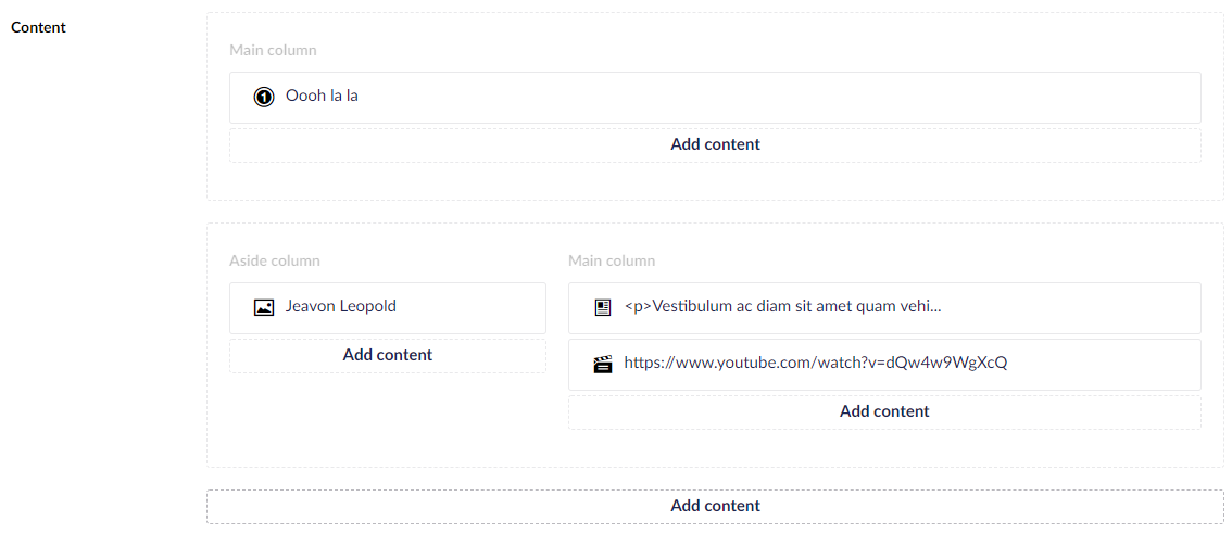
When adding Block List Sections to a page, you then end up with this view. Here I have replicated the "About us" page from the default starter kit, so you can see a Full Width Section containing a headline, and a Two Column Section containing a textarea and a video, and in the Aside column, there is an image.
Do you need custom previews of content?
Grid users, and probably especially Doc Type Grid Editor users, would probably need to get used to the lack of previews, and specifically razor previews in this. The custom views for blocks are AngularJS based, and thus can't render razor previews out of the box. I have never been a huge fan of the razor previews, as they take a little time to generate and load, and they can make the backoffice overwhelming with all the frontend design suddenly crammed into the backoffice. But I do think contextual previews is crucial for the editor experience. So in the above preview of my setup, you'll notice that I have set meaningful name templates for each block. I could also have made simple custom views for more elaboration. See this gist as an example for a more detailed, but still native-like preview.
Or you could just make razor previews work. I do have an experimental package working for this. You can get the source from Github, and you have to build it yourself. It has some concerns though - the path to your razor views are hardcoded, block lists needs a better way of sharing configurable custom views for blocks, to make this really good. The AngularJS code for the view is iffy at best, in order to get the block data values passed through to the backend API responsible for generating the previews. And it doesn't work if you have a block list in your block content document type. This will make a circular JSON dependency, and make it impossible to send the values to the backend. If you are adventurous, and can live with this, feel free to hack away :)
For my own use, I would probably work more in a direction where the preview function in Umbraco is used. In v7, this was often criticised for being slow and unreliable. But in v8 this is not the case anymore. And it's even powered by SignalR, so every time you hit save in Umbraco, the preview updates. So take a look at this example, where I work with the content, and has the preview open next to it. In addition to that, from Umbraco 8.10, the preview will scale to fit the browser viewport when you select a viewport, so you don't have to use two monitors, to make it useable anymore!

Rendering the grid content
With the "old" Grid, I had become used to using Skybrud.Umbraco.GridData to make the grid strongly typed, and more predictable to work with. With Block Lists it is strongly typed and predictable out of the box.
Block List comes with a default rendering using @Html.GetBlockListHtml(), where it looks for your blocks in a specific directory (Views/Partials/BlockList/Components). I like to have a bit more control, so I made my own rendering. I have added all the files needed in a gist, for your convenience.
In my setup, I have a partial for the section list, a partial for each section, and then a partial for each content block. These are located in Views/Partials, Views/Partials/Sections, Views/Partials/Blocks. To render my Block List Grid from a template, all I have to do is adding @Html.Partial("BlockGrid", Model.BlockListGrid).
BlockGrid looks like this:
@inherits UmbracoViewPage<BlockListModel>
@using Umbraco.Core.Models.Blocks

@if (Model != null)
{
    <div class="umb-grid">
        @foreach (var section in Model)
        {
            @Html.Partial("BlockGrid/Sections/" + section.Content.ContentType.Alias, section)
        }
    </div>
}
As you can see, BlockGrid loops through each section (block) in the Block List Grid, and renders the sections view. Each section has their own view, and thus I am not obliged to use Bootstrap, Foundation or any other limited CSS grid setup. I can do the markup just as I want, and show my Two Column Section like this:
@inherits UmbracoViewPage<BlockListItem<ContentModels.TwoColumnSection>>
@using Umbraco.Core.Models.Blocks
@using ContentModels = Umbraco.Web.PublishedModels

<div class="row">
    <div class="col-md-4">
        @foreach (var block in Model.Content.AsideColumn)
        {
            @Html.Partial("BlockGrid/Blocks/" + block.Content.ContentType.Alias, block)
        }
    </div>
    <div class="col-md-8">
        @foreach (var block in Model.Content.MainColumn)
        {
            @Html.Partial("BlockGrid/Blocks/" + block.Content.ContentType.Alias, block)
        }
    </div>
</div>
As you can see, each section partial is responsible for how the section is laid out. If I wanted to show the AsideColumn in its own row, I could do that, but here I want it to follow the view from the backoffice.
I hope this article gave you some good inspiration, in how to tailor the editing experience, and make the life of your editors better.
