Personalisation in Umbraco
Heads Up!
This article is several years old now, and much has happened since then, so please keep that in mind while reading it.
Before starting on a project, you will have probably thought about who is going to use it. For example: When writing an article for 24 days in Umbraco ;). You will likely have arrived at the conclusion that your audience will mostly consist of developers, probably like yourself. (But considering the large community you may also be – or your reader may be - a content editor, UX specialist or designer). You are probably sharing expert insights about Umbraco. (But you may also be or be addressing an Umbraco newbie, or want to write or read about more general topics).
As you can see: even relatively small projects can see great variations in audiences and topics. At our company and hopefully at yours as well, each project always starts with that question of: who is going to see and use this website?
Chances are I’ve already lost you as a reader right now. After all, there are many other articles you could be reading, and to an extent we all speak different languages. As a developer talking to non code-literate editors you may occasionally find yourself having to resort to metaphorical language to explain things: “Element X is like a brick in the foundations of a house.” As a content editor talking to developers you may sometimes find your ideas don’t translate well into the language of code.

Choosing your target audience
The problem with multiple audiences
Let’s move from this hypothetical situation to a real-life situation. This question of different audiences and different ways of speaking to them, is a similar problem to what we saw some of our agency’s clients were facing. The struggle to adjust the conversation to a specific audience or situation, like we do in real life; to tend to specific audiences’ needs in a split second, before they move on to another website.
We’ve been programmed to know that Google finishes our sentences and that Spotify chooses our music. We’ve come to expect immediate relevancy and personalisation online. So how come so many websites still look the exact same for everyone?
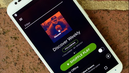
Your personal playlist
The emerging field of personalisation
The emerging field of personalisation felt like the obvious solution to tackle that problem, however we felt there wasn’t a specific solution for personalisation of Umbraco websites yet. Some general personalisation tools were available, but these were not seamlessly integrated into Umbraco. Sometimes they even come with whole CRMs, even though our clients often already had systems in place for this that they intended to keep using.
The company I work for then invested in a personalisation package created by some talented developers in Rotterdam. It already had some great functionalities, but needed a bit of tender loving care (some of you may remember this package, called Spindoctor). We updated it to Umbraco version 7 and 8, upgraded it with some new functionalities - like an integration with Google Analytics and an A/B-testing functionality - and rebranded the package as uPersonal.
Initially we just used the package for our own clients, but, as one of my developer colleagues commented: that may have been a bit “too introverted” 😉. When we heard from other Umbraco agencies that their clients were struggling with similar problems, we launched uPersonal in our.umbraco to both share it with and learn from the Umbraco community.
What it looks like in practice
Let's have a look at some examples of problems our clients struggled with:
The website of a large festival of medieval music:
Their audiences consisted of both experienced festival goers who knew exactly what medieval instruments like lutes, psalteries and shawms sounded – and of new audiences, who were mainly interested in the festival vibe, but could be scared off by the amounts of medieval musical jargon on the website.
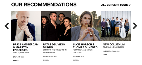
Personal tips based on your level of expertise with the festival
The website of a theatre:
Offering many genres of theatre for many different types of theatregoers, the homepage of this website features some large images of highlighted events, meant to capture the attention. But such prominent images should ideally match the user’s interest: parents looking to visit a show with their small children should see Dora the Explorer, ballet lovers should see Swan Lake etc.
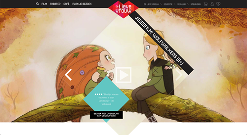
A personalized slider based on your interests
The website of a large real estate investment company:
The website serves both investors looking to invest in property and renters looking to rent that property: two very different audiences, looking for very different content on the website.
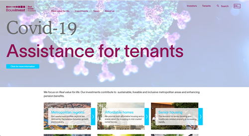
A personalised homepage based on if you are willing to invest or rent.
So where are we now and where are we going?
With these examples we've arrived at the now, questions I face in my daily reality, which is really where the fun starts (I think 😉). Because once in practice, personalisation is everything but an introverted activity. I get to brainstorm on how to execute personalisations with my optimisation, developer and client-side colleagues. Together we can see patterns, spot opportunities, determine how to shape the personalisations and grow in an iterative process.
The main questions to answer when you start personalisation are:
- Based on our data: which pages do not perform well with users? Do not convert well? How could personalisation help improve this?
- What are the user segments? Who is this specific group of users that we are personalising for? By what behaviour can we recognise and define these users? (e.g because the users have clicked on pages with specific properties (like a genre tag), or because the user has landed on the website through a specific keyword in Google)
- Once we have been able to recognise a certain type of user: what action must be executed? What content on the website needs to be rearranged to make sure relevant items are shown first, before other items? Will these users be shown specific content that is not shown to other users?
- How will we test if our assumptions were correct? What results do we aim for?
- How can we scale our personalisations? Can we use them for new parts of the website? For new groups of users?
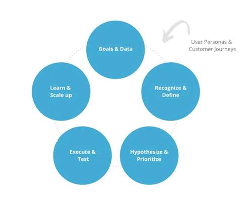
How to start with personalisation
Our New Year's resolutions
Although uPersonal already has quite a number of behaviours it can recognise + actions it can execute when such behaviour is spotted, next year will be all about learning from each other and the community to make the package even better.
Through the API, in-house developers at two of our clients’ are working to help build the personalisation options that they need to fit their companies specifically (involving even stricter privacy measures for an online investment bank and reliable location services for a region-based energy provider). Meanwhile, a number of Dutch Umbraco agencies have been using the package for a while now and we’re curious to hear their experiences. Hoping to address all of our own different audiences as well, I’ll start an extensive UX research in January to improve the UX for the content editors using the package. And of course I’d love to hear about your experiences and struggles with personalisation in Umbraco!
Let’s hope that as well as the year that we got of Covid-19, 2021 will also be the year we get rid of one-size-fits-all impersonal websites. I think together we should be able to do it.
Author info:
Ingrid van Beek is a user experience designer, who works at Basic Orange, with a passion for helping companies grow and deliver the best personalised experiences to their users. Feel free to connect on LinkedIn.