What should I set the colorspace setting to on my camera?
Heads Up!
This article is several years old now, and much has happened since then, so please keep that in mind while reading it.
What is a colour?
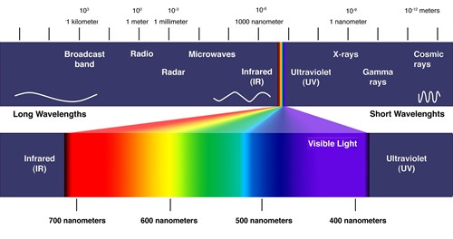
The human eye has the capability to see a lot of colours, but there is no finite or exact number of colours we can see. Generally, humans can see the range of colours between the end of infrared to the beginning of ultraviolet, and the wavelength of the electromagnetic waves that light actually is, is a descriptor we could use to identify its colour. The tricky thing is, mostly a colour is not just ONE wavelength of light (yes I know, that’s a colour too, but…), it’s a combination of wavelengths of light we see that our brain blends together and interprets as a colour.
The figure below shows the electromagnetic spectrum and specifically the visible light wavelengths.

Sadly, the wavelength descriptor does not work well in our digital workplace, where we cannot easily emit controlled wavelengths - or measure them for that matter. We need an alternative colour description for the digital world since our commonly available technology is severely limited, and cannot even begin to show or measure all the visible colours. We have to make compromises! So, we invented a simpler and more digital technology friendly colour model and descriptor.
In digital photography, we create or work with colours by using blends of only three primary colours – Red, Green and Blue (RGB) in close combination. Luckily, blends of these three primary colours does make it possible to reproduce most of the discernible colours to humans – but far from all of them. Our camera sensors actually only measures the amount of Red, Green and Blue light it sees, by using a filter (Beyer Filter) in front of each pixel. Likewise, our monitors use a Red, Green and Blue LED in each pixel to emit a colour for us to see.
To describe a pixel colour, we only describe the amount of Red, Green and Blue it consists of. This “amount” of a primary colour – fx. Red - is divided it into levels ranging from nothing to fully saturated, and the number of levels in between, is defined by the number of bits our image file format uses. Fx: There is 256 different levels of Red - from none (0) to Full (255) - in JPG, which is an 8 bit file format. Likewise, there is 65536 different levels of Red in TIFF, which is an 16 bit file format, and thus can contain billions of extra colour nuances JPG cannot (65536x65635x65526 vs. 256x256x256). Incidentally, bit depth is one in many reasons why you should always shoot RAW instead of JPG.
Get to point man, what is a Colour Space?
Since the different digital mediums we use - such as camera sensors, types of display panels and print technologies - have very different limitations in what colours they can measure/reproduce, we need some kind of common ground – a way of telling each device how the colours are supposed to look. If I have a colour described as 253,2,10 (which is level 253 for Red, 2 for Green and so on…), then we need to know what level 253 should look like according to the original source. Fx: Let’s say you’re retouching an image on an old display that has a limited colour gamut (range). The red letterbox in the image should look just right, but since it’s at the limits of the screens capabilities, the “just right” is obtained by you saturating the red colour almost all out, which translates to level 253 of 255 for red in a JPG. Now your friend sees the image on his modern wide gamut display, which can show far more colours because it can saturate the primary colours much more than your old display. The file says the red should be at level 253, which on his screen is a “Hollywood theatre blood in full blockbuster movie mode” saturated red – nowhere NEAR the Red you saw on your screen.
This is where colour spaces come in handy. A colour space defines what “Full” or fully saturated Red, Green or Blue means in old school wavelength measurements. By limiting how much saturation each primary colour can reach (effectively creating a limited colour space), and if devices adhere to this limit, we all understand how a saturated level 253 Red actually should look. This colour space information should be embedded in each image file, so we know how to interpret the levels correctly – otherwise its Hollywood vs. The Danish postal service as above.
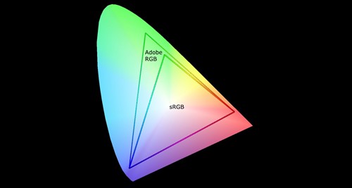
There are lots of possible limited colour spaces, but luckily most displays in the early ages of computers had more or less the same gamut. So effectively a colour space describing this gamut became a “de facto” standard for computer displays. This Color space is known as sRGB, and it is a fairly limited amount of all the colours humans can see. Offset equipment, and later on printers, could however easily print colours, that these basic displays could not show. So a different - wider - colour space was needed to be able to describe this. Adobe Software among others created colour spaces for this, but the Adobe space - known as aRGB - ended up being the most well known and broadly used standard.
The figure below visualises how the complete colour spectrum humans can see compares to the limited sRGB and wider aRGB colour spaces.

However… There is this on last thing… Every device produced may intend to adhere to one or another colours space, but electronics vary, and so does colour space needs. So, each monitor and printer should be regularly profiled by a calibration device. This profile makes the photo software aware of just how much the monitor is capable, and it can then instruct it to show exactly the right colour, within the given colour space it’s currently working. But this is an entire article on its own 😊
So, finally we have arrived at the answer to the question posed in the headline of this article:
If you shoot RAW: It doesn’t matter – RAW is not yet a developed image limited within a colour space. It still has all the possible colours that can be created from the measured amount of Red, Green and Blue light that arrived at the cameras sensor. The setting has no effect for the final image when shooting RAW. The colour space is first defined by your photo processing software, when it develops your image and exports it (fx. As a JPG).
If you shoot JPG: There is no single answer, but:
- if you tend to use the JPG’s as they are, or do post processing but only display your images on monitors and the web, you would want to set your colour space as sRGB. This limits the colour space to what most displays, devices and cheaper printing services use. Most importantly, it makes the images usable on the web as is, and will display fairly close to what it looks like on camera, and on your standard home monitor.
- If you post process a lot and have a wide gamut display, you might want to use aRGB to allow for proper interpretation of the potential colours. But in reality, you should be shooting RAW if this is your situation.
So to sum it up: Even though the expanded colour space aRGB sounds better than sRGB, you do not actually want to use it when shooting JPG. aRGB comes with a lot of problems and requirements to your devices and workflow. If you feel you have a greater colour space need, you should be shooting RAW and determine the colour space when exporting the final image - depending on what its needed for.
Merry Christmas
PS. You can find Tue's amazing photos at his website gallery