Colour grading
Heads Up!
This article is several years old now, and much has happened since then, so please keep that in mind while reading it.
This is something that is widely used in big Hollywood Blockbusters.
Basically what you do is assigning a color to your highlights and your shadows. A popular photography term is Split Toning.
But it is much more than that. You of course need to fix exposure issues. Add contrast and maybe saturation etc.
So lets try this out.
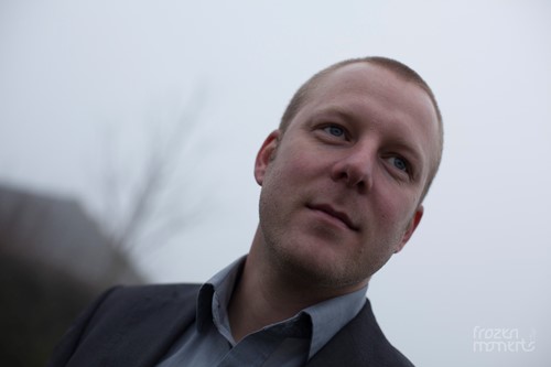
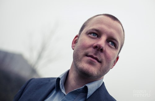
Here's my raw file
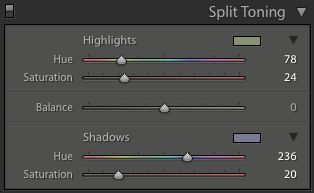
Now ... for a colour grade to work the best, you need to assign complementary colours to your highlights and shadows.
A very popular colour grade in Hollywood is the "orange and teal" colour grade.
I have tried to replicate that in Lightroom – Split Toning settings like this: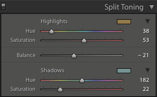
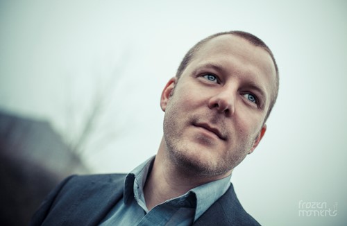
Which gives me this result
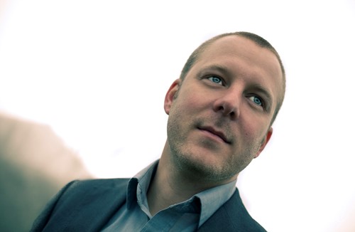
Now .. what you'll notice (and you can easily see this in those Hollywood Blockbusters) is, that hair and beards often tend to look green. But it is a look we have grown custom to, since a lot (and I really mean a lot) of movies use this look to some extend nowadays. I think the reason for this is, that it reminds us of "golden hour" ... warm and comfortable.
But let's take it further
Let's try to "play" around with our colour grade and try some other colours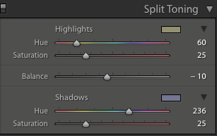
Giving me this result
I'm going to go one step further, and try to replicate some of those fashion shots I see in magazines etc.
Being the smart readers as you no doubt are, you might think these are the same settings as the previous image ... and they more or less are.
The major shift laying in the highlight colour and the balance between them.
The result is quite different, and closer to the popular "fashion" look.
Now ... this is a look i like.
And remember, all this can of course be saved as a preset.
So try this out ... it's really subtle changes you have to make, to make a totally different image.
Thank you for reading
If you'd like, you can check out more of my images at my website.
