Convert to grayscale
Heads Up!
This article is several years old now, and much has happened since then, so please keep that in mind while reading it.
We really hope you'll enjoy these 24 days with us.
A big line of #h5yrs goes out to Chriztian Steinmeier for letting us tap into his fantastic eco-system and code.
And now ... on with the show
Let's kick the show off with a tiny little hint to something you really should consider.
Sometimes, the minute you shoot a photo you just know it'll be awesome i black'n'white.
But my quick tip will be: Do not just use convert to Black'n'white / greyscale – And let me tell you why.
Let's kick this off with an example photo – do not lose your balance over the crazy wild example photo I am providing ...
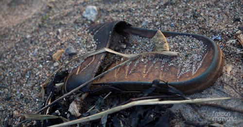
Let's say, I shot this photo (actually I did), and thought it could be a cool black'n'white photo. I actually do think it could, due to the amount of detail in the sand and the general tone of the photo.
So I load it up in either Photoshop or Lightroom (or any other photo application), and use convert to grayscale ... I get this:
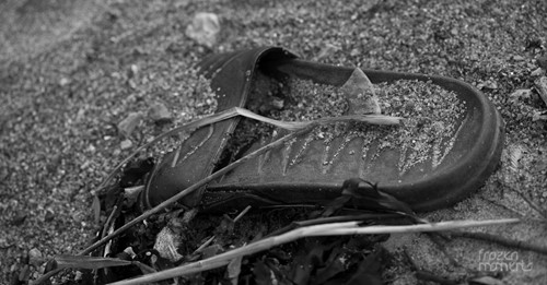
To be fair, the application has done just that ... converted it to grayscale. But that's the whole issue ... it's just greys. Nothing stands out, nothing gets attention ... and nothing is really black or white.
That's why you need to put a little extra work into your black'n'whites.
Now, this little tip will not go into details about how you do this, since there are as many ways to do this as there are photographers. And in the end it all comes down to 3 things:
- What kind of photo is it?
- What kind of look are you going for – what do you like?
- What's you're preferred photo editing application?
But I can tell you is, that you should experiment with curves, levels, HSL etc. etc. etc.
And you should do this to really make that black'n'white pop. To accentuate certain parts of the photo maybe. And in general just because you get at better end-result.
Maybe something like this
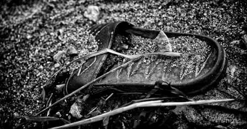
I really hope you'll notice the difference and see why that extra work pays off.
Now you see both blacks and whites, not only grays. The details in both the flip-flop but also the sand grains are much richer, and the finishing vignette keeps the eyes centered when looking at the photo.
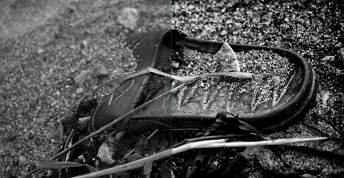
And just to compare the two, I've overlayed them here for you to see.
Thank you for reading ... look forward to tomorrow for yet another day.in/photography
