Can I have your Attention Please?
Heads Up!
This article is several years old now, and much has happened since then, so please keep that in mind while reading it.
Beware, that for explanation purpose some effects may be exaggerated!
First of all we need an image to work from. I have this rather simple shot from Kerteminde, Denmark

In the foreground we have our "hero" ... the yellow "life-saver thingy-magingy". Though this being very yellow and by that an "eye-catcher" I still feel we need to draw the attention to it even further.
Now, we can do this in a couple of ways. But a vignette is a fast and often reliable way of doing just that.
Using Lightroom's built in Post-Crop Vignetting effect with these settings:
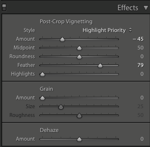
And that gives me this:

Close, but no Cigar
And yes ... we are getting there, but the thing is the Post-Crop Vignetting is only good if your main subject is in, or close to the middle of the frame ... and it rarely is – hence the rule of thirds.
So what to do then?
Enter the Radial Filter. The Radial Filter is a fantastic tool to draw attention to your subjects – and that in many ways actually. But let's just stick to vignetting for a start here.
By applying a Radial Filter that encapsulates your main subject, and then lowering the exposure you get a fully controllable vignette.

For this image my settings are:
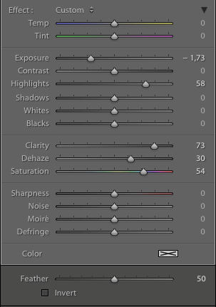
And the result is:

Now remember the "disclaimer" in the top of the text ... this may be too dark for some but it shows the purpose. You get the attention of you subject, and you are in control and not Lightroom.
But you can call for attention in other ways as well.

Look at this sun-rise shot in Fredericia, Denmark.
What if I wanted a coloured vignette to excentuate the warm colours of the sun-rise ... and then give the reflection of the sun in the water some attention.
Again ... I'd go with two Radial Filters. The first being a vignette with a red colour
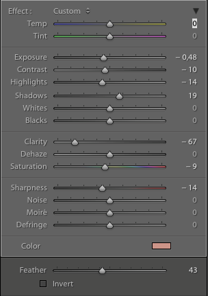
And the second one is small and long, and just covers the reflected light, as seen here

And with just basic settings like exposure and maybe clarity
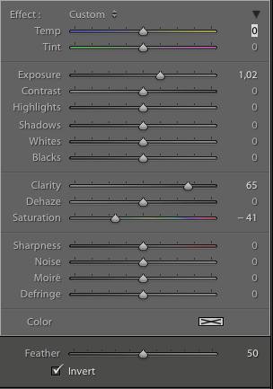
you end up with

Again .. let me stress that some effects may be over the top – but it is all in your "glory" to really see the effect.
So ... go out there, or maybe in there (Lightroom) and start getting that attention.
Merry Christmas everyone
If you'd like to see more of my images you can find them at my website.