Managing Crops of Background Images
Heads Up!
This article is several years old now, and much has happened since then, so please keep that in mind while reading it.
In the past, it has been difficult for the developer and author to guarantee that full width background images look appealing across a wide range of screen sizes as the image could potentially crop in a haphazard way. However, using the Umbraco Image Cropper, developers can give authors the ability to specify how a background image appears at each breakpoint and we can ensure that the end users receive an optimized browsing experience regardless of their screen size.

The Umbraco Setup
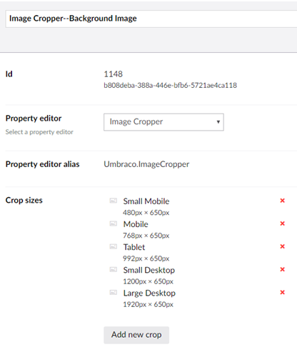
The first thing we need to do is determine what the image sizes should be at different breakpoints. The width of each image size will also serve as the breakpoint. We will set the height in our CSS. For the example image I use here, the breakpoints are 480px, 768px, 992px, 1200px, and 1920px. I have set the height to 650px at every breakpoint, but you can change this to fit whatever your design.
Now that we have the image sizes, we will create a new Image Cropper data type, using these values as our different Crop Sizes.
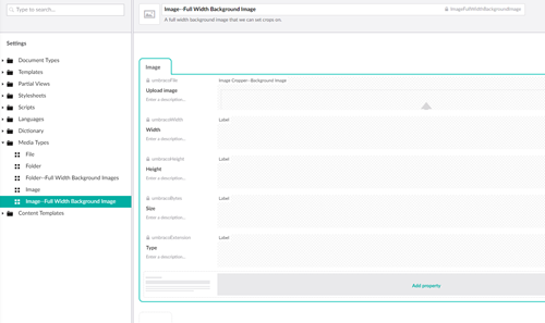
We will use the new Image Cropper data type, to create a new Media Type.
Next, we must allow the media library to use our new media type. You can do this by allowing this type on the existing media folder. However, this will require authors to choose the correct media type when they add an image. If authors have a choice, they may choose the wrong type. Let’s make the decision for them.
We do this by creating a new media type that only allows the new full width background image media type within it. Once we created that folder type, we will make an instance of this in the media library and create new a Media Picker Data Type that has the start node set to this folder. Then when we configure a property to use this data type, the data type guarantees that the media set on the document is a full width background images media type.
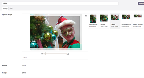
Now an author can create a full width background image media item, and with it, specify how they want the image to appear at different breakpoints. Finally, we need to render the HTML.
The Code
Normally, to render background images, we add a style tag to the HTML element. However, this doesn’t work if we want to use media queries to change the image at different breakpoints. For this reason, we will write inline CSS to specify our image crops. Since the images are full width and we know the crops are based on the breakpoints, we can loop though the different crops and generate the CSS that will be inline.
I use an HTML helper that takes an image object and CSS selector, parses the image crops, and writes the appropriate media queries for the different background images.
@using Umbraco.Web;
@using Umbraco.Core.Models;

@helper WriteBackgroundImageCrops(IPublishedContent image, string elementSelector)
{
  var htmlHelper = ((System.Web.Mvc.WebViewPage)WebPageContext.Current.Page).Html; ;
  var imageCrops = image.GetPropertyValue<Umbraco.Web.Models.ImageCropDataSet>("umbracoFile");

  @*//First we loop though the crops we have and figure out what image should be displayed at what breakpoint *@
  IDictionary<int, string> cropDetails;
  if (imageCrops != null && imageCrops.Crops != null && imageCrops.Crops.Any())
  {
     cropDetails = imageCrops.Crops.OrderBy(c => c.Width).ToDictionary(c => c.Width, c => image.GetCropUrl(c.Alias));
  }
  else
  {
    cropDetails = new Dictionary<int,string>() { { 0, image.Url }};
  }

  @*//Now loop though our crop details and build our media queries *@
  var minWidth = 0;
  <style>
    @foreach (var crop in cropDetails)
    {
      if(minWidth != 0) {<text>@@media (min-width: @(minWidth)px) {</text>}
      <text>@elementSelector {background-image:url(@htmlHelper.Raw(crop.Value));}</text>
      if(minWidth != 0) {<text>}</text>}
      minWidth = crop.Key;
    }
  </style>
}
Then in my template view, instead writing my background image in a style attribute, I use my Helper method to write the inline media queries.
@{
  var elementId = "image-" + Guid.NewGuid();// Unique ID for this div
}
@*// Pass in the image and the selector to our helper to write the CSS *@
@ImageHtmlHelper.WriteBackgroundImageCrops(Model.Content.HeroBackgroundImage, "#" +elementId)

@*// The element we want our full width background image on *@
<section id="@elementId" class="background-image-marquee">
  ...
</section>
The Result
Finally, when the site renders, our full width background image will show the different crops at the different breakpoints.

Using the Image Cropper Data Type in Umbraco, we have empowered authors to choose the best image crops at each breakpoint. In the example here, we used full-width background images. However, developers can apply the same principles to any image, ensuring that authors can deliver a tailored browsing experience to their users.