Modular Development
Heads Up!
This article is several years old now, and much has happened since then, so please keep that in mind while reading it.
We'll be using Document Type Compositions to handle the modularised authoring components. While on the integration side we'll be using Ditto, which uses DittoView (available in versions 0.10.0 and higher) to make content transformation portable enough to be included in partial views without any Controller wire up.
Before we get started
If you're unfamiliar with the Ditto, I recommended looking at Lars-Erik's blog article comparing the core Umbraco Models Builder and Ditto.
And for those of you unfamiliar with the concept, Compositions are a way of compontentising document & media type properties. This isn't anything new, we've had Compositions since Umbraco 7.2 and people have covered this over the last couple of years. There are resources about Compositions on Umbraco.tv and Blake Clerke has written a great article on them earlier this year.
How? Why?
For this demo, I've taken the existing Umbraco v7.5.4 Fanoe starter kit as a basis of showing how to integrate not only modular components but also DittoView which in itself can work standalone in an existing web application. The idea of going to the effort of modularising authoring components might seem counter intuitive at first because the Fanoe grid already supports, through the shear flexibility of the grid system many different types of authoring component. Personally I consider this worthwhile for a couple of reasons:
- Adding a component to a page which doesn't support authoring the Umbraco Grid (eg. a greatly simplified page)
- Consistent authoring & integration of a component from within and outside of the Umbraco Grid
So in our Fanoe starter kit, I'll be integrating a flexible promo boxes component. This is a flexible 2-4 item authoring component which could sit on a page or within the Umbraco Grid. We'll be using the Nested Content Umbraco package and a Document Type Composition to make up the fieldset for our individual promo boxes and then wrapping that Nested Content data type in a Document Type Composition to make it portable and easy to add to other pages. So meta!
To ensure the overarching Promo Boxes composition isn't a one trick pony I'll also be adding in an optional Title & Content authoring properties.
Here's an example of what we're aiming for, this is without the optional title.
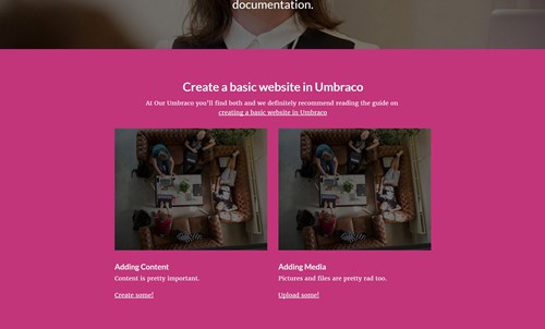
Enough talk! Time for action!!
There's a fair bit to cover so I'll just be covering some of the key areas here but be sure to checkout the demo will be available on Github for the full experience.
Typically, I'd use uSync to ensure the backoffice is up to date but because that's outside of the focus of this tutorial I've included the media files and a local SQL Compact file to get you up and running.
Creating the compositions
As previously discussed we'll be using Document Type Compositions to create our authoring component. I've created a Compositions folder, which is entirely unnecessary but I do like a tidy backoffice (Folders FTW!). We'll also be creating both these compositions as a new Document Type without a template. This is because, they are partial functionality and will not be used by itself as a standalone page.
First of all the Promo Box item composition, without this we won't have the structured required to create Nested Content items for the Promo Boxes.
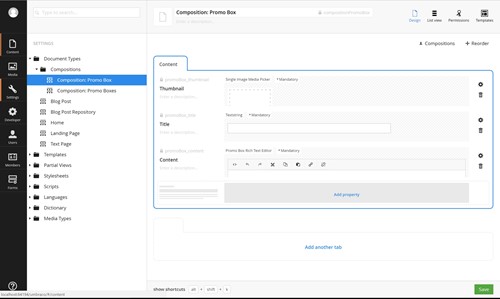
Nothing too fancy here, one thing to note though is that Nested Content does not currently work with the Upload data type, so we'll be using Media Picker instead.
Now we have our Promo Box, we can add it to the Document Type Composition for Promo Boxes.
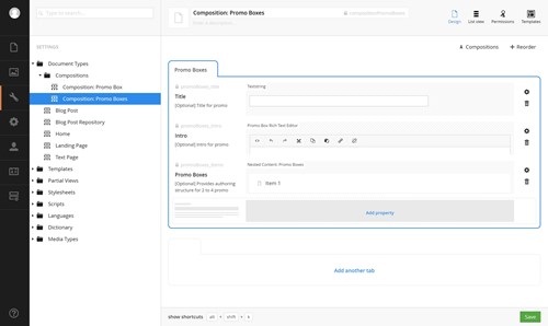
This contains the optional Title & Intro as well as the Nested Content data type. Here's a quick look at the Nested Content data type setup. For those of you who are used to packages like Archetype it function in a similar way, you're creating document types as your fieldset definitions. For our application that would be the "Composition: Promo Box". We're allowing authors to create 2 to 4 of these items and our markup will handle whatever they add upon integration.
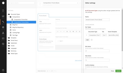
I'd like to take this moment to say I love the in-editor editor for editing editors. Very nice!
Another thing you may have noticed is. I've created the document types with the prefix "Composition: " this is simply to easily identify it as a composition and not something that should be used as a page type. Also all the alias properties are prefixed with "promoBox_" or "promoBoxes_", this is so they can be identified easily as belonging to their respective components. Having an alias like "title" or "intro" will no doubt get confusing to code around.
Utilising Compositions
So now we have our compositions we need to add them into our pages. This can be achieved by adding "Composition: Promo Boxes" into a page document type's compositions. This will automatically allow an author to add a set of Promo Boxes to an existing page. Let's add this to the Blog Post Repository page as this is a page which doesn't support the Fanoe Grid.
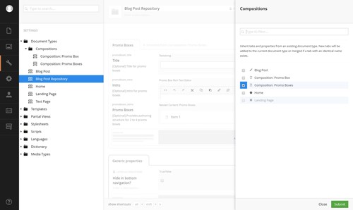
Now we've added it, let's add some content!
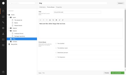
That's a pretty decent blog roll. As you can see we've added 4 items and below shows off Nested Content maintaining our Promo Box properties from the composition. Nifty!
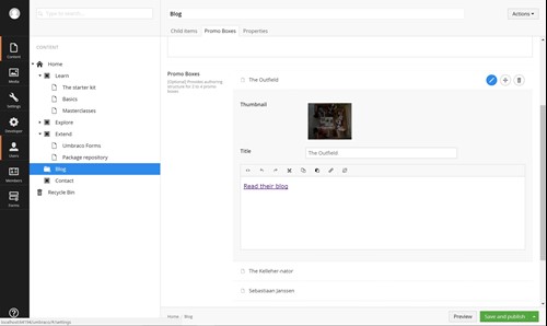
Wiring it up
Now that we have our authored content. The next step is wiring it all up, so this effort isn't wasted. As previously mentioned, I'm using DittoView here, which basically takes the current Umbraco Page request as transforms it into a provided POCO. The beauty of DittoView is it works in isolation of any controller meaning this approach can be added into an existing project so long as that project can support Ditto v0.10.0 or higher and the current request has an IPublishedContent to work with.
So let's look at that PromoBoxes component DittoView.
@using Our.Umbraco.ModularDevelopment.ViewModels;
@inherits Our.Umbraco.Ditto.DittoView<PromoBoxesViewModel>
@if (Model.View != null && Model.View.HasItems())
{
    <div class="grid-section">
        <div class="light">
            <div class="container">
                <div class="row clearfix">
                    <div class="col-md-12 column">
                        @Html.DisplayFor(model => model.View)
                    </div>
                </div>
            </div>
        </div>
    </div>
}
The PromoBoxes Partial View using DittoView
A few things here:
The first line is what initiates the Ditto View doing the transformation which then is assigned to Model.View property, this a strongly typed class.
Secondly, the actual markup is in a DisplayTemplate, this is so the wire up is done in the view but is then passed on to another view to handle the markup. I've done this for working with integration with the Umbraco Grid later on. I also really like working with DisplayFor as if you're dealing with potentially polymorphic objects it will handle which the rendering based on the class type.
The markup here is based on the grid markup as these Promo Boxes don't have any containing elements.
So let's look at that Promo Boxes view model class.
using Our.Umbraco.Ditto;
using System.Collections.Generic;
using System.Linq;
using System.Web;

namespace Our.Umbraco.ModularDevelopment.ViewModels
{
    [UmbracoProperties(Prefix = "promoBoxes_")]
    public class PromoBoxesViewModel
    {
        [UmbracoProperty]
        public string Title { get; set; }

        [UmbracoProperty]
        public IHtmlString Intro { get; set; }

        [UmbracoProperty]
        public IEnumerable<PromoBoxViewModel> Items { get; set; }

        [DittoIgnore]
        public int ColumnWidth
        {
            get
            {
                var itemCount = Items.Count();

                switch (itemCount)
                {
                    case 3:
                        return 4;
                    case 4:
                        return 3;
                    default:
                        return 6;
                }
            }
        }
    }
}
PromoBoxesViewModel POCO with Ditto Processors
This is a fairly straightforward POCO which allows Ditto to do its thing. Title & Intro are fairly simple. They're just Umbraco properties which require no further conversion aside from adding the "promoBoxes_" prefix to them so that Ditto knows where to look.
The Items however are handled in a separate class. Nested Content returns an IEnumerable<IPublishedContent> which when used in conjunction with an IEnumerable<Class> will be automagically tranformed into that Class type. Pretty sweet, huh? I thought so too.
Finally the ColumnWidth property is something Ditto will ignore hence the DittoIgnore attribute. This is here to make our column widths smart with the Bootstrap markup used. I'd be interested to hear if people feel this might be an anti-pattern or not.
Moving on to the individual Promo Box view models now.
using Our.Umbraco.Ditto;
using Our.Umbraco.ModularDevelopment.ComponentModel;
using System.Web;

namespace Our.Umbraco.ModularDevelopment.ViewModels
{
    [UmbracoProperties(Prefix = "promoBox_")]
    public class PromoBoxViewModel
    {
        [UmbracoProperty]
        [UmbracoPicker]
        [EnumerableConverter]
        [ContentValueUmbracoUrl]
        public string Thumbnail { get; set; }

        [UmbracoProperty]
        public string Title { get; set; }

        [UmbracoProperty]
        public IHtmlString Content { get; set; }
    }
}
PromoBoxViewModel POCO with Ditto Processors
They're again a straightforward POCO. Title & Intro are simply Umbraco properties. Thumbnail however, because we're using a Media Picker rather than an Upload requires a few chained processors to get working. In production code I'd turn these into a Multi Processor so they're reusable. Hopefully this chaining is fairly straightforward but to explain it, it's doing the following:
- Finding a UmbracoProperty called "promoBox_thumbnail"
- Converting the comma separated value of IDs returned to that into an IEnumerable<IPublishedContent>
- EnumerableConverter then converts this into a single IPublishedContent
- ContentValueUmbracoUrl then takes this IPublishedContent value and gets the Url property from it which is then assigned to our Thumbnail property
Going back to the Display Template I talked about earlier, it looks a bit like this.
@using Our.Umbraco.ModularDevelopment.ViewModels
@model PromoBoxesViewModel
@if (Model.HasItems())
{
    if (Model.HasTitle())
    {
        <div class="row">
            <h2>@Model.Title</h2>
            @Model.Intro
        </div>
    }
    <div class="row">
        @foreach (var item in Model.Items)
        {
            <div class="col-sm-6 col-md-@Model.ColumnWidth">
                <div class="thumbnail">
                    <img alt="@item.Title" src="@item.Thumbnail" style="height: auto; width: 100%; display: block;">
                    <div class="caption">
                        <h3>@item.Title</h3>
                        @item.Content
                    </div>
                </div>
            </div>
        }
    </div>
}
PromoBoxes DisplayTemplate view
Finally, after all this work I'll add it to the Blog Post Repository view. Fortunately this is as simple as including a Partial View.
@inherits Umbraco.Web.Mvc.UmbracoTemplatePage
@{
    Layout = "Master.cshtml";
}

<div role="content">

	<section class="light blogarchive equalizer">
		<div class="container">

			<div class="row">
				@foreach(var post in CurrentPage.Children)
				{
					<div class="col-sm-6">
						<div class="content equal">
							<a href="@post.Url">
								<div class="date">@post.CreateDate.ToLongDateString()</div>
								<h2>@post.Name</h2>
								<p>@Umbraco.Truncate(post.Introduction, 240, true)</p>
							</a>
						</div>
					</div>
				}
			</div>
		</div>
	</section>

</div>
@Html.Partial("PromoBoxes")
Blog Overview View with added PromoBoxes Partial View
Notice that this view is almost entirely unchanged and requires that the BlogOverview view requires no knowledge of Ditto at all to work. Here is the finished result. Looking sharp!
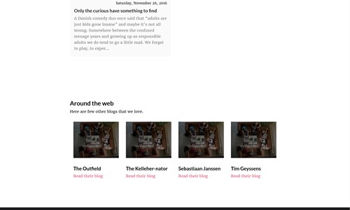
Now that we've done all the heavy lifting, adding in the Promo Boxes authoring component is as easy as adding the composition and the Partial View where ever it is needed. In the demo code I've also added it to the Text Page document type to illustrate this point.
Bonus Points: Adding Promo Boxes to Umbraco Grid
This may seem like overkill as it is possible to already create a banner already, but the intention is to reuse markup and authoring. One of the advantages I mentioned before was a consistent authoring experience inside and outside of the Umbraco Grid. So let's add this Promo Boxes component to the grid.
This is all made possible by using Doc Type Grid Editor, which plays nicely with Ditto View as it sends an IPublishedContent to its grid view. Again, this can be done without investing wholesale into Ditto as it works along side your existing grid editors and web application.
Configuring the composition to work with Grid Editors
Adding in document types to the grid editor is fairly simple with Doc Type Grid Editor, adding in the below configuration with this page installed will add a new editor to the list of available editors in the Grid. The new "Promo Boxes" editor still needs to be added in as the Fanoe setup rightly doesn't use the "all available editors" option for its configuration.
[
    {
        "name": "Promo Boxes",
        "alias": "promoBoxes",
        "view": "/App_Plugins/DocTypeGridEditor/Views/doctypegrideditor.html",
        "render": "/App_Plugins/DocTypeGridEditor/Render/DocTypeGridEditor.cshtml",
        "icon": "icon-box",
        "config": {
            "allowedDocTypes": [ "compositionPromoBoxes" ],
            "nameTemplate": "",
            "enablePreview": true,
            "viewPath": "/Views/Partials/Grid/Editors/DocTypeGridEditor/",
            "previewViewPath": "/Views/Partials/Grid/Editors/DocTypeGridEditor/Previews/",
            "previewCssFilePath": "",
            "previewJsFilePath": ""
        }
    }
]
A partial snippet of Grid.Editors.Config.js
So now that we've made this available. Let's add it to the Home Page. This requires modifying the Grid FrontPage data type. In the screengrab below shows the configuration for the "Full width content" row, which now supports the "Promo Boxes". Which to our authors looks like this.
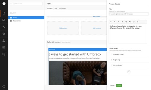
Because we used a DisplayTemplate the view for this is really simple. Literally two lines of code.
@inherits Our.Umbraco.Ditto.DittoView<Our.Umbraco.ModularDevelopment.ViewModels.PromoBoxesViewModel>
@Html.DisplayFor(model => model.View)
The view for PromoBoxes doc type grid editor
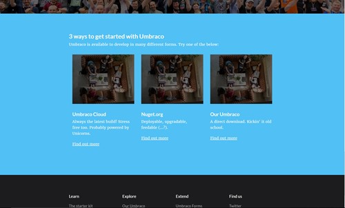
And the results are exactly as you'd expect. This time we have 3 items rather than 4 to show off the flexibility of this component.
Conclusion
Not bad, eh? I hope this has been useful. Compositions are one of my favourite bits of functionality in the core. So many aspects of web development are geared towards components it's nice to work on self contained chucks of functionality. DittoView is also a great way to make functionality self contained. A little goes a long way.
We've covered quite a bit today, but I'd be keen to write a follow up in the new year for how we could take this demo a step further by making the "Composition: Promo Box" item itself a grid editor meaning it will work with the standard grid configuration rather than just be a fieldset for the "Composition: Promo Boxes".