Custom List View Layouts
Heads Up!
This article is several years old now, and much has happened since then, so please keep that in mind while reading it.
With Umbraco 7.4 a new feature was introduced - the custom list view layout. It’s a feature that haven’t got much attention and it might be the lack of documentation, guilty as charged. It is a feature which, with very little effort, can be really powerful. Custom list view layouts gives us all the features of a list view - copy, delete, search, pagination etc. but with the possibility to make a custom layout that is 100% tailored the data we want to present.
Umbraco already ships with four list view layouts today and I am pretty sure you already know about them. Two for the content section and two for the media section.
Content list view
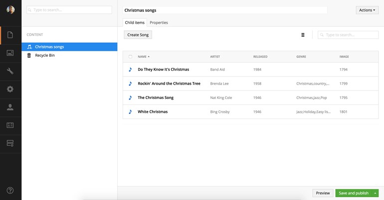
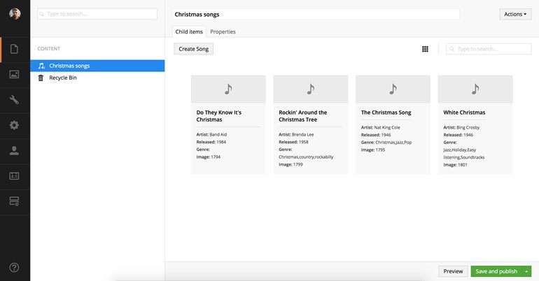
For the content section we have the well known “table”-layout and in version 7.4 a new “card”-layout was introduced.
Media list view
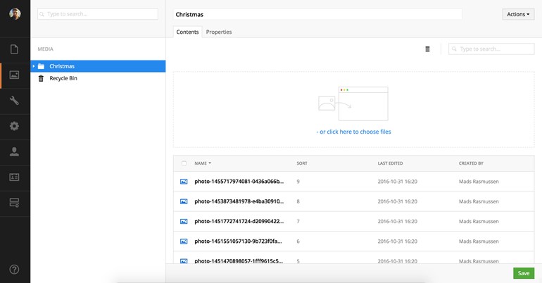
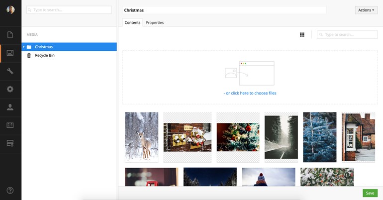
The media section comes with a media grid, which is rewritten and redesigned in Umbraco 7.4, and a “table”-layout, similar to the content section, for fast and easy image data comparison.
One of the cool things about those four layouts is they are all built on the same foundation as we are going to use when we make our own list view layout. This gives us idea of how flexible they are and how much we are able to customise them. This also means that if you don’t like how the default layouts looks/works, it is easy to swap them out with your own.
Today we are going to set up a custom list view layout for a custom list view. In this small example we will bring the christmas spirit into Umbraco with a collection of famous christmas songs.
Setting up the document types
First we are going to set up two super basic document types. One to collect information about a christmas song and one as a repository for the list view.
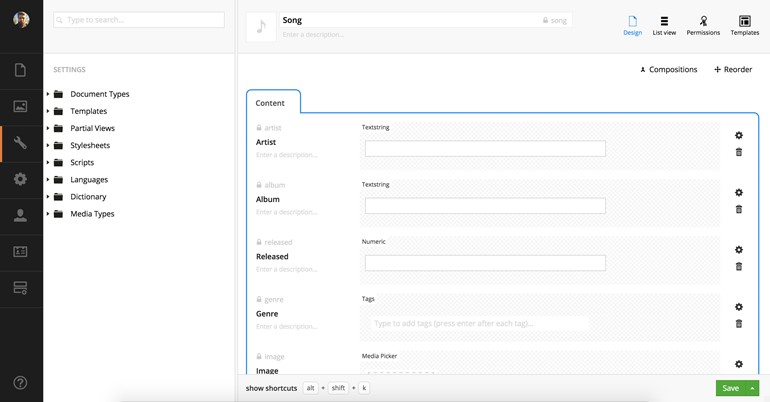
Our first document type is called “Song” and has properties for artist, album, release year, genre and an image. It looks like this:
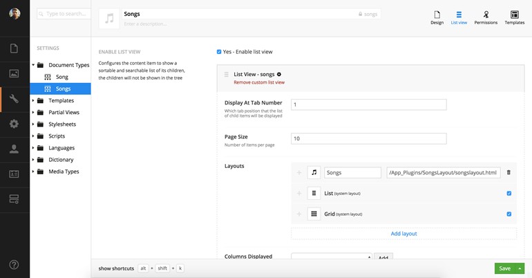
The second document type is called “Songs”. For this document type we set up a custom list view.
Adding the custom layout
To add our custom layout we find the layouts section in the list view configuration. We are able to pick an icon, give the layout a name and enter the path to the html file we will add in a moment. If we want our new list view as the default view for this document type, we can reorder the list view layouts so our new layout is the first in the list and if we didn’t want the other two layouts available for the editor, we could easily uncheck these so they will not show up in the list view.

Configuring the correct data to show in the view
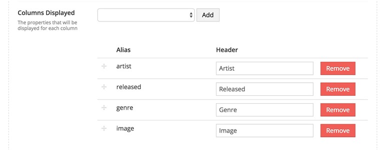
Another important thing for our custom list view is the data we want to present. In the list view configuration we are able to show the data we have entered for each song. We do this by adding the fields from our “song” document type. In my example I want to show the artist, release year, genre and the image. This is how the configuration looks like when it’s done.
Show me some code
Now the foundation is in place and we are ready to start to add some code. For this layout we need a package manifest to load in our javascript and css, a html view with a controller and some css to make it all look pretty. If you are new to how to extend the back office please take a look at the documentation for adding a custom property editor. We follow the same principles in this example.
The package manifest
A super basic manifest which loads in the javascript and css file.
{
    javascript: [
        '~/App_Plugins/SongsLayout/songslayout.controller.js'
    ],
    css: [
        '~/App_Plugins/SongsLayout/songslayout.css'
    ]
}
The HTML
The view is also pretty straight forward. First we bind the controller to the view and then loops through all the available items in the list. I have added click handler for selecting the item and a click handler for opening the item details.
<div ng-controller="My.ListView.Layout.SongsLayoutController as vm"
     ng-if="items"
     class="my-songs-layout__cards">

   <div
      class="my-songs-layout__card"
      ng-repeat="item in items"
      ng-class="{'-selected':item.selected}"
      ng-click="vm.selectItem(item, $event, $index)"
      ng-style="{'background-image': 'url(' + item.imageThumbnail + ')'}">

      <div class="my-songs-layout__overlay">
        <div class="my-songs-layout__released">{{ item.released }}</div>
        <div class="my-songs-layout__artist">{{ item.artist }}</div>
        <div class="my-songs-layout__name">{{ item.name }}</div>
        <div class="my-songs-layout__genre">{{ item.genre }}</div>
      </div>

      <div class="my-songs-layout__button" ng-click="vm.clickItem(item)">View song</div>

   </div>

</div>
The controller
I have added inline comments for the controller. I think that is the easiest way to see what happens. If you want to read more about the list view data and the listViewHelper functions you can see it all in the back office UI Api documentation.
(function () {
    "use strict";

    function SongsLayoutController($scope, listViewHelper, $location, mediaResource, mediaHelper) {

        var vm = this;

        vm.selectItem = selectItem;
        vm.clickItem = clickItem;

        // Init the controller
        function activate() {

            // Load background image for each item
            angular.forEach($scope.items, function (item) {
                getBackgroundImage(item);
            });

        }

        // Load background image
        function getBackgroundImage(item) {
            mediaResource.getById(item.image)
                .then(function (media) {
                    // find the image thumbnail
                    item.imageThumbnail = mediaHelper.resolveFile(media, true);
                });
        }

        // Item select handler
        function selectItem(selectedItem, $event, index) {

            // use the list view helper to select the item
            listViewHelper.selectHandler(selectedItem, index, $scope.items, $scope.selection, $event);
            $event.stopPropagation();

        }

        // Item click handler
        function clickItem(item) {

            // change path to edit item
            $location.path($scope.entityType + '/' + $scope.entityType + '/edit/' + item.id);

        }

        activate();

    }

    angular.module("umbraco").controller("My.ListView.Layout.SongsLayoutController", SongsLayoutController);

})();
The CSS
And some css. I do not have that much to say about this :)
.my-songs-layout__cards {
    display: flex;
    flex-wrap: wrap;
}

.my-songs-layout__card {
    background-color: #ffffff;
    background-size: cover;
    background-position: center center;
    box-shadow: 0 3px 6px rgba(0, 0, 0, 0.16), 0 3px 6px rgba(0, 0, 0, 0.23);
    height: 200px;
    border: 5px solid transparent;
    display: flex;
    flex-direction: column;
    color: #ffffff;
    margin: 10px;
    user-select: none;
    position: relative
}

.my-songs-layout__card.-selected {
    border-color: #2e8aea;
}

.my-songs-layout__card:hover {
    cursor: pointer;
}

.my-songs-layout__overlay {
    background: rgba(0, 0, 0, 0.3);
    padding: 20px;
}

.my-songs-layout__released {
    margin-bottom: 5px;
    opacity: 0.5;
}

.my-songs-layout__genre {
    font-size: 11px;
}

.my-songs-layout__name {
    font-size: 24px;
    font-weight: bold;
    line-height: 1.3em;
}

.my-songs-layout__button {
    background: #2e8aea;
    color: #ffffff;
    font-size: 12px;
    text-transform: uppercase;
    display: flex;
    padding: 5px 15px;
    border: none;
    position: absolute;
    bottom: 10px;
    right: 10px;
    align-self: flex-start;
}

.my-songs-layout__button:hover {
    background: #177ce8;
}
The final result
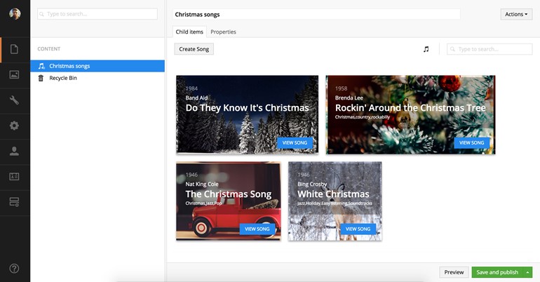
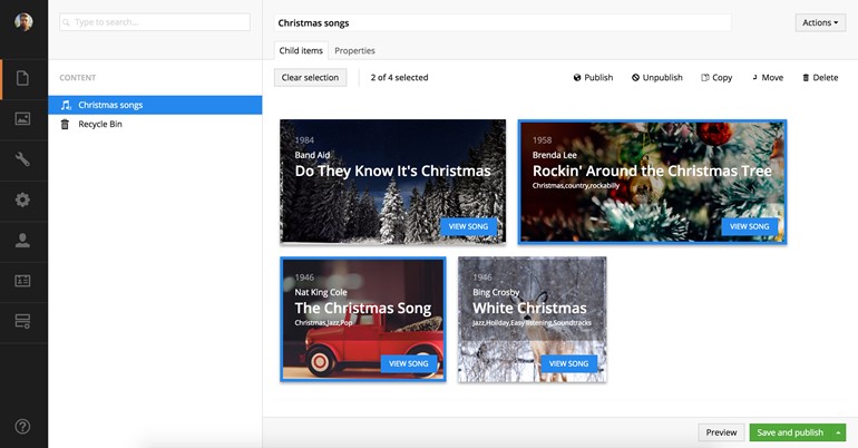
So there you have it, and easy way to make the editing experience a bit better by giving your list view a custom layout. The new layout makes it easy to navigate the christmas songs and makes each song easy recognizable. I hope this simple example gives you some ideas how you might be able to tweak a list view in your own Umbraco setup.
Merry christmas and happy hacking.