The power of (Christmas) card modes
Heads Up!
This article is several years old now, and much has happened since then, so please keep that in mind while reading it.
I get the distinct honour of closing this year's calendar, so following tradition I'll share a little something with you that lifts my spirits these days. It's an approach that my team and I have been using lately to meet a high need for flexibility in layouts from designers and editors alike - while keeping the backend clean and not sacrificing visual testing and documentation.
It's not strictly tied to Umbraco, but rather something that impacts how we structure and communicate about the frontend.
This post is not highly technical, so if you're just mildly interested in CSS and know the basics of pre-processors, I hope you will find this useful too.
What's the matter?
I guess I can best open this with an example.
Say we need to display some different content bits, or cards, in a content panel that appears across a site. The editors can choose a varying number of cards to be displayed in the panel. The chosen cards can represent different content types, for instance an editorial article, a product, an image gallery or an event, so each type needs to be presented with a set of information that fits the content type.
On our side, we want to make sure that the layout of the panel adapts in a controlled way to the varying number of cards, so we can keep a visual hierarchy between the chosen cards, no matter if there are three or 20.
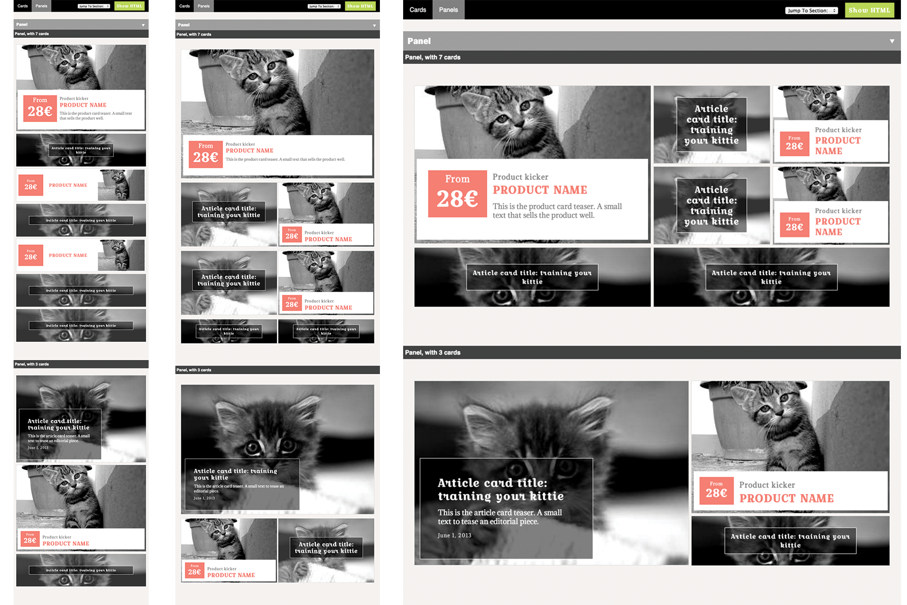
Consider the following fairly simple setup with seven card slots.

On small screens we want to stack the cards. We want the first card to have a lot of visual weight, but for all the following we want to save space. When there is more screen space, we can increase the visual weight of the cards a bit.
When there are only three cards, we can afford a little more space, but we want to still keep some hierarchy. The slots in the panel could then line up something like this:

So far, so good. But notice how some of the cards would have to take on a slightly different layout across the breakpoints.
And now remember that each of these positions can be taken up by completely different content types, each with their specific styling needs. A product card needs a price, an event needs to show date, time and location, an article card might need a publication date, etc.
As the card types and the card slot counts grow, applying the styling for each type directly on the panel element can quickly become a testing and maintenance nightmare.
Just to run perceptual difference tests, we would have to not only set up the different layouts based on amount of cards, but also examples of each content type in each slot across the different panel layouts.
Ugh. Not exactly a dream task.
So what we need is a way to show all the different presentation modes of each content type in an isolated manor for our tests. And then to apply those presentation modes to the cards based on where they sit in any given panel layout - without tightly coupling the styling to that panel (so we can reuse the cards in panels with different layouts).
We would also prefer to keep the markup for each card type the same no matter the placement and panel. That simplifies the template setup - and by keeping all knowledge of the panel layout and each card presentation entirely in CSS we are free to switch betweens the modes depending on the flow of the panel layout across breakpoints.
Who you gonna call? Card modes
For overview, these are terms I'm using:
panels - are full width containers for a set of cards.
card slots - are the direct container of individual cards in e.g. a panel. This is where we know the properties of the presentation, so card slots provide the needed layout context for assigning presentation modes to the card types we can expect to see in the card slot.
cards - are the individual self-contained chunks of content to be displayed. The raw card has only the most basic styling and has no knowledge of presentational context.
card types - are variations of cards with the specific markup needed to best represent a content type (product teaser card, article teaser card, event card, etc.). If you can describe a unique set of properties or content to be displayed, it's a card type.
card modes - are additional stylings of the card types to meet whatever restrictions apply to a specific slot in a panel, e.g. "has to be fixed ratio, 3x2", "is suited for big areas", "is suited for small areas". Each card type is styled in multiple modes as needed. The modes are kept entirely in SCSS (or what else you prefer) as mixins, with a uniform naming structure like MODE_product-card-A, MODE_product-card-B, MODE_article-card-A etc. To ensure that the card mode styles are consistent and testable, we keep the card modes mostly breakpoint agnostic and let the panels handle any adjustments to the surrounding layout.
Sometimes we may also need to vary the colours of a card in order to match a specific type of panel. We do that by splitting out the colours, in the same manner as the layout, in
card themes - a presentational set holding all colour styling. THEME_card-type-red, THEME_card-type-black, THEME_card-type-yellow which can then also be applied to panels or card slots.
But let's stick to the layout today.
Mmm... grouping things
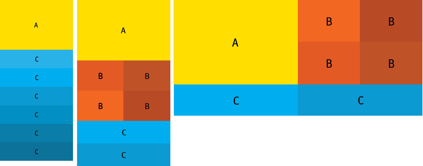
We start by identifying the needed modes. To keep it simple, in our little example from earlier, they can be grouped like so:

Mode A has the most weight and the most room. In this mode we can show all the information available on a given card type. We give Mode A a fixed aspect ratio to make it easy to combine cards across different grid configurations.
Mode B is also fixed ratio, but has less weight and typically less room, so we want to display a little less information on cards in this mode.
Mode C shows the least possible information needed to communicate the meaning of a card. For grid flexibility in this example we also keep C at fixed ratio.
Great, now we have a little more to go by.
Quick! To the style guide!
In fact, we have enough information to set up these modes in our style guide for card types in question.
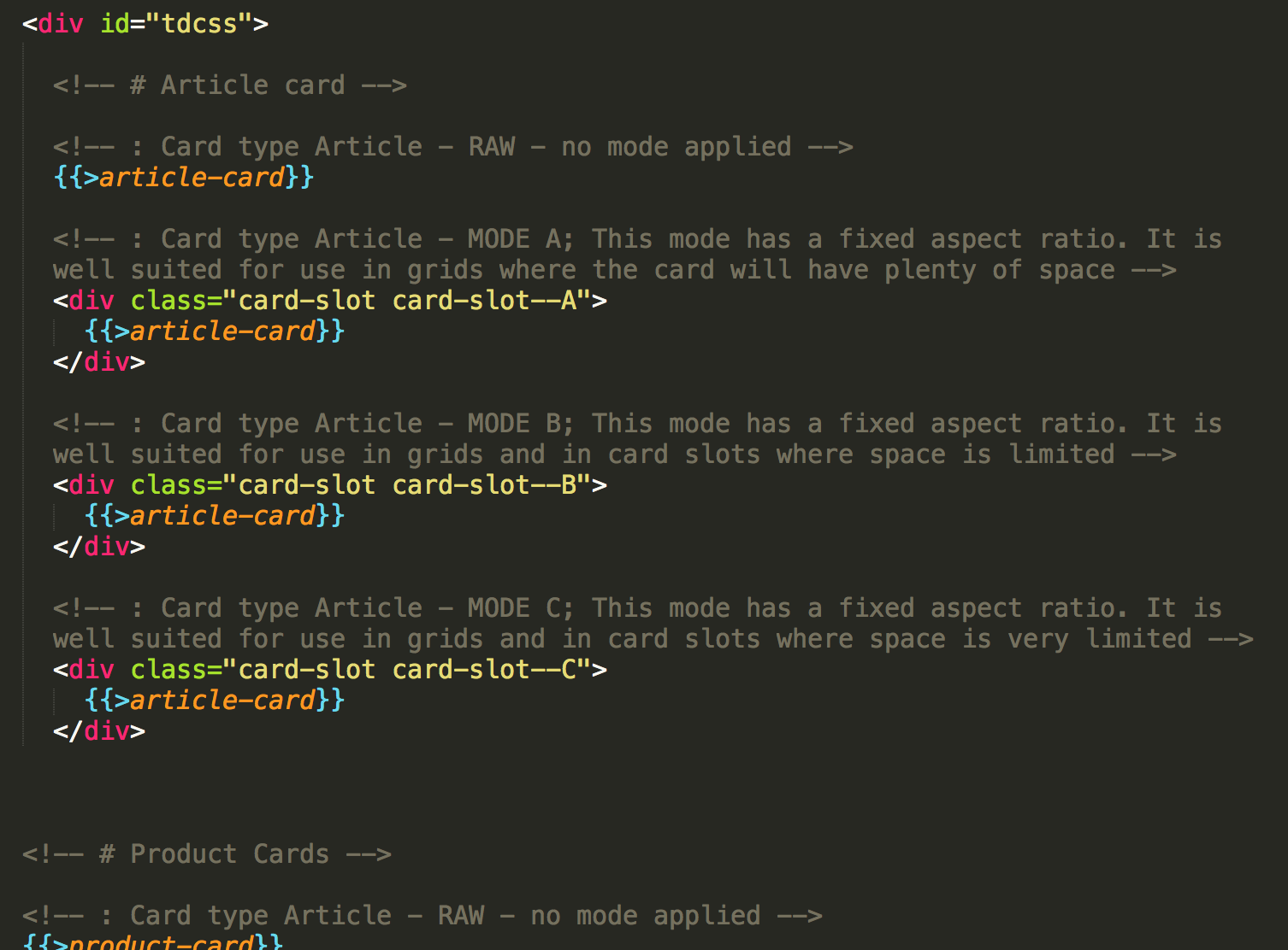
We will expect to see card types Product and Article in this panel, so we set up the three modes for those two cards types, arranging the needed styling in uniformly named MODE mixins like so:
@mixin MODE_article-card—A {
     // all the A MODE styling for the ARTICLE card type goes here
     .article-card {
          ...
     }
     .article-card__publiction-date {
          ...
     }
     ...
}

.card-slot—A {
     // allow direct application by a card-slot modifier - used in the style guide
     @include MODE_article-card—A;
}


@mixin MODE_product-card—A {
     // all the A MODE styling for PRODUCT card type goes here
     .product-card {
          ...
     }
     .product-card__price {
          ...
     }
     ...
}

.card-slot—A {
     // allow direct application by a card-slot modifier - used in the style guide
     @include MODE_product-card—A;
}
I also like to include a raw version of each card type in my style guide to make it clear what markup and content is available.
And since the markup is the same for all cards of the same type, I can simply include the same partial in my style guide as needed.

becomes:

Awesome!
This is totally something that we can run our visual tests on. We also have a place to point team members to, when they need to know what presentation styles we have in place for the different card types, which makes it way easy to evaluate when a new mode or a new card type is needed.
As an added bonus, we now have a language for the layout. We can talk about card type X in mode Y. Simple names, but they're very useful in our team communication.
Tip: Any style guide framework will do just fine. These examples are set up in TDCSS.js - if you're not already working with style guides, check that out for a dead simple starting point at http://jakobloekke.github.io/tdcss.js/.
Into the panel
With this in place, we can go ahead and apply the modes to panels in different configurations. To keep it all in the CSS, we can turn to structural pseudo-classes to apply the modes depending on our current card count. These days support is pretty solid (http://caniuse.com/#search=nth), however IE8 is left out (on the mqs as well, of course), so you will need to apply some fallback for that.
Tip: If you're not familiar with this set of selectors, swing by http://css-tricks.com/how-nth-child-works/ - don't be scared by the notice of browser support, the article is a few years old. Also, try this great tool from Lea Verou to get a better feel for them: http://lea.verou.me/demos/nth.html
Our smallest break point is fairly simple:
@include mq(small) {

  // ---------------------
  // card slot layout / card mode assignments

  // first card slot always
  .panel__card-slot:first-child {
    @include MODE_article-card--A;
    @include MODE_product-card--A;
  }

  // second card slot when it is also among the three last
  // i.e. when there are up to four card slots in panel
  .panel__card-slot:nth-child(2):nth-last-child(-n+3) {
    @include MODE_article-card--B;
    @include MODE_product-card--B;
  }

  // the second card slot when there are more than four cards in panel
  // and all following slots always
  .panel__card-slot:nth-child(2):not(:nth-last-child(-n+3)),
  .panel__card-slot:nth-child(n+3) {
    @include MODE_article-card--C;
    @include MODE_product-card--C;
  }

}
Note: structural pseudo-classes are fun, but honestly they are not the most easily scannable thing in the universe, so as they get more complex your colleagues might appreciate a comment with your intentions, especially if they are subject to change.
Also, I would advise you to group the mode applications when possible and sensible, since you are effectively repeating all the rules for the modes in each context where you apply it. No more than had you applied the styles directly, of course, but it might be easier to lose track of when it's this simple to do. If a lot of panels are using the same modes, you might even want to consider injecting some placeholders to group further. YMMV.
In this manner work your way through the breakpoints.
@include mq(medium) {

  // styles applying to all card slots on this breakpoint
  .panel__card-slot {
    float: left;
     ...
  }

  // first card always
  .panel__card-slot:first-child {
    width: 100%;
    @include MODE_article-card--A;
    @include MODE_product-card--A;
  }

  // following four card slots
  .panel__card-slot + .panel__card-slot:nth-child(-n+5) {
    width: 50%;
    @include MODE_article-card--B;
    @include MODE_product-card--B;
  }

  // All card slots above 5
  // and last slot always when count is even
  .panel__card-slot:nth-child(n+6),
  .panel__card-slot:last-child:nth-child(even) {
    width: 50%;
    @include MODE_article-card--C;
    @include MODE_product-card--C;
  }

  // when the last card slot is even, take up whole row
  .panel__card-slot:last-child:nth-child(even) {
    width: 100%;
  }
}
And so our example from earlier takes shape:

You can now go through the panel layouts for even more card slots and subsequently add more card types as/if needed. The groundwork you did by adding the card modes directly to the style guide helps you to ensure that they are all in the right shape, so you can focus on the flow of the card slots at this point.
And there you have it.
Biggest benefit from this approach for me, the frontender, is that each mode remains visible, and therefore testable, without setting up a working example of each panel/card configuration.
Biggest benefit for my backender is that all the presentational handling is left to CSS, so the markup doesn't have to duplicate any complex information about grid, breakpoints or card presentation across them.
For my designing colleagues this provides a great overview and a concrete framework with set restraints to work from.
And to the whole team it gives a system and a language to ease the communication about the structure and the styling as the site grows and changes.
I hope you can find some of this as useful as I have. And if you have an interesting approach that has helped you tackle this is a different way, do share. In the spirit of Christmas and all.
Happy holidays!
tl;dr: An approach to set up repeated content chunk styling in a testable, flexible, maintainable way. Setup and selectors can get slightly complex and approach only gives full yield IE9+, but hooray for style guides, and team communication benefits.
Merry Christmas.