Responsive Images
Heads Up!
This article is several years old now, and much has happened since then, so please keep that in mind while reading it.
Unfortunately, these capabilities are often not used because they seem daunting at first and become a lot of work to maintain. In this blog post we’ll learn the basics of these responsive image capabilities and how to make them available and maintainable to Umbraco content editors.
Why should we care
Mobile devices often don’t have the same screen size, processing power, and internet speed that desktops/laptops enjoy. Using responsive image capabilities we can serve images optimized for specific device resolutions & sizes.
For a powerful large screen laptop we can serve a high resolution image . For a small screen phone we can serve a smaller resolution version of that image. We can also serve alternative versions that are better optimized and will have a smaller download size such as WebP-images. This way our websites load faster, consume less battery and use less data.
Some devices have very high DPI screens such as Apple devices with Retina screens. When not optimized for high DPI screens, images will look blurry. Using the responsive image capabilities we can provide higher resolution images that look crisp on High DPI screens.
Ultimately, responsive images help us deliver the best image experience possible catering to any device.
Responsive Images
Srcset & sizes attribute
Let’s start from the following HTML displaying the Umbraco logo (taken from Umbraco press page) in a very large resolution without using any of the responsive image capabilities:
<img
    src="UmbracoLogoLarge.png"
    width="1081" height="1081"
alt="Umbraco Logo" />To serve multiple versions of the Umbraco logo, we can use the srcset-attribute and sizes-attribute as shown below:
<img
    srcset="UmbracoLogoExtraSmall.png 270w,
            UmbracoLogoSmall.png 540w,
            UmbracoLogoLarge.png 1081w"
    sizes="(max-width: 270px) 270px,
           (max-width: 540px) 540px,
           1081px"
    src="UmbracoLogoLarge.png"
    alt="Umbraco Logo"
/>The srcset-attribute accepts a comma separated list where each item in the list is a combination of a URL to an image and the pixel width of that image. The browser will use this data together with the data in the sizes-attribute and decide which image is best suited.
The sizes-attribute also accepts a comma separated list. Each item in the list take a combination of a media query and the desired width to display the image as. The desired width can be specified using px, em, or vw.
Mozilla’s documentation does a really good job at explaining the logic the browser will follow, so I’ll quote it below:
1. Look at its device width
2. Work out which media condition in the sizes list is the first one to be true
3. Look at the slot size given to that media query
4. Load the image referenced in the srcset list that most closely matches the chosen slot size
There’s another srcset capability which we haven’t addressed. The ability to change resolutions while maintaining the same size rendered on screen. This is used for high DPI screens that will emulate a smaller screen size for compatibility reasons, but still want to display the images at the highest resolution the device supports. This high DPI support applies to many Apple products with "Retina" displays. To use this capability, instead of specifying the image width (270w), we can use the x-descriptors:
<img
    srcset="UmbracoLogoExtraSmall.png 1x
            UmbracoLogoSmall.png 2x"
    src="UmbracoLogoExtraSmall.png"
    width="270" height="270"
    alt="Umbraco Logo"
/>Unfortunately, there’s no way to combine srcset w-descriptors and x-descriptors. If we do have a need for that, we can use the picture-element instead.
Mozilla has great documentation that explains srcset & sizes in more details. Consider reading MDN for more details.
Picture-element
The picture-element builds on top of the capabilities of the srcset-attribute but expands it even further. We can wrap our img-element with the picture-element and instead of using the srcset-attribute on the img-element, we can insert multiple source-elements within the picture-element.
Both the picture-element and the source-elements don’t have any visualization, but they help the browser determine which image source to use for the img-element. Here’s a sample of what that would look like:
<picture>
    <source srcset="UmbracoLogoExtraSmall.png" media="(max-width: 270px)" sizes="270px" />
    <source srcset="UmbracoLogoSmall.png" media="(max-width: 540px)" sizes="540px" />
    <source srcset="UmbracoLogoLarge.png" sizes="1081px" />
    <img src="UmbracoLogoLarge.png" alt="Umbraco Logo" />
</picture>Similarly to how the srcset-attribute on the img-element works, source-elements will provide hints to the browser. The browser will evaluate all options and pick the best suited source for the img-element. The source-element takes the same srcset-attribute and sizes-attribute, but because we can create a source-element for each variation we don’t need to set comma-separated lists into the attributes. We still can though!
In addition to the srcset-attribute and sizes-attribute, there’s also a media-attribute and the type-attribute. The media-attribute will take a media query to specify which source to use.
NOTE: Both media queries in the sizes-attribute and media-attribute don’t support the full media query spec. The most important aspect of media queries such as querying width & height of the viewport are supported.
Using the type-attribute we can specify the MIME type of the source. This is commonly used to provide WebP-images which are better optimized than jpg and png images. Not all browsers support WebP, but the browser will fallback to other sources in that case. Here’s an updated sample including WebP-images:
  <picture>
    <source type="image/webp" srcset="UmbracoLogoExtraSmall.webp" media="(max-width: 270px)" sizes="270px" />
    <source type="image/webp" srcset="UmbracoLogoSmall.webp" media="(max-width: 540px)" sizes="540px" />
    <source type="image/webp" srcset="UmbracoLogoLarge.webp" sizes="1081px" />
    <source srcset="UmbracoLogoExtraSmall.png" media="(max-width: 270px)" sizes="270px" />
    <source srcset="UmbracoLogoSmall.png" media="(max-width: 540px)" sizes="540px" />
    <source srcset="UmbracoLogoLarge.png" sizes="1081px" />
    <img src="UmbracoLogoLarge.png" alt="Umbraco Logo" />
</picture>Using squoosh.app to optimize the above images using WebP, the file size of the images have been reduced by 40-50%.
I tried to keep this section as short and informative as possible. For more details, check out Mozilla’s Developer Network’s excellent documentation on Responsive Images.
Creating a Responsive Image Macro in Umbraco
The responsive image features above are very powerful, but constructing the HTML is not intuitive enough for most content editors. Using sensible defaults and Umbraco’s powerful Content Editing capabilities we can make these responsive image capabilities accessible to content editors using an Umbraco Macro.
NOTE: This step-by-step guide will be using Umbraco 8.1.5. Newer and older versions of Umbraco can accomplish the same results, though implementation will vary.
Basic Responsive Image Macro
Follow these steps to create the Responsive Image Macro:
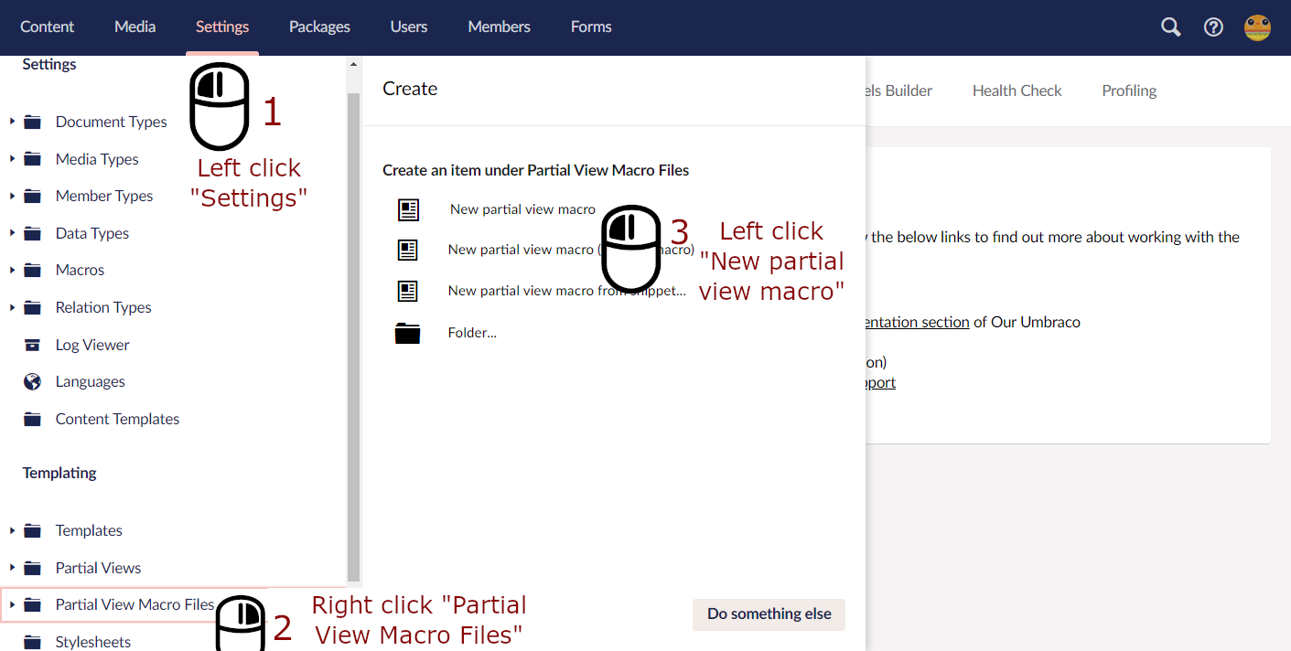
- Navigate to the "Settings" dashboard in the Umbraco backoffice
- Right Click on "Partial View Macro Files" under the "Templating" section and click the "Create" menu in the fly-out menu
- Click "New partial view macro"

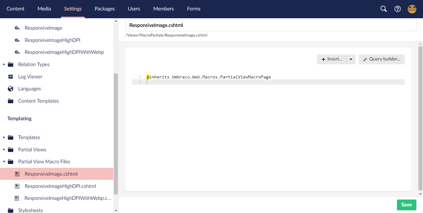
- Set the name as "ResponsiveImage.cshtml" but leave the code section empty for now

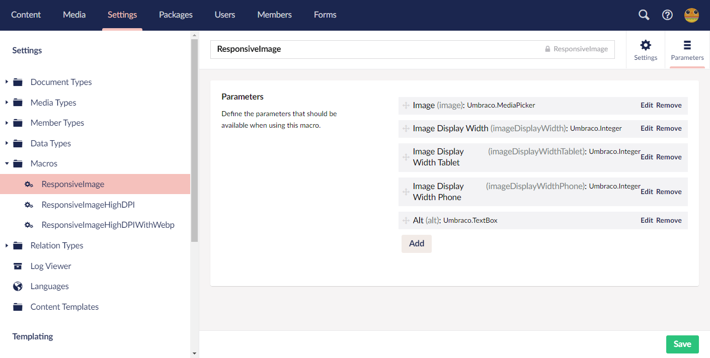
- Navigate to "ResponsiveImage" under "Settings" > "Macros" and click on the "Parameters" tab located top right

- Match the parameters with the list below and the screenshot above:
- Image: The image parameter will be used to select which image to render.
- Name: Image
- Alias: image
- Editor: Media Picker
- Image Display Width: The width in pixels that the image should be displayed as. When scaling occurs, the height will be resized to maintain original aspect ratio.
- Name: Image Display Width
- Alias: imageDisplayWidth
- Editor: Numeric
- Image Display Width Tablet: This parameter serves the same purpose as "Image Display Width" but for tablet sized screens.
- Name: Image Display Width Tablet
- Alias: imageDisplayWidthTablet
- Editor: Numeric
- Image Display Width Phone: This parameter serves the same purpose as "Image Display Width" but for phone sized screens.
- Name: Image Display Width Phone
- Alias: imageDisplayWidthPhone
- Editor: Numeric
- Alt: Used to provide an alternate description for accessibility purposes.
- Name: Alt
- Alias: alt
- Editor: Textbox
- Navigate back to the "Partial View Macro Files" > "ResponsiveImage.cshtml" and paste the below code into the Razor file.
@inherits Umbraco.Web.Macros.PartialViewMacroPage
@using Umbraco.Web.Models
@using ContentModels = Umbraco.Web.PublishedModels;
@{
    var image = Umbraco.Media(Model.GetParameterValue<string>("image")) as ContentModels.Image;

    var displayWidth = Model.GetParameterValue<int>("imageDisplayWidth", 0);
    var displayWidthTablet = Model.GetParameterValue<int>("imageDisplayWidthTablet", 0);
    var displayWidthPhone = Model.GetParameterValue<int>("imageDisplayWidthPhone", 0);

    var alt = Model.GetParameterValue<string>("alt");
    alt = alt == null ? string.Empty : string.Format("alt=\"{0}\"", alt);
}
<picture>
    @if(displayWidthPhone > 0){
        <source
            srcset="@Html.Raw(image.Url.GetCropUrl(width: displayWidthPhone))"
            media="(max-width: 480px)"
            sizes="@(displayWidthPhone)px" />
    }
    @if(displayWidthTablet > 0){
        <source
            srcset="@Html.Raw(image.Url.GetCropUrl(width: displayWidthTablet))"
            media="(max-width: 768px)"
            sizes="@(displayWidthTablet)px" />
    }
    @if(displayWidth > 0){
        <source
            srcset="@Html.Raw(image.Url.GetCropUrl(width: displayWidth))"
            sizes="@(displayWidth)px" />
    }
    <img src="@image.Url" @Html.Raw(alt) />
</picture>
Full Umbraco solution on GitHub
The code will do the following:
- Fetch all Macro parameter values which will be used to generate the picture+source-elements
- For Mobile and Tablet sizes, if the width has been set a source-element will be generated with the following attributes:
- Srcset: We’ll use GetCropUrl method to create a URL to the image with the specified width
- Media: We’ll use the media query (max-width: 480px) to target mobile devices
- Sizes: We’ll print the desired Image Width suffixed with "px"
- If the fallback Display Width has been specified we’ll generate another source-element, but without the media-attribute.
- Lastly, we’ll print the img-element with the alt-attribute coming from the alt-parameter.
Usually it is recommended to specify the width and height for an img-element, but in this case we won’t because that would stop the sizes-attribute from working.
Note: The order of the source-elements can impact the browser behaviour.
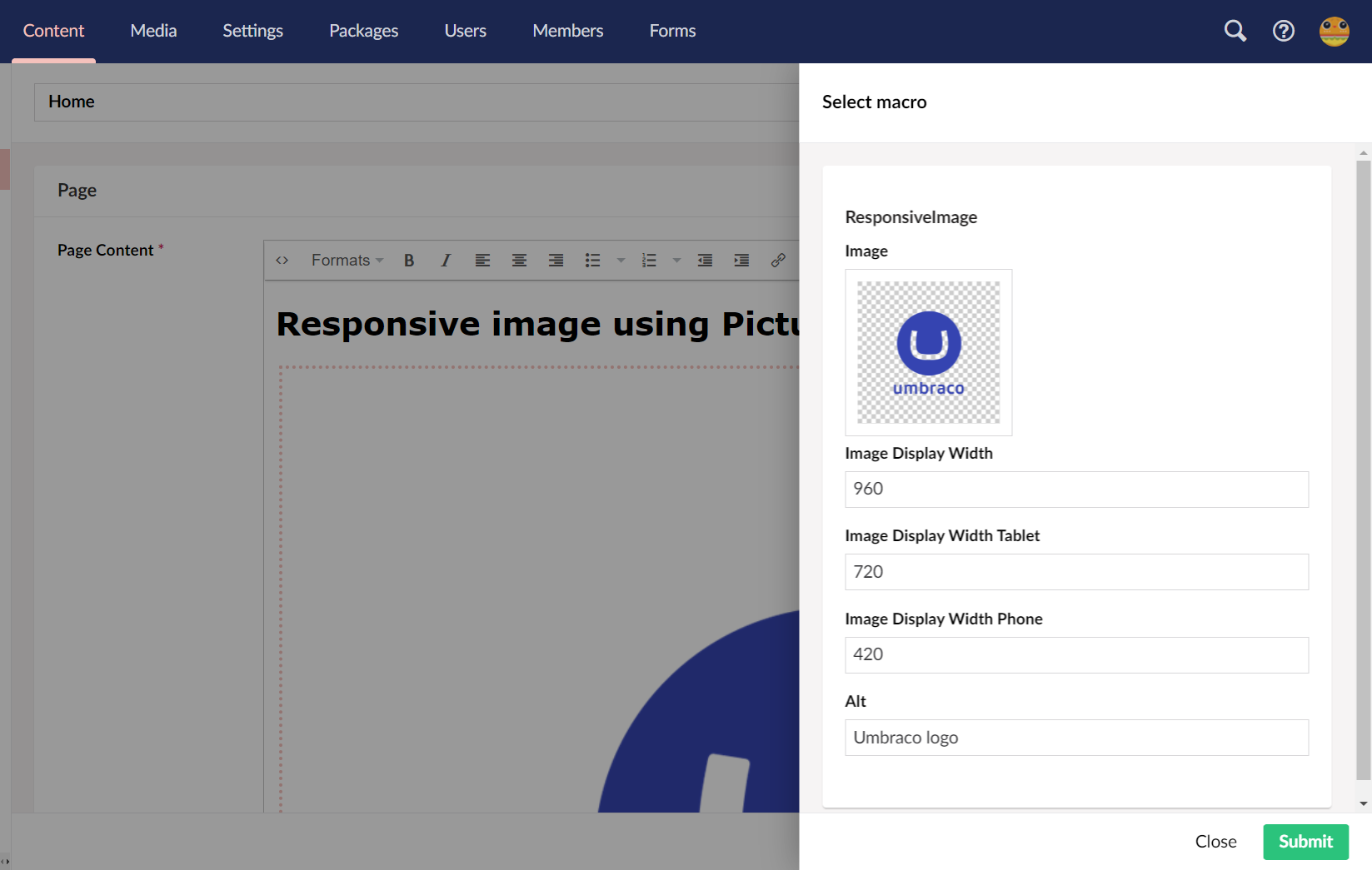
Now that our Macro is ready, let’s use it in a Rich Text Editor as below:
The rendered Macro output will be the following:
<picture>
    <source srcset="/media/bdpjq2s3/umbracologolarge.png?mode=pad&width=420" media="(max-width: 480px)" sizes="420px" />
    <source srcset="/media/bdpjq2s3/umbracologolarge.png?mode=pad&width=720" media="(max-width: 768px)" sizes="720px" />
    <source srcset="/media/bdpjq2s3/umbracologolarge.png?mode=pad&width=960" sizes="960px" />
    <img src="/media/bdpjq2s3/umbracologolarge.png" alt="Umbraco logo" />
</picture>
As a result, a lower resolution image will be served to small screen devices, saving data and enhancing site performance.
Adding High DPI support
Let’s update our Macro code to support High DPI screens:
@inherits Umbraco.Web.Macros.PartialViewMacroPage
@using Umbraco.Web.Models
@using System.Text
@using ContentModels = Umbraco.Web.PublishedModels;
@{
    var image = Umbraco.Media(Model.GetParameterValue<string>("image")) as ContentModels.Image;

    var displayWidth = Model.GetParameterValue<int>("imageDisplayWidth", 0);
    var displayWidthTablet = Model.GetParameterValue<int>("imageDisplayWidthTablet", 0);
    var displayWidthPhone = Model.GetParameterValue<int>("imageDisplayWidthPhone", 0);

    var alt = Model.GetParameterValue<string>("alt");
    alt = alt == null ? string.Empty : string.Format("alt=\"{0}\"", alt);
}
<picture>
    @RenderSource(image, displayWidthPhone, "(max-width: 480px)")
    @RenderSource(image, displayWidthTablet, "(max-width: 768px)")
    @RenderSource(image, displayWidth)
    <img src="@image.Url" @Html.Raw(alt) />
</picture>

@helper RenderSource(ContentModels.Image image, int displayWidth, string mediaQuery = null)
{
    int nativeWidth = image.Value<int>("umbracoWidth");
    mediaQuery = mediaQuery == null ? string.Empty : string.Format("media=\"{0}\"", mediaQuery);
    if (displayWidth > 0)
    {
        StringBuilder srcSetBuilder = new StringBuilder();
        srcSetBuilder.AppendFormat("{0} 1x", image.Url.GetCropUrl(width: displayWidth));

        int widthx1point5 = Convert.ToInt32(Math.Truncate(displayWidth * 1.5));
        if (widthx1point5 <= nativeWidth)
        {
            srcSetBuilder.AppendFormat(",{0} 1.5x", image.Url.GetCropUrl(width: widthx1point5));
        }

        int widthx2 = (int)displayWidth * 2;
        if (widthx2 <= nativeWidth)
        {
            srcSetBuilder.AppendFormat(",{0} 2x", image.Url.GetCropUrl(width: widthx2));
        }

        <source srcset="@Html.Raw(srcSetBuilder.ToString())"
                @Html.Raw(mediaQuery)
                sizes="@(displayWidth)px" />
    }
}
Full Umbraco solution on GitHub
We’ve refactored the code to generate source-elements to a reusable Razor HTML helper called RenderSource. For each source element, we calculate whether we can provide a higher resolution of the image for 1.5x and 2x DPI screens.
For 1.5x, we check whether the displayWidth x 1.5 is less or equal to the original image width.
If so, we serve the 150% larger resolution image. We do the same for 2x resolutions. This way we provide High DPI images when possible without burdening our content editors with the complexity.
The output of our updated Macro would look something like this:
<picture>
    <source
        srcset="/media/bdpjq2s3/umbracologolarge.png?mode=pad&width=420 1x,/media/bdpjq2s3/umbracologolarge.png?mode=pad&width=630 1.5x,/media/bdpjq2s3/umbracologolarge.png?mode=pad&width=840 2x"
        media="(max-width: 480px)" sizes="420px" />
    <source
        srcset="/media/bdpjq2s3/umbracologolarge.png?mode=pad&width=720 1x,/media/bdpjq2s3/umbracologolarge.png?mode=pad&width=1080 1.5x"
        media="(max-width: 768px)" sizes="720px" />
    <source srcset="/media/bdpjq2s3/umbracologolarge.png?mode=pad&width=960 1x" sizes="960px" />
    <img src="/media/bdpjq2s3/umbracologolarge.png" alt="Umbraco Logo" />
</picture>
Notice how we’re able to serve 1x, 1.5x, and 2x images for mobile devices. For tablets 1x and 1.5x. For larger screens only 1x due to the specified widths. If the original image was a higher resolution, all srcset-attributes could have a 1x, 1.5x, and 2x image URL.
Adding WebP support
Out of the box, Umbraco does not support converting images to WebP-images on the fly. Luckily, the underlying image library for Umbraco -ImageProcessor- has a plugin for WebP.
Let’s install the WebP NuGet package using the following command in the NuGet console:
Install-Package ImageProcessor.Plugins.WebPTo request the WebP version of an image in Umbraco, we can pass in furtherOptions: "&format=webp&quality=90" to the GetCropUrl function.
Let’s update our Macro code to provide WebP-sources as well:
@inherits Umbraco.Web.Macros.PartialViewMacroPage
@using Umbraco.Web.Models
@using System.Text
@using ContentModels = Umbraco.Web.PublishedModels;
@{
    var image = Umbraco.Media(Model.GetParameterValue<string>("image")) as ContentModels.Image;

    var displayWidth = Model.GetParameterValue<int>("imageDisplayWidth", 0);
    var displayWidthTablet = Model.GetParameterValue<int>("imageDisplayWidthTablet", 0);
    var displayWidthPhone = Model.GetParameterValue<int>("imageDisplayWidthPhone", 0);

    var alt = Model.GetParameterValue<string>("alt");
    alt = alt == null ? string.Empty : string.Format("alt=\"{0}\"", alt);
}
<picture>
    @RenderSources(image, displayWidthPhone, "(max-width: 480px)")
    @RenderSources(image, displayWidthTablet, "(max-width: 768px)")
    @RenderSources(image, displayWidth)
    <img src="@image.Url" @Html.Raw(alt) />
</picture>

@helper RenderSources(ContentModels.Image image, int displayWidth, string mediaQuery = null)
{
    int nativeWidth = image.Value<int>("umbracoWidth");
    mediaQuery = mediaQuery == null ? string.Empty : string.Format("media=\"{0}\"", mediaQuery);
    if (displayWidth > 0)
    {
        StringBuilder srcSetBuilder = new StringBuilder();
        StringBuilder srcSetWebpBuilder = new StringBuilder();
        srcSetBuilder.AppendFormat("{0} 1x", image.Url.GetCropUrl(width: displayWidth));
        srcSetWebpBuilder.AppendFormat("{0} 1x", image.Url.GetCropUrl(width: displayWidth, furtherOptions: "&format=webp&quality=90"));

        int widthx1point5 = Convert.ToInt32(Math.Truncate(displayWidth * 1.5));
        if (widthx1point5 <= nativeWidth)
        {
            srcSetBuilder.AppendFormat(",{0} 1.5x", image.Url.GetCropUrl(width: widthx1point5));
            srcSetWebpBuilder.AppendFormat(",{0} 1.5x", image.Url.GetCropUrl(width: widthx1point5, furtherOptions: "&format=webp&quality=90"));
        }

        int widthx2 = (int)displayWidth * 2;
        if (widthx2 <= nativeWidth)
        {
            srcSetBuilder.AppendFormat(",{0} 2x", image.Url.GetCropUrl(width: widthx2));
            srcSetWebpBuilder.AppendFormat(",{0} 2x", image.Url.GetCropUrl(width: widthx2, furtherOptions: "&format=webp&quality=90"));
        }

        <source type="image/webp"
                srcset="@Html.Raw(srcSetWebpBuilder.ToString())"
                @Html.Raw(mediaQuery)
                sizes="@(displayWidth)px" />
        <source srcset="@Html.Raw(srcSetBuilder.ToString())"
                @Html.Raw(mediaQuery)
                sizes="@(displayWidth)px" />
    }
}
Full Umbraco solution on GitHub
Rename RenderSource to RenderSources as we’ll be printing out two source-elements, one source-element for the normal image and one for the WebP-version.
Let’s duplicate the StringBuilder code and adjust the second one for the WebP-image. We’ll pass in furtherOptions: "&format=webp&quality=90" to the GetCropUrl function when appending to the WebP-StringBuilder.
For the WebP-source we need to specify the type-attribute as image/webp.
The output will look something like this:
<picture>
    <source type="image/webp"
        srcset="/media/bdpjq2s3/umbracologolarge.png?mode=pad&width=420&format=webp&quality=90 1x,/media/bdpjq2s3/umbracologolarge.png?mode=pad&width=630&format=webp&quality=90 1.5x,/media/bdpjq2s3/umbracologolarge.png?mode=pad&width=840&format=webp&quality=90 2x"
        media="(max-width: 480px)" sizes="420px" />
    <source
        srcset="/media/bdpjq2s3/umbracologolarge.png?mode=pad&width=420 1x,/media/bdpjq2s3/umbracologolarge.png?mode=pad&width=630 1.5x,/media/bdpjq2s3/umbracologolarge.png?mode=pad&width=840 2x"
        media="(max-width: 480px)" sizes="420px" />
    <source type="image/webp"
        srcset="/media/bdpjq2s3/umbracologolarge.png?mode=pad&width=720&format=webp&quality=90 1x,/media/bdpjq2s3/umbracologolarge.png?mode=pad&width=1080&format=webp&quality=90 1.5x"
        media="(max-width: 768px)" sizes="720px" />
    <source
        srcset="/media/bdpjq2s3/umbracologolarge.png?mode=pad&width=720 1x,/media/bdpjq2s3/umbracologolarge.png?mode=pad&width=1080 1.5x"
        media="(max-width: 768px)" sizes="720px" />
    <source type="image/webp" srcset="/media/bdpjq2s3/umbracologolarge.png?mode=pad&width=960&format=webp&quality=90 1x"
        sizes="960px" />
    <source srcset="/media/bdpjq2s3/umbracologolarge.png?mode=pad&width=960 1x" sizes="960px" />
    <img src="/media/bdpjq2s3/umbracologolarge.png" alt="Umbraco logo" />
</picture>
Summary
Responsive image features such as the srcset-attribute and picture-attribute are well supported by browsers. These features allow us to optimize our websites to save mobile data and improve performance. For High DPI displays we can also serve beautiful high resolution images.
Combining the picture-element and Umbraco’s Macro capabilities we can provide an intuitive way for content editors to provide responsive images that:
- Serve different resolutions depending on screen width
- Serve higher resolutions for high DPI devices
- Serve WebP optimized images
Thank you to the 24days team for letting me contribute this blog post. Follow me on Twitter (@RealSwimburger) and check out my blog (swimburger.net) covering Umbraco and many other software development topics. Cheers!