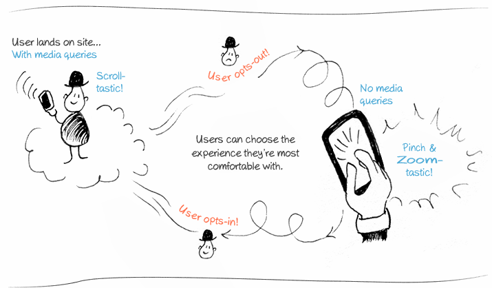
Media Query opt-out with Umbraco
Heads Up!
This article is several years old now, and much has happened since then, so please keep that in mind while reading it.

> tl;dr? See the working example here
Inspired by these posts:
http://mistermorris.tumblr.com/post/19679735499/a-responsive-panacea
http://css-tricks.com/user-opt-out-responsive-design/
I set about seeing if I could piece together a Media Query opt-out with Umbraco
Umbraco lets you be all anal retentive on the front end

Umbraco: the Neve of the CMS world?
As demonstrated beautifully by Dan Okkels Brendstrup, front-enders hold dear the HTML that they write. By design with Umbraco you start from the ground up, so rather than trying to shoehorn your HTML & CSS into an awkward templating system, it works with your way of working from the very start. While this post mostly may not be the most Umbraco specific of the bunch, it's the sheer fact that if you can imagine it, most likely you can do it with Umbraco.
Back to business
For simplicity lets say we have our media queries in a separate style sheet, which will be included in our all singing, all dancing version but excluded for our media query opt-out version.
We want to include these styles on a page based on whether the user is happy to receive a media-query based layout or not and set a cookie to remember what their preference is.
Without getting all grown up and creating a macro, lets just include it right within our masterpage where we would usually be including our styles.
Styles and Viewport (Razor)
<umbraco:Macro runat="server" language="cshtml">
@{
// check for a previously set cookie, so we know which version to serve.
HttpCookie optOutcss = new HttpCookie("noThanksToMediaQueries");
optOutcss            = Request.Cookies["noThanksToMediaQueries"];

	// Need to check for a null value if there's no cookie
	if(optOutcss != null){

		// fixed viewport and no media queries
		<meta name="viewport" content="width=960, initial-scale=0.3333, user-scalable=yes"/>
		<link rel="stylesheet" href="/css/nomediaqueries.css"/>

	}else{

		// device width viewport with media queries
		<meta name="viewport" content="width=device-width; minimum-scale=0.3; maximum-scale=1;"/>
		<link rel="stylesheet" href="/css/withmediaqueries.css" />
	}
}
</umbraco:Macro>
Tip: The same could be done with XSLT. I haven't given myself to the dark side just yet.
Now lets make a separate switch link (which could appear anywhere with our HTML source flow) that the user can click,
perhaps they know the full desktop site very well and want to see it how they would normally.
The switch link (Razor)
<umbraco:Macro runat="server" language="cshtml">
@{
// our variable optOutcss with tell us if the user said no to Media Queries
HttpCookie optOutcss = new HttpCookie("noThanksToMediaQueries");
optOutcss = Request.Cookies["noThanksToMediaQueries"];

	// Need to check for a null value if there's no cookie
	if(optOutcss != null){

		// Yep a cookie exist, the user has already opted out of Media Queries,
		// lets give them the option of getting them back in case they're feeling adventurous.
		<div id="mediaqueries-off">Responsive styles are currently off <a href="#">Switch On</a></div>

	}else{

		// The user hasn't set a preference for Media queries yet so they'll get them by default.
		<div id="mediaqueries-on">Responsive styles are currently on <a href="#">Switch off</a></div>
	}
}
</umbraco:Macro>
The switch (js)
The final piece of the puzzle. I'm using jQuery & the cookie plug-in here for convenience.
Smarter Umbracians that me would probably also have a non-JavaScript fallback - perhaps by just throwing an &altTemplate=noMediaQueries string into the URL and then adjusting the alternate master template accordingly.
$(document).ready(function(){

  // When someone opts-out of media queries.
  $("#mediaqueries-on a").click(function(){
    if($.cookie('noThanksToMediaQueries') != "true"){
    //Media queries to the ground!!!
    $.cookie('noThanksToMediaQueries', 'true', { expires: 20, path: '/' });
    location.reload();
    }
  });

  // When someone says gimmie that good Media Query shit.
  $("#mediaqueries-off a").click(function(){
    // Remove the cookie, The full site wasn't all that.
    // Get me back to the mini version.
    $.removeCookie('noThanksToMediaQueries', { path: '/' });
    location.reload();
    return false;
  });

});
You'd probably want to also include a non-js fallback in a real world scenario
And there you have it - See the example here
Some web designers may be loathed to see all their hard work creating a responsive design undone, but the way I see it most users are going to be either appreciative or completely oblivious that they're being served a responsive design, and this is just one way of helping out users who know exactly what they want and dont want to be spoon fed, or feel like they're being hand-held just because they're on a certain screen-width or device. The particularly cranky or ultra savvy users may even be circumnavigating your design altogether with services like Instapaper and Readability anyway. So ease up! Design still matters.
Wishing you a very Kentucky Fried Christmas from Japan