The importance of great images ... and how you achieve them
Heads Up!
This article is several years old now, and much has happened since then, so please keep that in mind while reading it.
On a daily basis I - one way or another - work with and within Umbraco. As an Editor though, since my programming skills are more or less on a non-existing level - and oh no, not meaning that in any good way ... at all - just ask around! :D
Anyways, since we've got that cleared you might have guessed that you're not going to see any code in this post (boooo ... we're coders, we demand code!). Yes yes .. I know, but just bear with me here ... you might even learn something completely different.
Images are my speciality. And images have a huge effect on how a website - or any other digital media for that matter - is presented.

We all look to Apple if we want a reference or a benchmark on how to make a great presentation. And YES! Apple have a bunch of great products - I use most of them myself - but if you really look, you'll notice that one thing all Apple presentations have, is GREAT images. Professionally shot, edited and cropped. Flawless.
We should have that too!
Sure we should, and that's the whole reason for this post ... with a darn long intro :D
When prepping a site for a client it's ok to have images of kittens scattered all over the site - for testing purposes. But when you get to the point of presenting the site to the client, you should really use great photos that are more representative to the site.
And why should you do this?
You should because it's my experience, after many years of trial and error, that most clients don't respond positively to "layout" images or "lorem ipsum" texts.
Though you're telling them "this will all be replaced, of course, with your content" and they say "Oh ... I see". Still, they often don't get it. Furthermore, this is your chance as an angency to guide your clients on the "right path". And by that, of course, I mean YOUR path: Your ideas, your design and maybe even your images.
Let me demo that for you
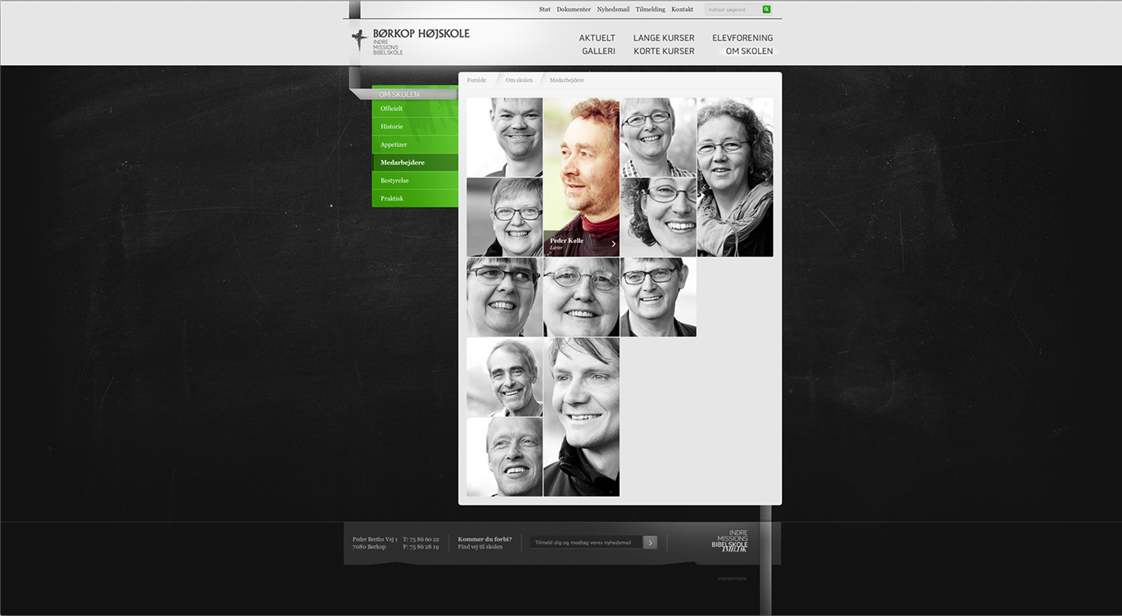
We had this assignment of totally redesigning a site. It was a school, that - amongst other needs - needed to present the teachers and staff. A quick thing to fail due to often bad images, and/or different angles and crops of the people. So what we did, was using a batch of my various portraits - in different crops - and in black-and-white [always a good trick, if you have very different images] showing them, how we envisioned the staff presentation.
Like this [click for larger view]:

(Just imagine that with kittens instead ... right?)
So what happed was that the client realised, that this would not do with their current - sorry to say - own [read: bad] images. So they hired a photographer to shoot and - ta-da - color grade the images, to get that consistent look.
The final result [click for larger view]:

One happy client ... but also one happy agency :)
A little bonus info: We got to do all the crops for the images - and yes, we're using the standard Image Cropper here. The images have no fixed spot in the grid, it all depends on the amount of staff. A new comes in, the layout of the page is rearranged. So each staff image actually have tree crops: One square, one tall and one wide. Umbraco takes care of all that for us - well, actually our mighty coda-Yoda® Greystate wrote some kind of algorithm for that ... but still.
But I don't have any great photos I can use!
Sure you do. Either the client has provided a bunch for you to use, once the design phase begun, or you may have a pile in you system. Otherwise you have have a couple of options:
- You could use stock-images from i.e. iStock Photo or Shutter Stock
- Or you could shoot them yourself
If you go with option 1 you should more or less be home free, editing wise. The cool thing about these sites is, that images are fairly cheap. All the way down to $1 pr. image. Beware, some are fairly expensive though. But you can be sure to get quality images.
If you go with option 2 and you're not an image editing/color correction expert ... don't worry, I've got you all covered.
All you need is Adobe Photoshop or Adobe Photoshop Elements. Both apps can be downloaded and tested free for 30 days here.
When you're set, simply load the action I'm providing here on the site [see bottom of article] and run it on you images.
What does it do? - glad you asked.
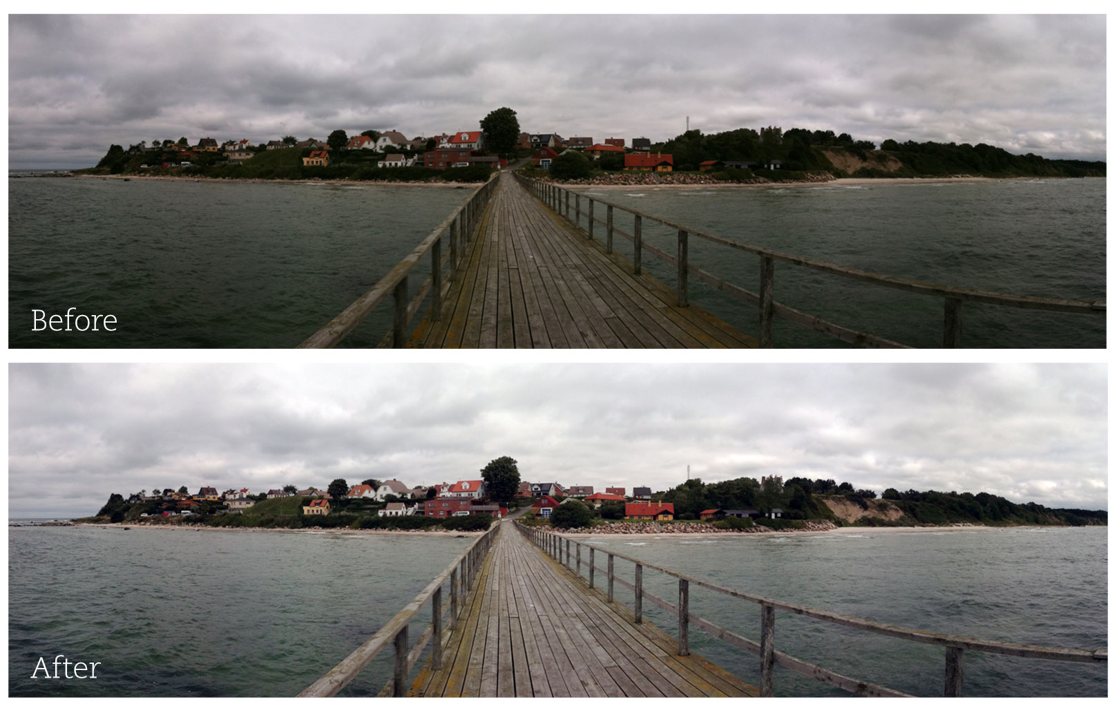
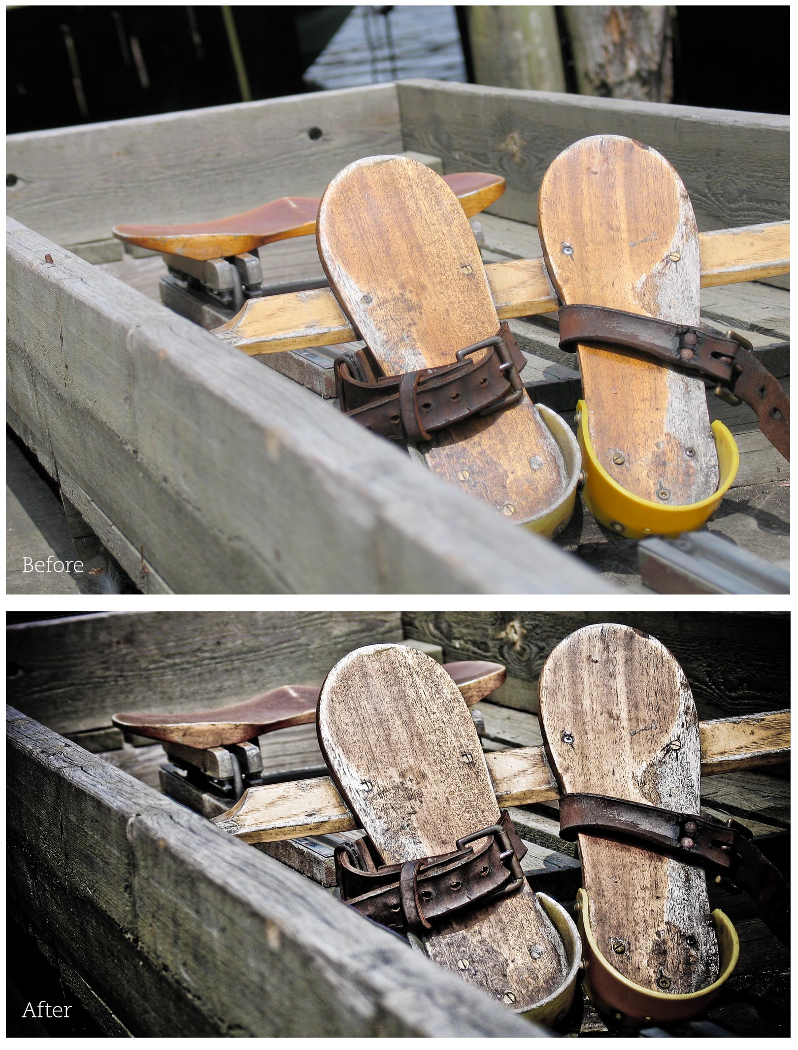
Basically it does sort of a "general color correction", adds contrast and sharpening to your images. So let me show you a before and after.

The image is more clear now and colors are more vibrant. Believe me, this does make a difference.
And if you are a Photoshop expert, then please remember to be creative. Play with cropping and color grading. You might just get that extra order from the client.
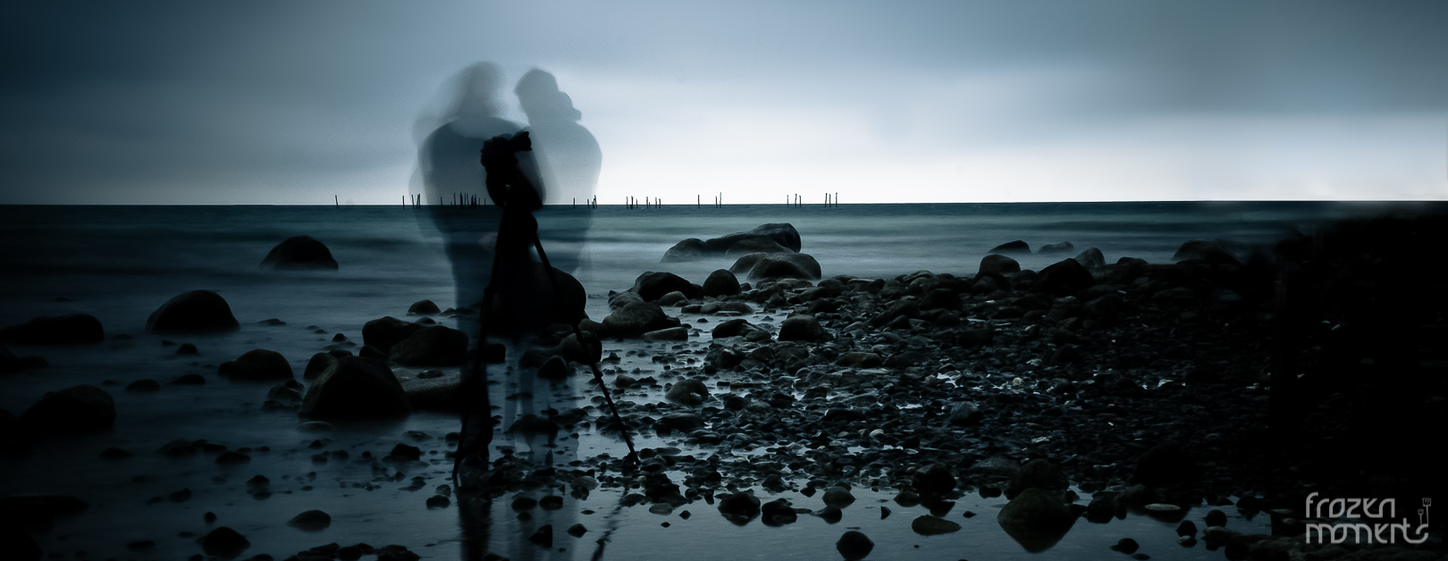
And as a finishing touch, I'll show you just that.

I hope you all can see the potential of this ...
And finally ... the Photoshop Action - download it here.
I hope you learned something from this and enjoyed it ... despite the lack of code lines.
Keep those great images flowing ... and have a wonderful Christmas.
And if you're somewhat intrigued to view more of ... let say ... my images, you could check out my website. Thank you for "listening".
... and to those of you wondering,
YES ... we are related ... he is my brother!