No More Empty Tabs, Please
Heads Up!
This article is several years old now, and much has happened since then, so please keep that in mind while reading it.
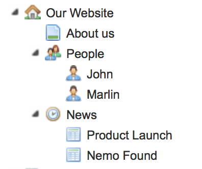
It looks nice, right? Totally following Kim's advice from last year's calendar we've of course provided some meaningful icons for the various document types - what we can't see from that screenshot, is what the editor is faced with on at least three of those nodes - nodes she'll be visiting more than a few times in the first 10-15 of her many sessions editing the website... for instance, she'll be seeing this when she clicks the People or News nodes:
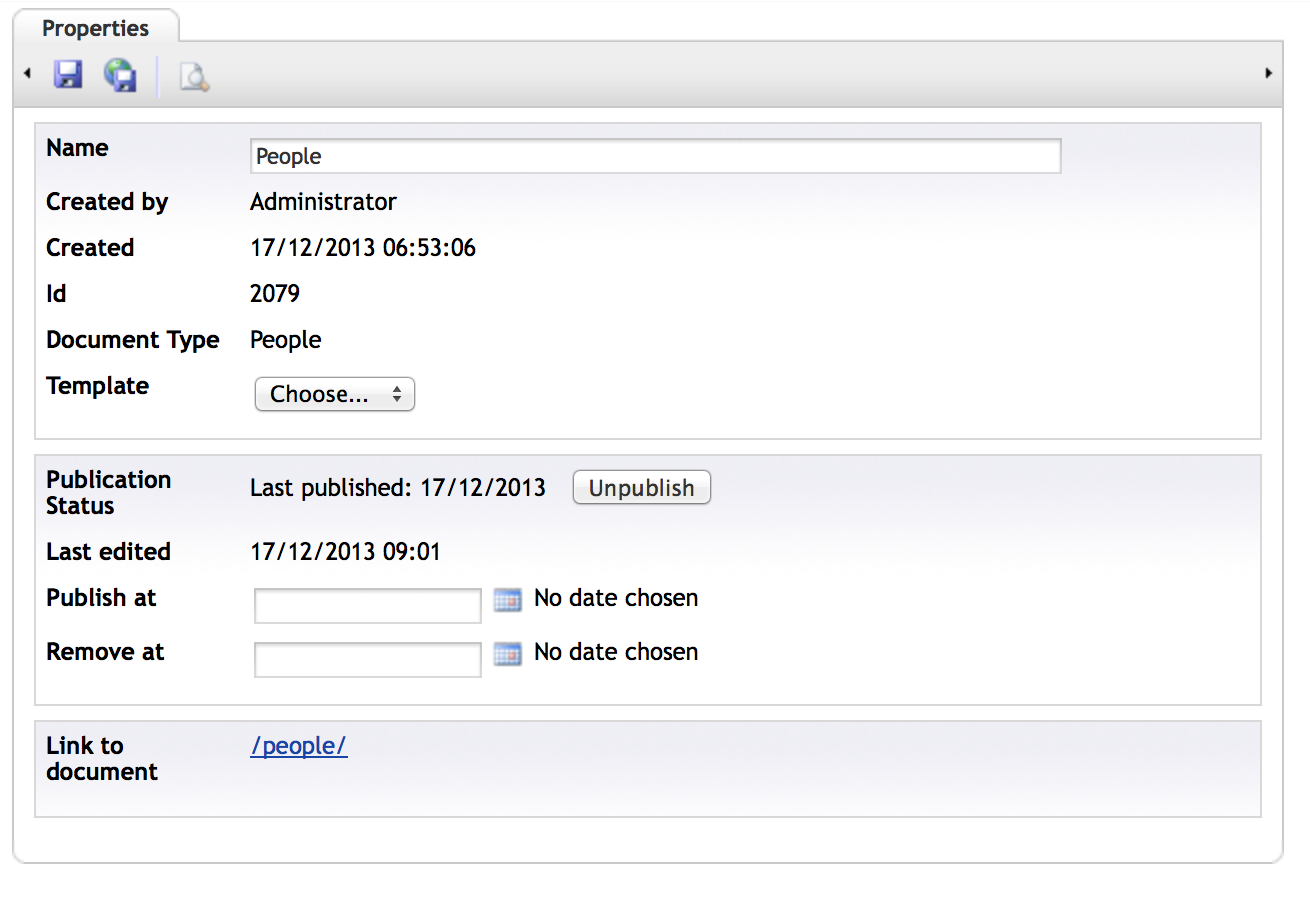
Drat! Not useful at all. That Generic properties tab is roughly the equivalent of an empty tab to the editors.
What to do?
So at Vokseværk we've been using a couple of handy data types to remedy this problem: Notes and Render Macro - both of uComponents fame, of course :)
Notes
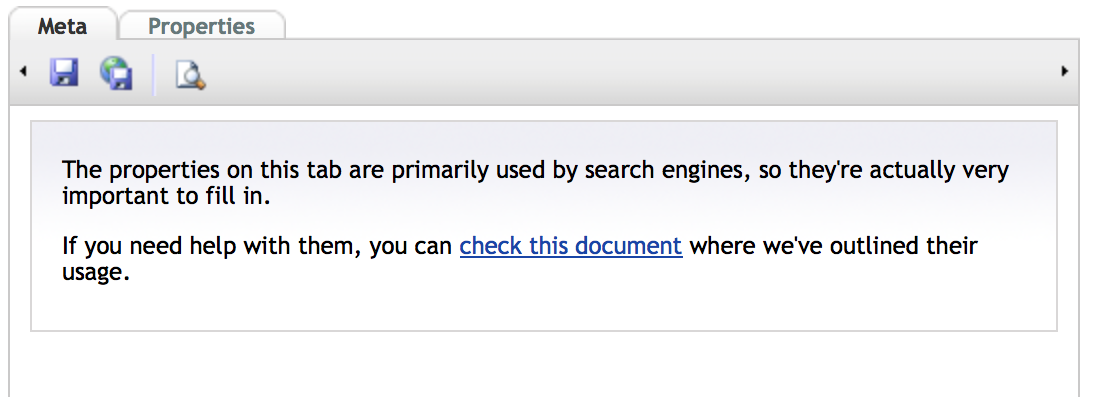
To minimize the amount of phone-calls regarding "the website you built", you just need to provide the editor with enough information - every property has a description for contextual help (see Doug's "Superhero" post for more info about that one), but sometimes you may wish that you could provide a little general info for the properties collected on that particular tab. The Notes data type lets you do that - it's just a WYSIWYG editor where you can add text, bullets, images etc. to explain the purpose of the document, like this:
Render Macro
If you have a section like the aforementioned People section with a lot of people added, it would be great to have kind of a dashboard or overview of them sitting right there on the top node, which otherwise wouldn't be of much use, right? So using the Render Macro data type, you can do pretty much anything you already know how to do on the front-end, only it's being rendered in the back-office instead.
So instead of an empty tab, our editors now see this when they click on the People node:
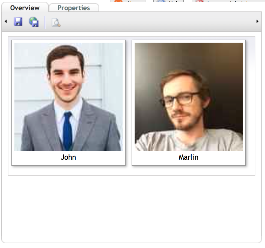
So much more useful - it's way faster for the editor to quickly glance over the images and find the one she's going to edit - of course the images are links to the actual Person nodes so it's a matter of clicking the image to get to the info.
Another very useful scenario is the News section - here it might make sense to render a table with the title, date and author of the posts - maybe even add some client-side sorting & filtering to make it really easy for the editors to get to the specific node faster than wading through the content tree:
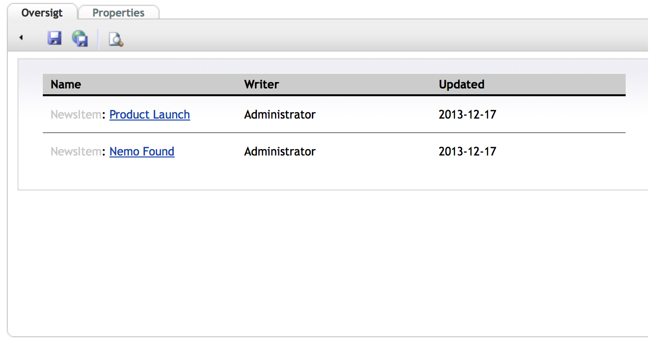
Of course, I hope (fingers crossed) that the "Container Type" functionality of Umbraco 7 will eliminate this particular use case :-)
How did you code this?
Code-wise it's just like a regular macro - I use XSLT but you should be able to use any other language allowed in a macro (please correct me if I'm wrong).
We have a GitHub project for this, that you could use as a starter.
Thanks!
So, if you've been doing similar things in your solutions, please share them in the comments, so we can learn a trick or two.